BRANDING

ART DIRECTION
BRANDING

ART DIRECTION
BRANDING

ART DIRECTION
BRANDING

ART DIRECTION
Creating brand identities for a variety of industries.
Creating brand identities for a variety of industries.
Creating brand identities for a variety of industries.
Creating brand identities for a variety of industries.
I’ve designed logos and brand identities for a variety of industries, with a focus primarily on start-ups. All of these businesses have shared the same common goal: to connect to a wide audience and distinguish themselves from the competition. This case study examines my process and outcome for a curated selection.
I’ve designed logos and brand identities for a variety of industries, with a focus primarily on start-ups. All of these businesses have shared the same common goal: to connect to a wide audience and distinguish themselves from the competition. This case study examines my process and outcome for a curated selection.
I’ve designed logos and brand identities for a variety of industries, with a focus primarily on start-ups. All of these businesses have shared the same common goal: to connect to a wide audience and distinguish themselves from the competition. This case study examines my process and outcome for a curated selection.
Logofolio: Volume 1.

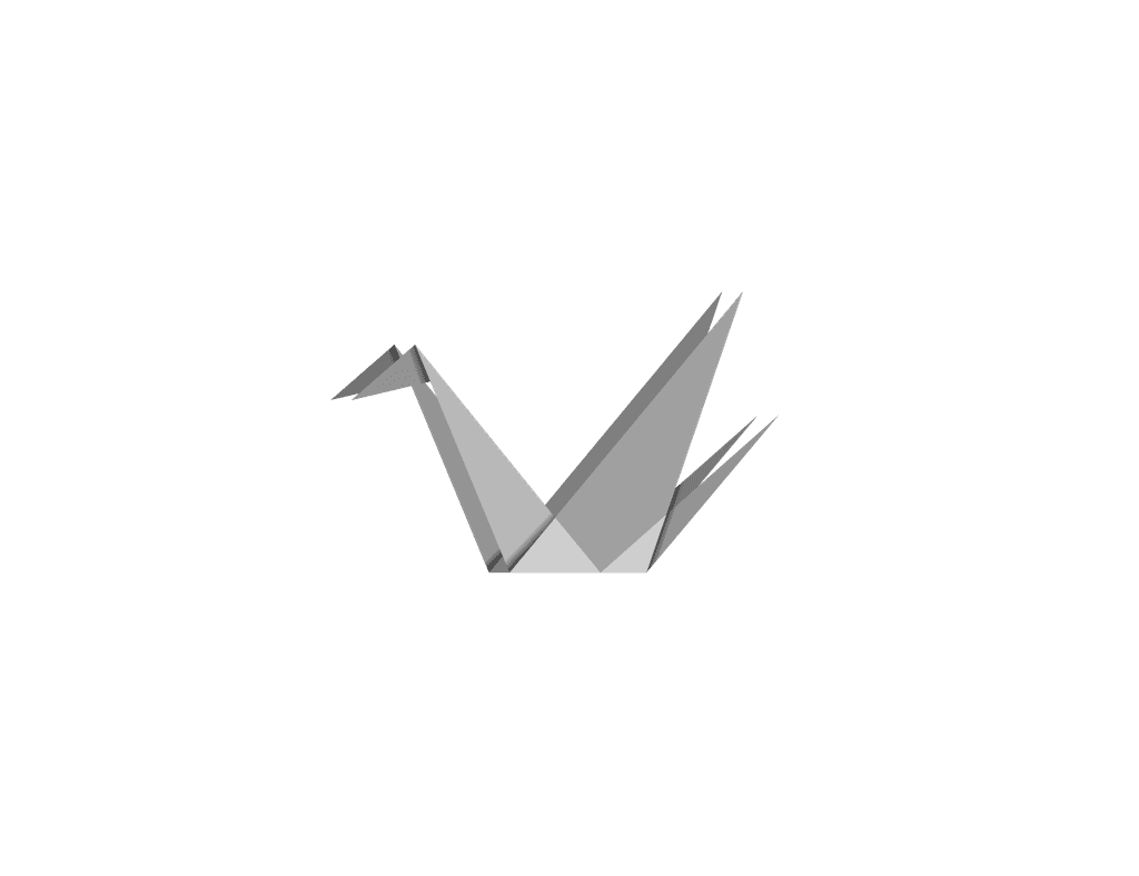

Logofolio: Volume 2.

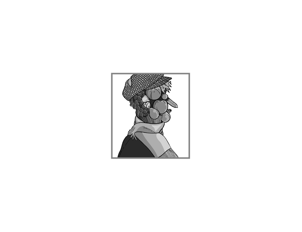

Logofolio: Volume 3.


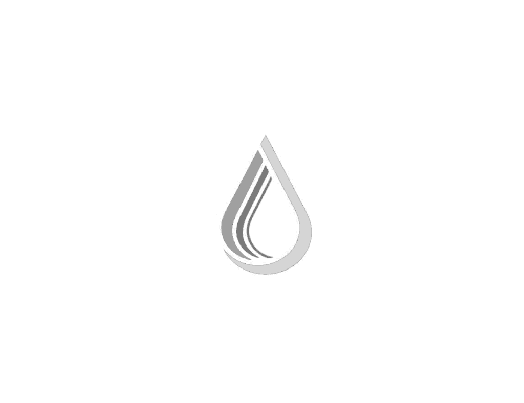

Logofolio: Volume 4.


Branding De. Gusto.


LOGOFOLIO
Logofolio: Volume 1.
Logofolio: Volume 1.


CASE STUDY
Branding De. Gusto.
Branding De. Gusto.
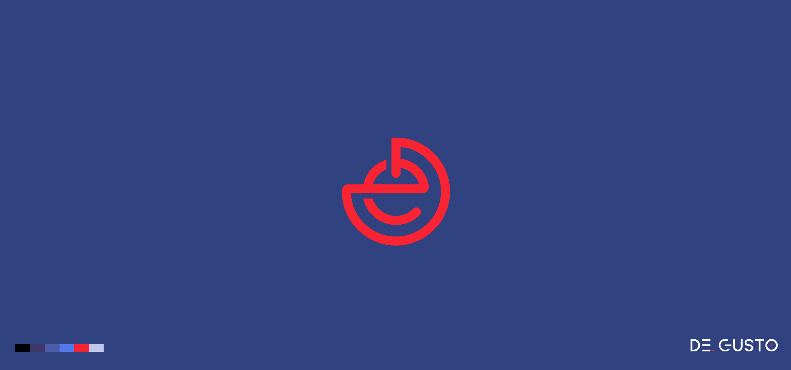
Understanding the business: De.Gusto is an interior design company with a physical office based in Taipei.
Founded by three Taiwanese entrepreneurs, this startup combines the founders mixed backgrounds into the creation of an interior design company, offering niche but modern styles.
Competitive analysis: Logos and brand identities for interior design companies tended to be a lot more visually pleasing and creative than in most other industries. When doing a competitive analysis, I found there was a huge variety of design styles, especially in the Taiwanese market. Commonalities tended to favour minimalist, elegant or chic designs.
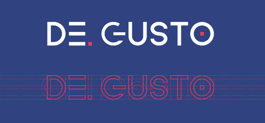
In addition to the logo mark, I created a bespoke piece of typography to be used as a logotype.
A secondary logo was also created to market De. Gusto’s rustic products.
Conceptualisation: I started with rough sketches when conceptualising the logo for De. Gusto, exploring stylish and abstract concepts based on a discussion with the team.
After exploring dozens of ideas, the team was most happy with the concept of a monogram comprised of the ‘D’ and ‘e’ in De. Gusto. As the team weren’t particularly interested in the logo being overly literal or abstract, they felt a timeless monogram would work as a middle-ground.
Outcome: After the chosen concept was selected, the team also requested one of the discarded designs be used for a secondary product within the De.Gusto brand. This secondary logo had an organic look to it, which the team felt would market their rustic products well. To create this secondary logo I hand-painted stripes of black onto a sheet of paper, which I converted to a vector and used as a brush to create the outline of a circle in the design. The monogram and custom logotype was then created using Illustrator. After receiving final approval I exported the designs for hand over, along with a basic styleguide.
LOGOFOLIO
Logofolio: Volume 2.
Logofolio: Volume 2.


CASE STUDY
Branding Search Know More.
Branding Search Know More.
Understanding the business: Search Know More is a platform for a variety of e-learning requirements where users can find specialised educational material sourced from educators worldwide.
This start-up was founded by five entrepreneurs and media veterans from Sydney.
Competitive analysis: When doing a competitive analysis of logos and brand identities in the e-learning space, I found that most designs fell into one of two major categories.
Outdated: Several e-learning companies were branded with the same symbols, such as graduation caps, owls and trees of knowledge. We all agreed that this made the brand feel outdated and ineffective as learners want to feel their education is as up-to-date as possible.
Modern minimalism: Well-established brands in the tech space have been opting for extreme minimalism with their logo designs (i.e. Coursera, Skillshare, Udemy) for a while now. Search Know More definitely wanted to stand out from these giants but were inspired by the minimalist aesthetic these brands conveyed.
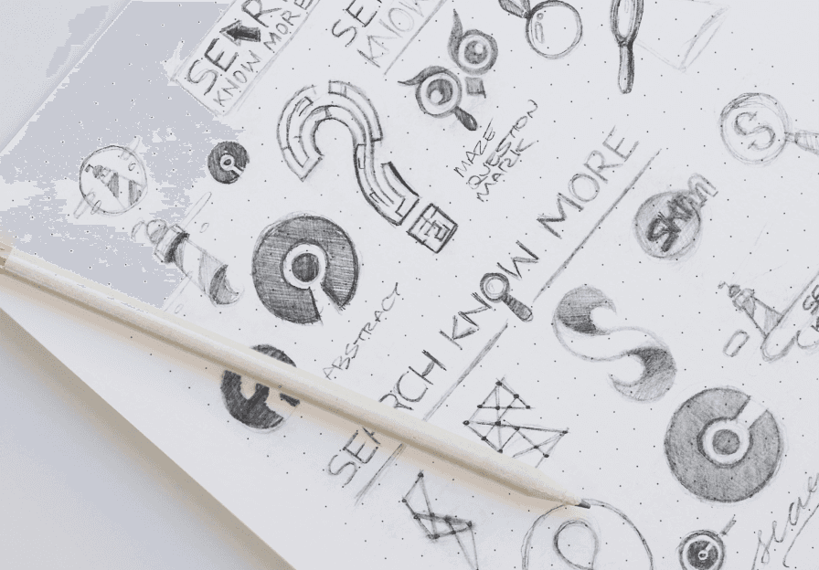
The initial conceptual sketches for branding Search Know More.
In addition to the primary logo, I also created this animated logo in After Effects to be used for video content.
Conceptualisation: After exploring dozens of concepts and sketches, I presented a curated selection of results to the team. Trying to avoid cliche’s, while still conveying meaning proved difficult in this space. With many concepts to choose from, the team were immediately drawn to the concept of a question-mark and light-bulb combined. This concept fused the two into one design, conveying the idea of asking a question and receiving an answer. The team thought this was clever and when executed in a minimalist aesthetic, would convey their message well.
Outcome: After tracing over the initial sketch in Illustrator I presented the final logo to the team for final approval. With no changes needed, I took to exporting the final design as well as creating the animated logo, which the team requested as an additional deliverable. Using After Effects I animated the bulb of the logo to flicker on and off, exported at different speeds, with and without text. With these assets handed over (along with a basic style guide), the team then moved to the next phase of development: building the platform.
LOGOFOLIO
Logofolio: Volume 3.
Logofolio: Volume 3.


CASE STUDY
Branding Top Two Japan.
Branding Top Two Japan.
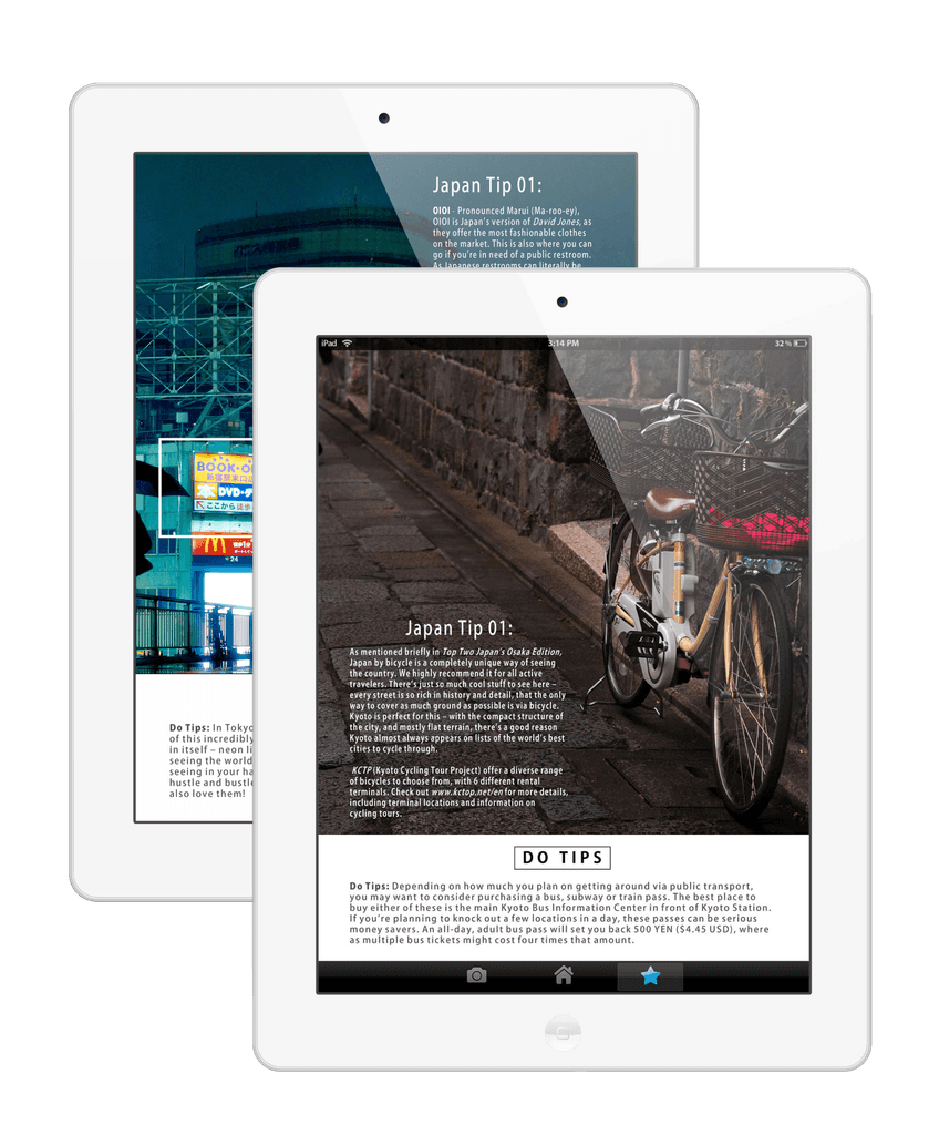
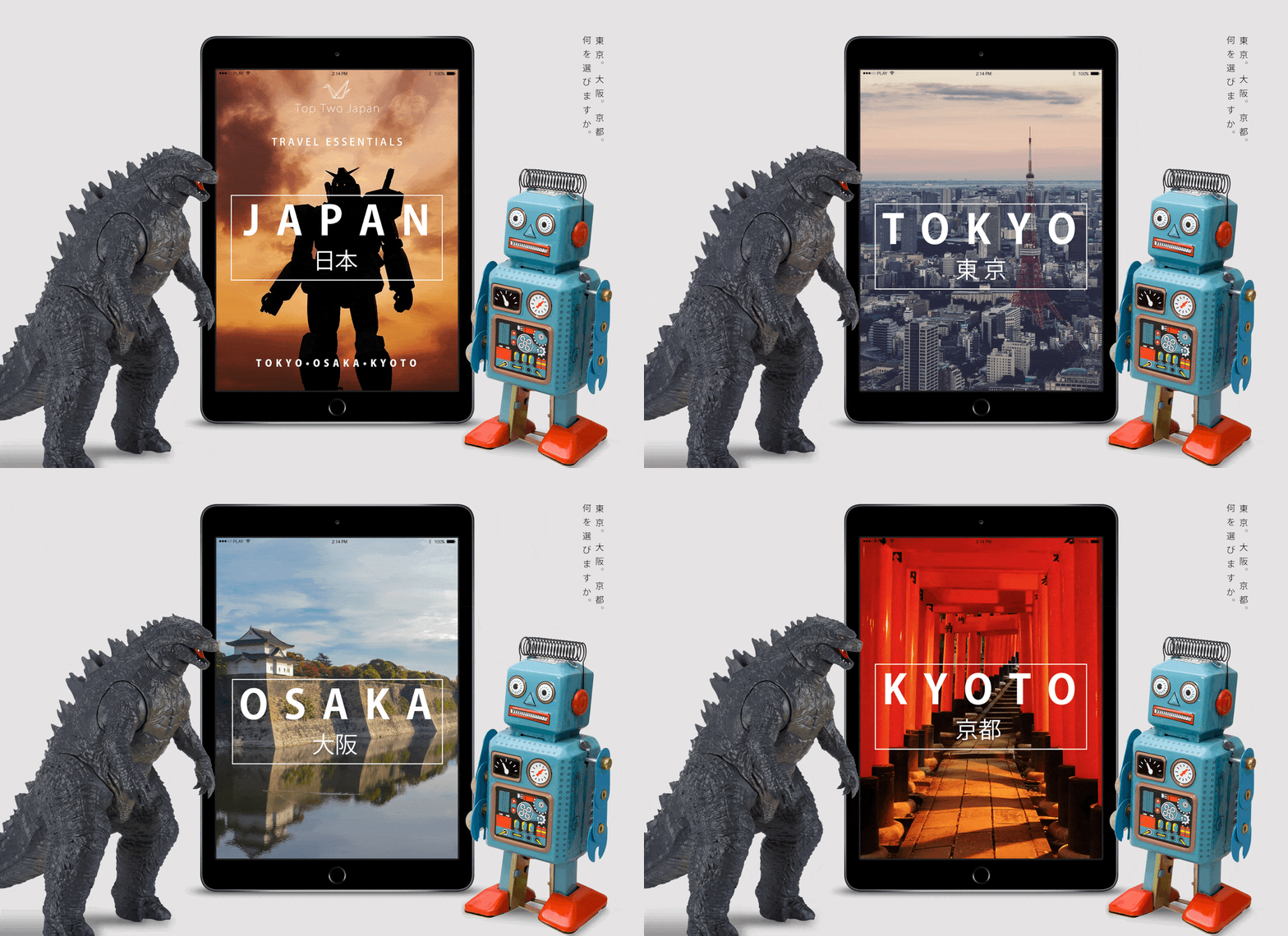
Understanding the business: Top Two Japan is a three-part e-book series that compiles insiders knowledge of Tokyo, Osaka and Kyoto into an easy-to-consume e-book format. It was written by a variety of creators and Japan-experts who passionately poured their knowledge into the series.
The primary sources of distribution would include Amazon, social media and the marketing channels of the founders company, Raw Lens Media.
Competitive analysis: My competitive analysis for Top Two Japan consisted of looking at in-direct competitors (logos and brand identities related to Japan), as well as direct competitors, such as those in the e-book space, particularly in the travel market. To do this, I looked on Dribbble, Behance, Pinterest and Instagram. Here were my key take-aways:
Logos for Japan-related content (restaurants, festivals, etc) were very creative and inspiring. Japan has a wealth of visual motifs to draw from, so there was no shortage of creativity there.
Logos for travel-related e-books fell into two major categories. The first being well-established brands (such as Lonely Planet or Monocle). These brands used simple logos due to their placement in the market. The other category was indie travel books, which were extremely creative in their branding and overall design.
Conceptualisation: Drawing from a rich assortment of Japanese design elements, I started my exploration with sketches, as always. I liked the idea of incorporating an organic element into the design, having been inspired by designs I’d seen in my competitive analysis. After presenting my concepts to the team, however, I was surprised in the results. The team preferred the concept of two cranes beside each other (a familiar motif, but conveyed with a sense of modern-minimalism). The team felt this best conveyed the overall aesthetic they were hoping to achieve with the books: clean and minimal, like modern-day Japan itself. After our meeting, I brought my sketch into Adobe Illustrator, where I traced over the outlines.
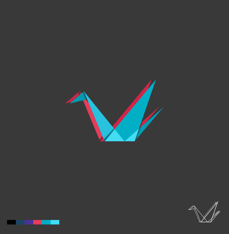
Outcome: In addition to the main logo being a clean-line design, the team also wanted to see an illustrated variation with gradients, which would be used sparingly as a secondary logo device. Before starting, I consulted with the team on the specific use of this secondary logo as I felt the background colour would inform the logo colour choices.
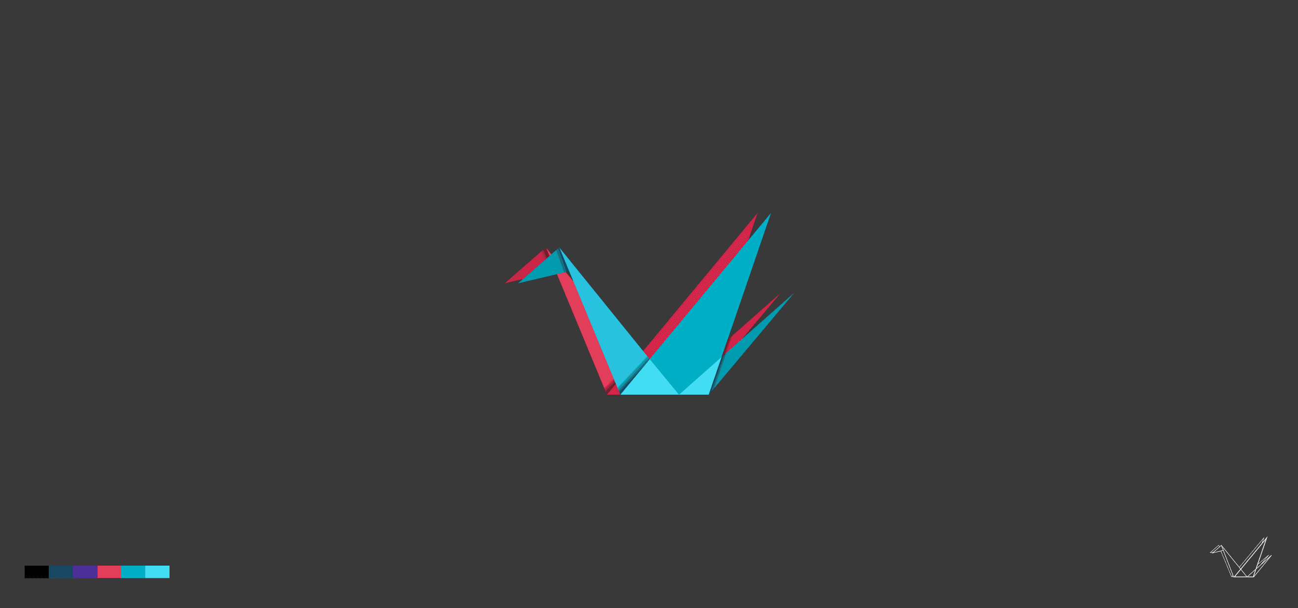
Once establishing that this logo would be used exclusively on dark, charcoal backgrounds, I created this variation with bright, contrasting colours.
LOGOFOLIO
Logofolio: Volume 4.
Logofolio: Volume 4.


Understanding the business: De.Gusto is an interior design company with a physical office based in Taipei.
Founded by three Taiwanese entrepreneurs, this startup combines the founders mixed backgrounds into the creation of an interior design company, offering niche but modern styles.
Competitive analysis: Logos and brand identities for interior design companies tended to be a lot more visually pleasing and creative than in most other industries. When doing a competitive analysis, I found there was a huge variety of design styles, especially in the Taiwanese market. Commonalities tended to favour minimalist, elegant or chic designs.


In addition to the logo mark, I created a bespoke piece of typography to be used as a logotype.


A secondary logo was also created to market De. Gusto’s rustic products.
Conceptualisation: I started with rough sketches when conceptualising the logo for De. Gusto, exploring stylish and abstract concepts based on a discussion with the team. After exploring dozens of ideas, the team was most happy with the concept of a monogram comprised of the ‘D’ and ‘e’ in De. Gusto. As the team weren’t particularly interested in the logo being overly literal or abstract, they felt a timeless monogram would work as a middle-ground.
Outcome: After the chosen concept was selected, the team also requested one of the discarded designs be used for a secondary product within the De.Gusto brand. This secondary logo had an organic look to it, which the team felt would market their rustic products well. To create this secondary logo I hand-painted stripes of black onto a sheet of paper, which I converted to a vector and used as a brush to create the outline of a circle in the design. The monogram and custom logotype was then created using Illustrator. After receiving final approval I exported the designs for hand over, along with a basic styleguide.
Branding Search Know More.
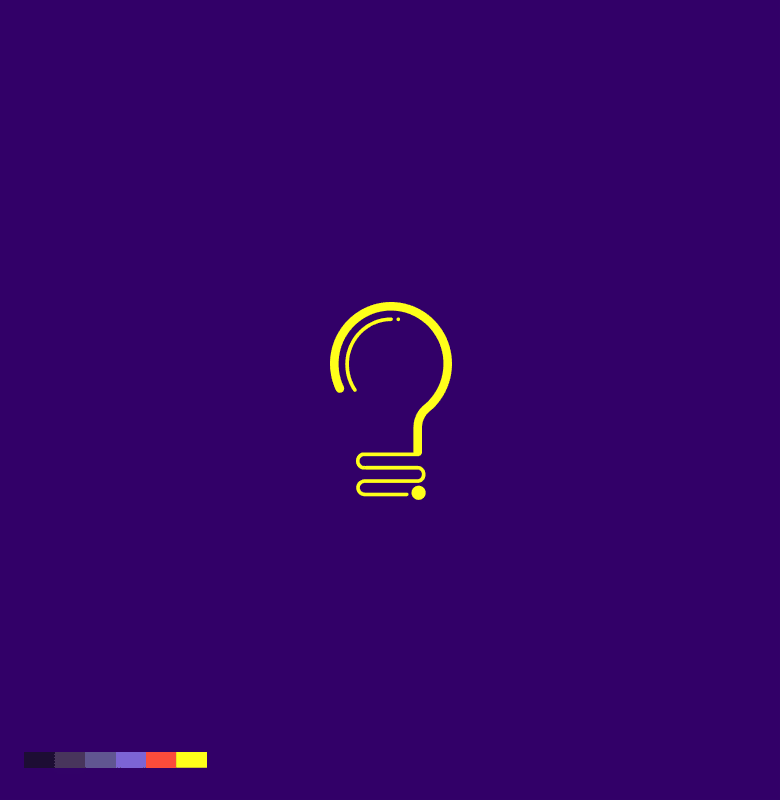

In addition to the primary logo, I also created this animated logo in After Effects to be used for video content.
Understanding the business: Search Know More is a platform for a variety of e-learning requirements where users can find specialised educational material sourced from educators worldwide.
This start-up was founded by five entrepreneurs and media veterans from Sydney.
Competitive analysis: When doing a competitive analysis of logos and brand identities in the e-learning space, I found that most designs fell into one of two major categories.
Outdated: Several e-learning companies were branded with the same symbols, such as graduation caps, owls and trees of knowledge. We all agreed that this made the brand feel outdated and ineffective as learners want to feel their education is as up-to-date as possible.
Modern minimalism: Well-established brands in the tech space have been opting for extreme minimalism with their logo designs (i.e. Coursera, Skillshare, Udemy) for a while now. Search Know More definitely wanted to stand out from these giants but were inspired by the minimalist aesthetic these brands conveyed.


The initial conceptual sketches for branding Search Know More.
Conceptualisation: After exploring dozens of concepts and sketches, I presented a curated selection of results to the team. Trying to avoid cliche’s, while still conveying meaning proved difficult in this space. With many concepts to choose from, the team were immediately drawn to the concept of a question-mark and light-bulb combined. This concept fused the two into one design, conveying the idea of asking a question and receiving an answer. The team thought this was clever and when executed in a minimalist aesthetic, would convey their message well.
Outcome: After tracing over the initial sketch in Illustrator I presented the final logo to the team for final approval. With no changes needed, I took to exporting the final design as well as creating the animated logo, which the team requested as an additional deliverable. Using After Effects I animated the bulb of the logo to flicker on and off, exported at different speeds, with and without text. With these assets handed over (along with a basic style guide), the team then moved to the next phase of development: building the platform.
Branding Top Two Japan.

Understanding the business: Top Two Japan is a three-part e-book series that compiles insiders knowledge of Tokyo, Osaka and Kyoto into an easy-to-consume e-book format. It was written by a variety of creators and Japan-experts who passionately poured their knowledge into the series.
The primary sources of distribution would include Amazon, social media and the marketing channels of the founders company, Raw Lens Media.
Competitive analysis: My competitive analysis for Top Two Japan consisted of looking at in-direct competitors (logos and brand identities related to Japan), as well as direct competitors, such as those in the e-book space, particularly in the travel market. To do this, I looked on Dribbble, Behance, Pinterest and Instagram. Here were my key take-aways:
Logos for Japan-related content (restaurants, festivals, etc) were very creative and inspiring. Japan has a wealth of visual motifs to draw from, so there was no shortage of creativity there.
Logos for travel-related e-books fell into two major categories. The first being well-established brands (such as Lonely Planet or Monocle). These brands used simple logos due to their placement in the market. The other category was indie travel books, which were extremely creative in their branding and overall design.
Conceptualisation: Drawing from a rich assortment of Japanese design elements, I started my exploration with sketches, as always. I liked the idea of incorporating an organic element into the design, having been inspired by designs I’d seen in my competitive analysis. After presenting my concepts to the team, however, I was surprised in the results. The team preferred the concept of two cranes beside each other (a familiar motif, but conveyed with a sense of modern-minimalism). The team felt this best conveyed the overall aesthetic they were hoping to achieve with the books: clean and minimal, like modern-day Japan itself.brought into Adobe Illustrator, where I traced over the outlines.
Outcome: In addition to the main logo being a clean-line design, the team also wanted to see an illustrated variation with gradients, which would be used sparingly as a secondary logo device. Before starting, I consulted with the team on the specific use of this secondary logo as I felt the background colour would inform the logo colour choices.
Once establishing that this logo would be used exclusively on dark, charcoal backgrounds, I created this variation with bright, contrasting colours.


Branding Aged Care Today.


Conceptualisation: When conceptualising the logo design for Aged Care Today, I started with rough sketches, which then became slightly more polished sketches, which were then presented to the team. I also explored concepts via a wordmap.
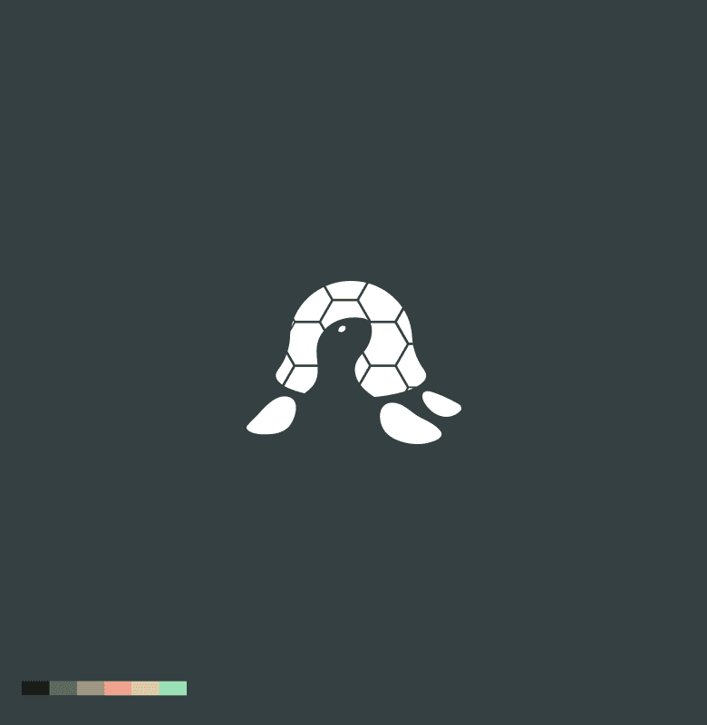
The concept that was unanimously popular was the turtle, as it symbolised a creature living in its home (its shell) for its entire life. The team was pleased with the creativity of this concept and felt it helped differentiate Aged Care Today with its competitors in the space.
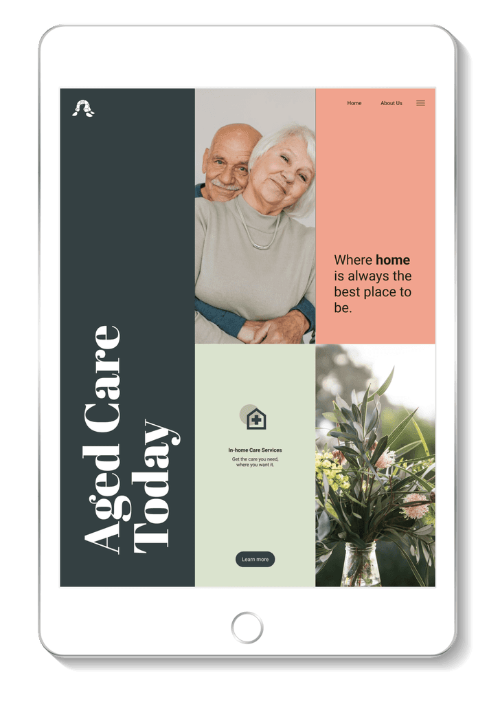
Outcome: The execution of this design was straight forward. I took to Illustrator to recreate the initial sketch as a vector, emphasising bold shapes and a strong silhouette to ensure the design worked at a reduced scale.
Once complete, I created a small branding kit, complete with a basic style guide to assist the team in developing the brand further.
Understanding the business: Aged Care Today was established as a sub-initiative of Comlink, an aged care service in Queensland, Australia. Working with the local government, Aged Care Today aimed to help elderly people stay in their home longer by providing in-home services at a fraction of the cost.
Competitive analysis: When doing research for logos and brand identities for Aged Care Today, I looked at the aged care industry, social services industry and health industry as a whole. Taking note of commonalities, I noticed an over-reliance on outdated trends and cliche’s. These included hearts, cross’s and human figures. For inspiration, I compiled a collection of unique examples, as well as examples where the designer took familiar concepts but executed them in a unique way. After presenting my notes with the team, it was decided that we wanted to steer clear of all of these familiar tropes and create something specific to the goal of Aged Care Today; assisting the elderly in staying in their homes longer.

Conceptualisation: After exploring dozens of concepts and sketches, I presented a curated selection of results to the team. Trying to avoid cliche’s, while still conveying meaning proved difficult in this space. With many concepts to choose from, the team were immediately drawn to the concept of a question-mark and light-bulb combined. This concept fused the two into one design, conveying the idea of asking a question and receiving an answer. The team thought this was clever and when executed in a minimalist aesthetic, would convey their message well.
Outcome: After tracing over the initial sketch in Illustrator I presented the final logo to the team for final approval. With no changes needed, I took to exporting the final design as well as creating the animated logo, which the team requested as an additional deliverable. Using After Effects I animated the bulb of the logo to flicker on and off, exported at different speeds, with and without text. With these assets handed over (along with a basic style guide), the team then moved to the next phase of development: building the platform.
Understanding the business: Top Two Japan is a three-part e-book series that compiles insiders knowledge of Tokyo, Osaka and Kyoto into an easy-to-consume e-book format. It was written by a variety of creators and Japan-experts who passionately poured their knowledge into the series.
The primary sources of distribution would include Amazon, social media and the marketing channels of the founders company, Raw Lens Media.
Competitive analysis: My competitive analysis for Top Two Japan consisted of looking at in-direct competitors (logos and brand identities related to Japan), as well as direct competitors, such as those in the e-book space, particularly in the travel market. To do this, I looked on Dribbble, Behance, Pinterest and Instagram. Here were my key take-aways:
Logos for Japan-related content (restaurants, festivals, etc) were very creative and inspiring. Japan has a wealth of visual motifs to draw from, so there was no shortage of creativity there.
Logos for travel-related e-books fell into two major categories. The first being well-established brands (such as Lonely Planet or Monocle).
These brands used simple logos due to their placement in the market. The other category was indie travel books, which were extremely creative in their branding and overall design.
Conceptualisation: Drawing from a rich assortment of Japanese design elements, I started my exploration with sketches, as always. I liked the idea of incorporating an organic element into the design, having been inspired by designs I’d seen in my competitive analysis. After presenting my concepts to the team, however, I was surprised in the results. The team preferred the concept of two cranes beside each other (a familiar motif, but conveyed with a sense of modern-minimalism). The team felt this best conveyed the overall aesthetic they were hoping to achieve with the books: clean and minimal, like modern-day Japan itself.brought into Adobe Illustrator, where I traced over the outlines.
Outcome: In addition to the main logo being a clean-line design, the team also wanted to see an illustrated variation with gradients, which would be used sparingly as a secondary logo device. Before starting, I consulted with the team on the specific use of this secondary logo as I felt the background colour would inform the logo colour choices.
Once establishing that this logo would be used exclusively on dark, charcoal backgrounds, I created this variation with bright, contrasting colours.
CASE STUDY
Branding Aged Care Today.
Branding Aged Care Today.
Understanding the business: Aged Care Today was established as a sub-initiative of Comlink, an aged care service in Queensland, Australia. Working with the local government, Aged Care Today aimed to help elderly people stay in their home longer by providing in-home services at a fraction of the cost.
Competitive analysis: When doing research for logos and brand identities for Aged Care Today, I looked at the aged care industry, social services industry and health industry as a whole. Taking note of commonalities, I noticed an over-reliance on outdated trends and cliche’s. These included hearts, cross’s and human figures. For inspiration, I compiled a collection of unique examples, as well as examples where the designer took familiar concepts but executed them in a unique way.
After presenting my notes with the team, it was decided that we wanted to steer clear of all of these familiar tropes and create something specific to the goal of Aged Care Today; assisting the elderly in staying in their homes longer.

DaRawNature's Background: When conceptualising the logo design for Aged Care Today, I started with rough sketches, which then became slightly more polished sketches, which were then presented to the team. I also explored concepts via a wordmap.
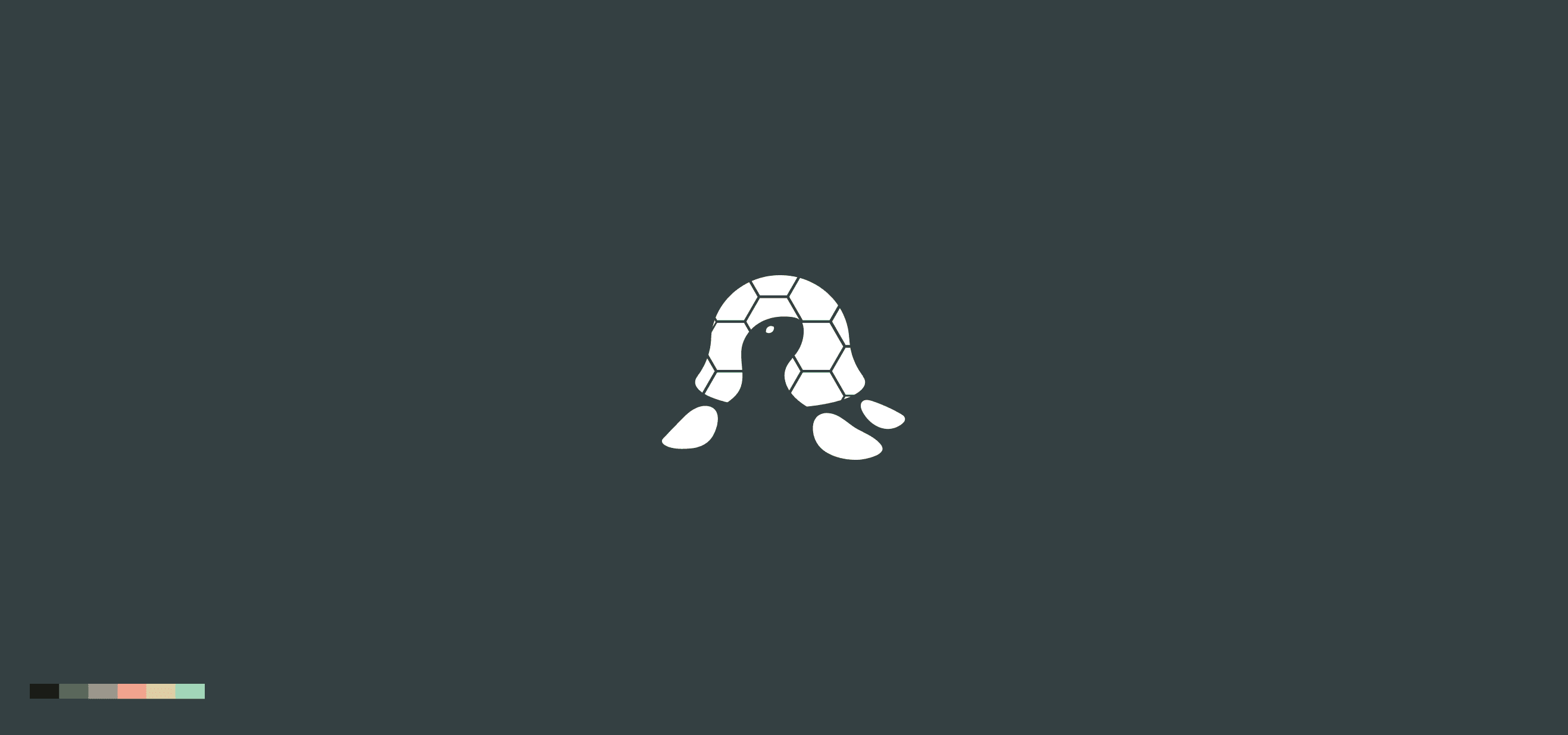
The concept that was unanimously popular was the turtle, as it symbolised a creature living in its home (its shell) for its entire life. The team was pleased with the creativity of this concept and felt it helped differentiate Aged Care Today with its competitors in the space.
Conceptualisation: When conceptualising the logo design for Aged Care Today, I started with rough sketches, which then became slightly more polished sketches, which were then presented to the team. I also explored concepts via a wordmap.
The concept that was unanimously popular was the turtle, as it symbolised a creature living in its home (its shell) for its entire life. The team was pleased with the creativity of this concept and felt it helped differentiate Aged Care Today with its competitors in the space.
Understanding the business: Aged Care Today was established as a sub-initiative of Comlink, an aged care service in Queensland, Australia. Working with the local government, Aged Care Today aimed to help elderly people stay in their home longer by providing in-home services at a fraction of the cost.
Competitive analysis: When doing research for logos and brand identities for Aged Care Today, I looked at the aged care industry, social services industry and health industry as a whole. Taking note of commonalities, I noticed an over-reliance on outdated trends and cliche’s. These included hearts, cross’s and human figures. For inspiration, I compiled a collection of unique examples, as well as examples where the designer took familiar concepts but executed them in a unique way. After presenting my notes with the team, it was decided that we wanted to steer clear of all of these familiar tropes and create something specific to the goal of Aged Care Today; assisting the elderly in staying in their homes longer.
The Brief: The execution of this design was straight forward. I took to Illustrator to recreate the initial sketch as a vector, emphasising bold shapes and a strong silhouette to ensure the design worked at a reduced scale.
Once complete, I created a small branding kit, complete with a basic style guide to assist the team in developing the brand further.
Outcome: The execution of this design was straight forward. I took to Illustrator to recreate the initial sketch as a vector, emphasising bold shapes and a strong silhouette to ensure the design worked at a reduced scale.
Once complete, I created a small branding kit, complete with a basic style guide to assist the team in developing the brand further.


Conceptualisation: When conceptualising the logo design for Aged Care Today, I started with rough sketches, which then became slightly more polished sketches, which were then presented to the team. I also explored concepts via a wordmap.
The concept that was unanimously popular was the turtle, as it symbolised a creature living in its home (its shell) for its entire life. The team was pleased with the creativity of this concept and felt it helped differentiate Aged Care Today with its competitors in the space.
Outcome: The execution of this design was straight forward. I took to Illustrator to recreate the initial sketch as a vector, emphasising bold shapes and a strong silhouette to ensure the design worked at a reduced scale.
Once complete, I created a small branding kit, complete with a basic style guide to assist the team in developing the brand further.


Let's work
together.
This website was designed and
developed by Clay Pixels.
joshuascott888@outlook.com.au


