ILLUSTRATION
ILLUSTRATION

MOTION DESIGN
MOTION DESIGN
Bringing ideas to life with illustration and movement.
Bringing ideas to life with illustration and movement.
Bringing ideas to life with illustration and movement.
I started my career as an Illustrator and have used illustration and motion design in advertising, book design, product design and more. In this section I want to show the many ways Illustration and animation can bring complex ideas to life.
I started my career as an Illustrator and have used illustration and motion design in advertising, book design, product design and more. In this section I want to show the many ways Illustration and animation can bring complex ideas to life.
I started my career as an Illustrator and have used illustration and motion design in advertising, book design, product design and more. In this section I want to show the many ways Illustration and animation can bring complex ideas to life.
I started my career as an Illustrator and have used illustration and motion design in advertising, book design, product design and more. In this section I want to show the many ways Illustration and animation can bring complex ideas to life.
The Moondyne Joe Festival.
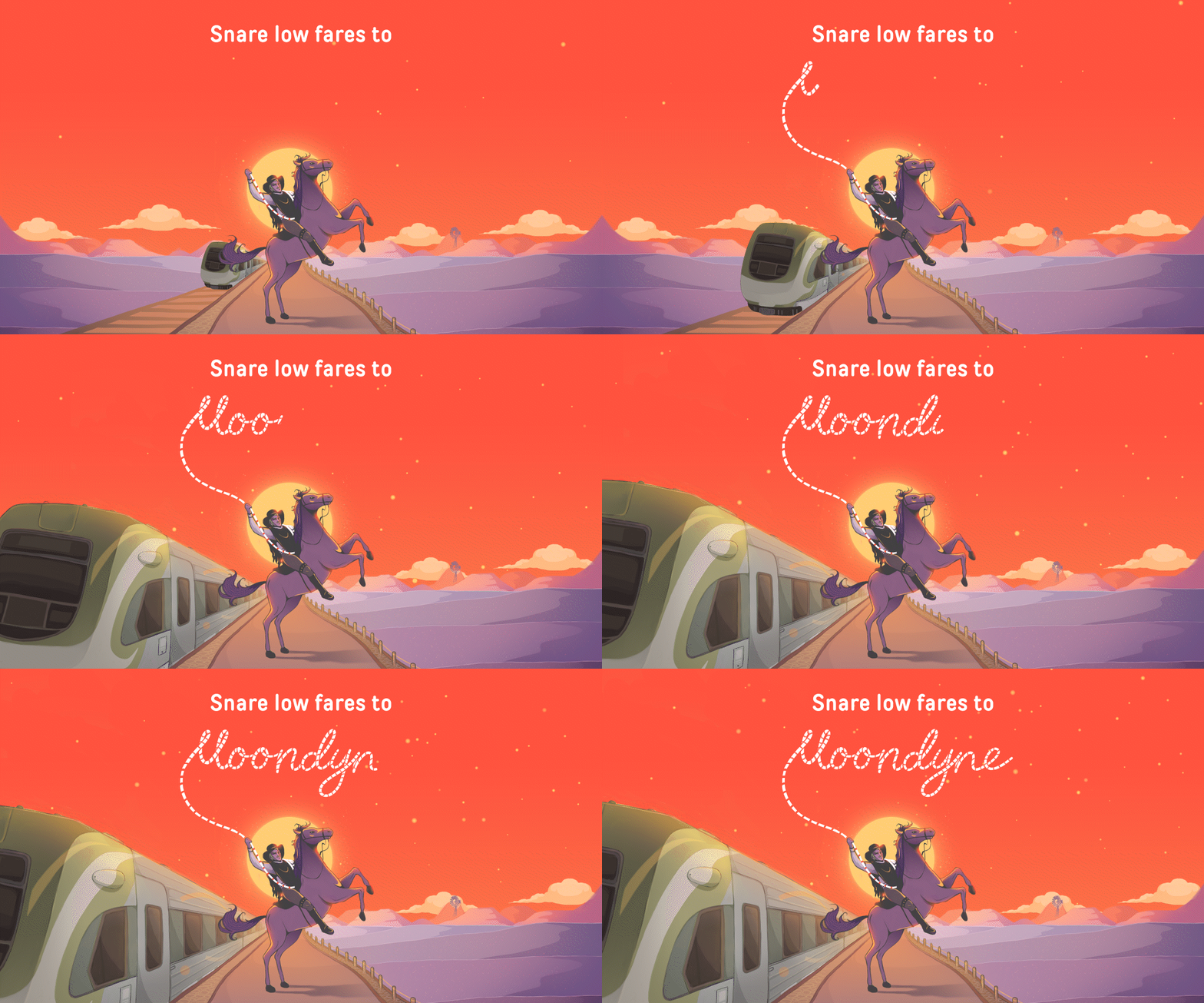

The Project: TransWA commissioned design agency Rare to create a digital and print campaign for promoting the Moondyne Festival.
As an Illustrator and Motion Designer, I worked with Rare to make this happen.
The festival celebrates the life of Moondyne Joe, also known as Joseph Bolitho Johns, a notorious bushranger who lived in Western Australia's Avon Valley from 1826-1900.
The Brief: Rare’s brief required Moondyne Joe to be the artworks focal point with the background train still prominent. They also required the illustration to be adaptable for both print and digital formats in various dimensions.
In terms of animation, Rare asked for the extension of Moondyne Joe’s rope to form the word ‘Moondyne’ as the train moves forward and surrounding elements animate in subtle ways.
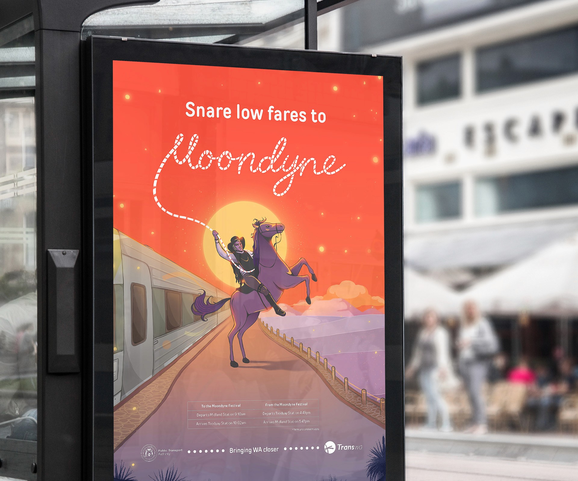

The bright colour palette was chosen to give prominence to the printed advertisements showcased on trains and throughout Perth.
Conceptualisation: Initially, I created coloured sketches for the artwork, which I presented to Rare's team and the client for approval of the direction, mood, and style. Since the deliverables required outputs in various dimensions, I tested the initial sketches with these dimensions to ensure they fit or could be adjusted accordingly.
I chose warm, bold colours to emphasise the mood of the Western Australian outback, as well as give emphasis to the design when showcased on trains, bus’s and online platforms.
The final outcome: Following a design critique and discussion, I used Photoshop to create the final artwork. By separating items onto different layers I was also able animate the artwork (using both After Effects and Photoshop) effectively and iterate the animation based on feedback.
The feedback given on the final artwork from both the client and agency were overwhelmingly positive with praise given to the mood, colour palette and effectiveness at achieving the goals of the campaign.
Fremantle's jungle-art cafe.
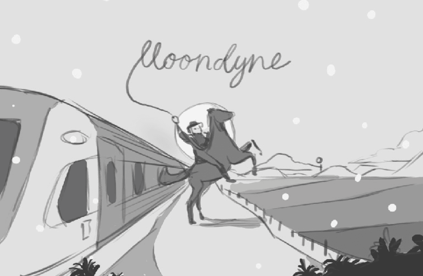

A rough conceptual sketch to block in Moondyne's composition.
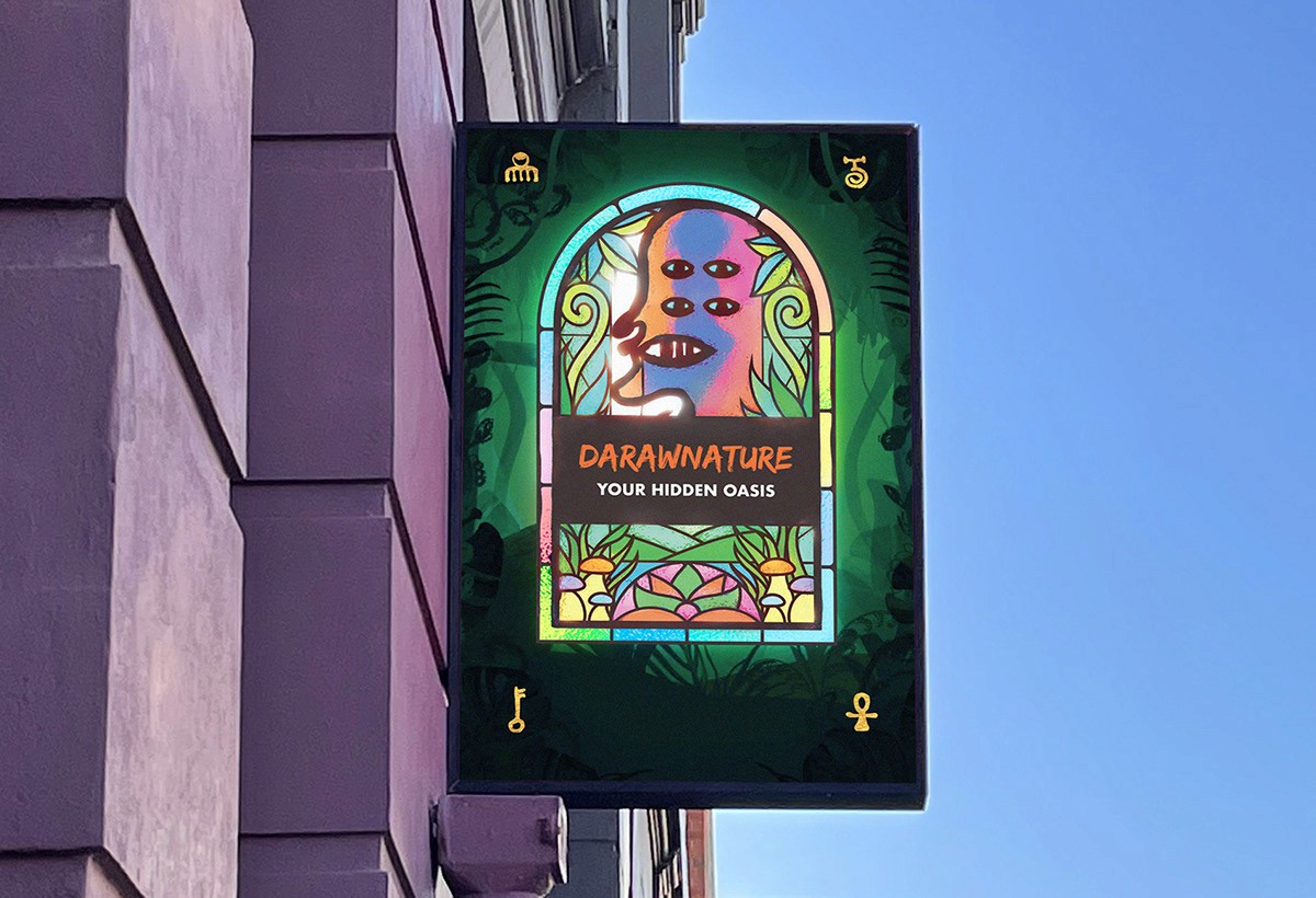

DaRawNature's Background: DaRawNature is a cafe and creative hub in Fremantle, Australia. It's well-known for providing an inclusive and welcoming atmosphere to all who step inside. Tucked away in an alley and surrounded by greenery, the cafe doubles as an art gallery, showcasing owner Dave Folley’s paintings as well as the work of local artists.
As part of a brand refreshment, I designed a suite of illustrated signs and marketing assets to help give the space a fresh look.
The Brief: Dave gave me a lot of creative freedom for this project, but to ensure we were on the same page, I suggested we establish some specific details. The café, despite being one of Fremantle's most attractive locations, was somewhat obscure as it was tucked away down an alleyway. As a result, we both understood that the signage was crucial to the space's visibility. Furthermore, it was important the signage reflected DaRawNature’s unique character and charm. From the initial signage, the other deliverables such as the animation loop and social media posts would be created.
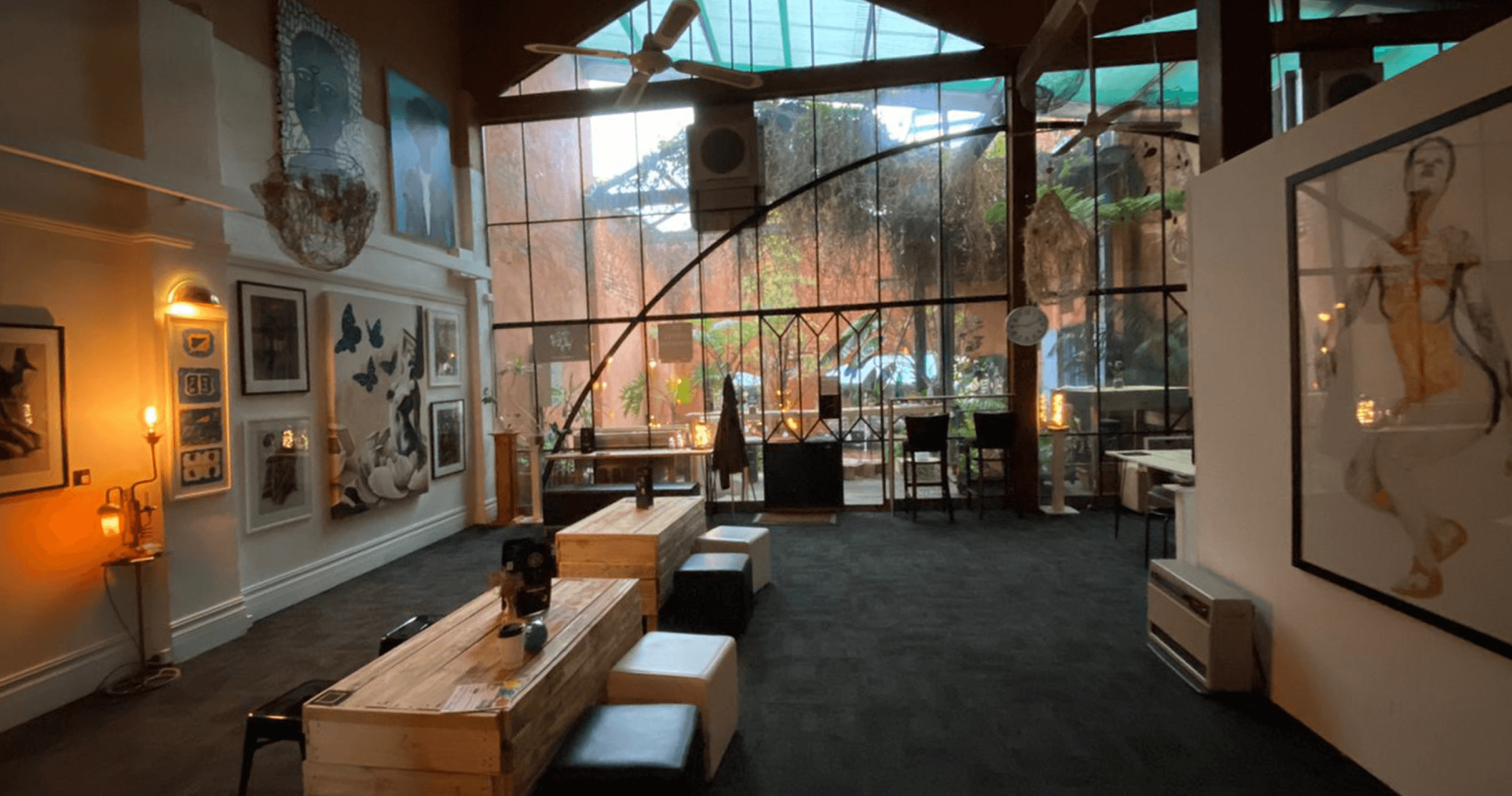

DaRawNature is a warm and inviting space that mixes artistic and cultural influences into something unique.
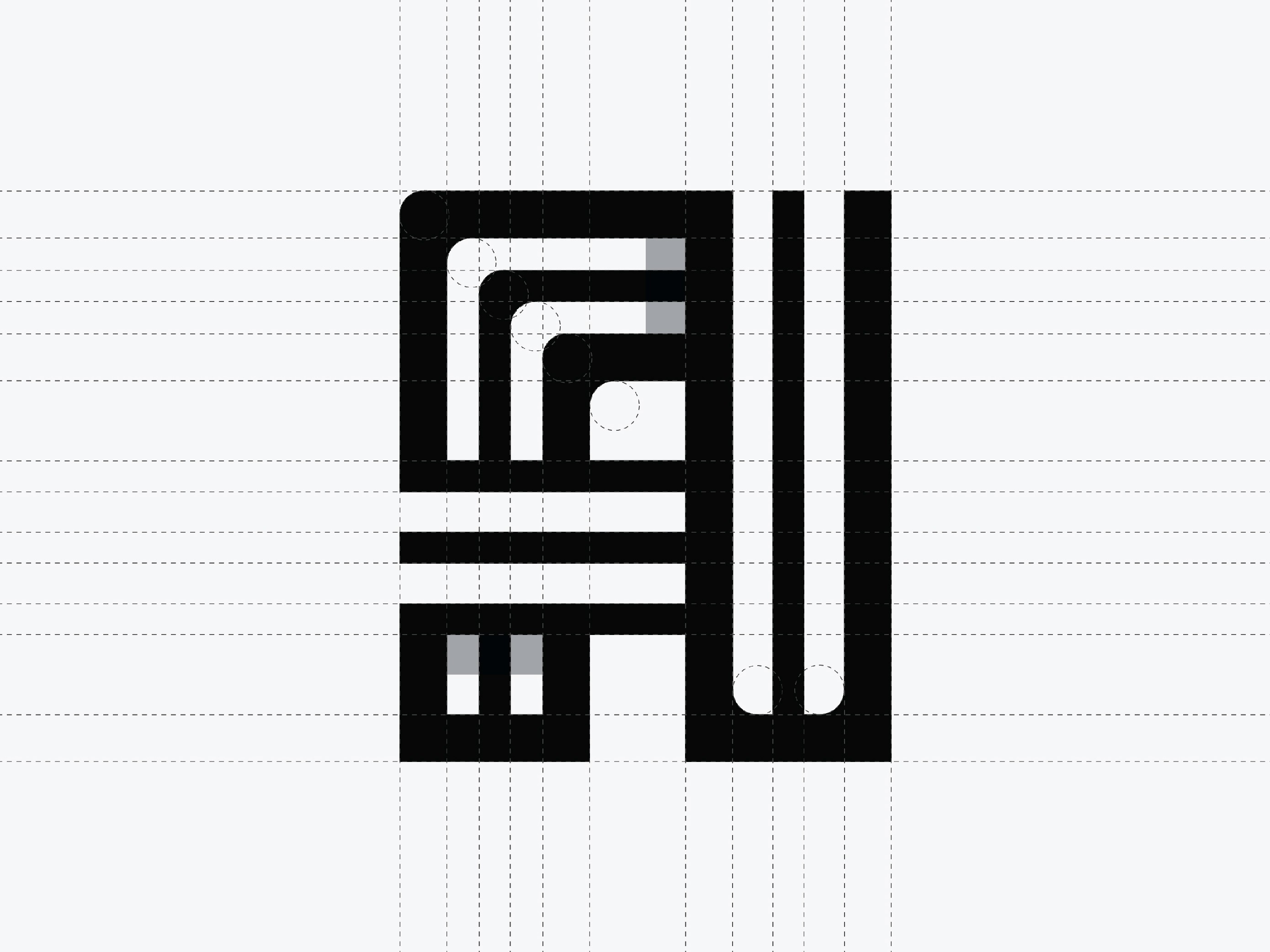
Conceptualisation: Given DaRawNature’s location on a street with muted, colonial-style buildings, I knew that bright colours were the best way to make the signage stand out. In order to retain DaRawNature’s unique character, I wanted to incorporate Dave’s artwork into the design. Choosing from a wide selection, I felt one particular piece stood out, as it created a beautiful silhouette with minimal strokes, perfect for a logo or branding asset. After getting Dave’s consent to alter the design slightly, I created DaRawNature’s new logo, which was incorporated into the signage illustration.
After brain-storming a few ideas, I felt it would work well to incorporate the colourful stained-glass mirrors within DaRawNature into the illustration somewhere. To create the window, I started with a sketch which I then brought into Adobe Illustrator, where I traced over the outlines.
From there I tried recreating the design in Photoshop and asked Dave as well as Altea (DaRawNature’s manager and fellow artist) to hand-paint different plants and pieces of foliage that I repurposed into the work.
Using After Effects, I also designed an animation loop for the final set of deliverables.


This animation loop was created for DaRawNature's social media and online marketing presence.
The final outcome: After installing the new signage, Dave expressed immense satisfaction with the final result. He told me that the rebrand helped yield a higher number of patrons and that numerous customers praised how well the signage captured the atmosphere of the space in a creative and modern way.
Creating artwork for AmpleLife.
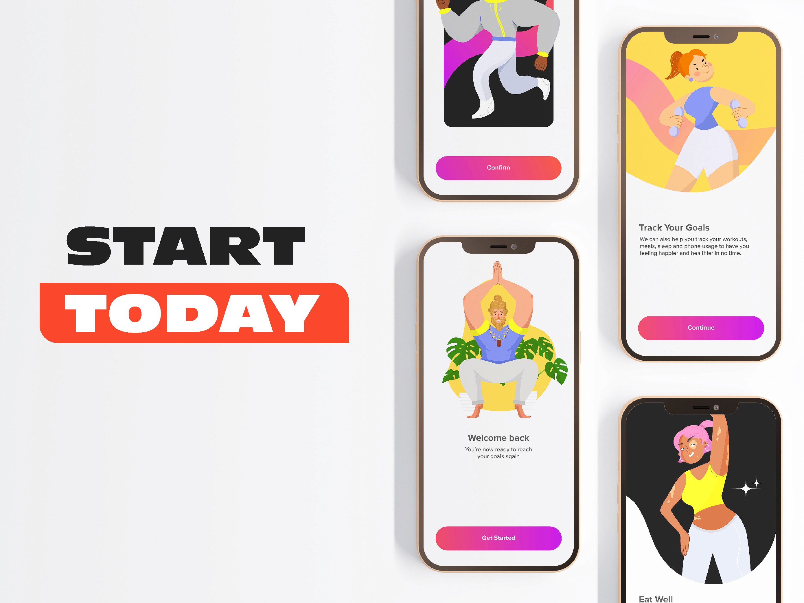
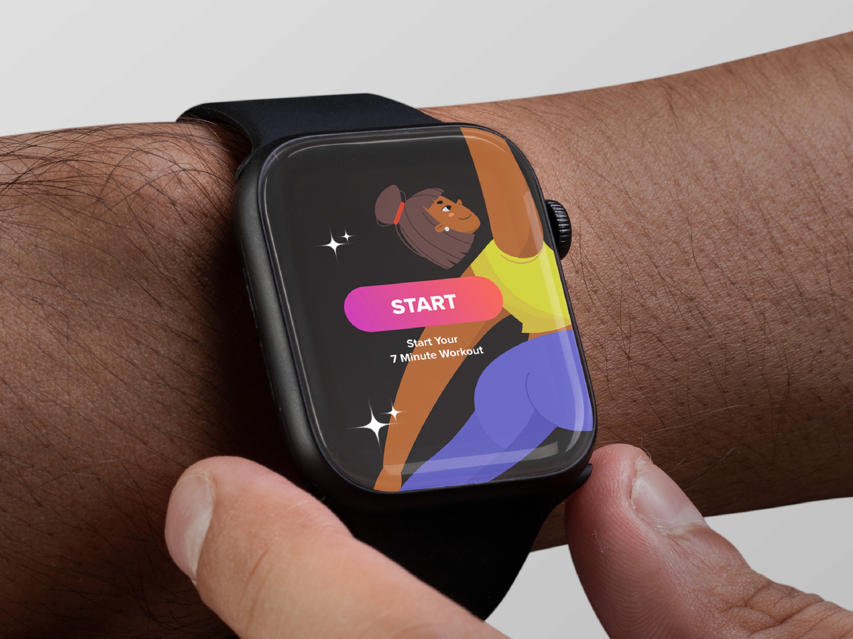
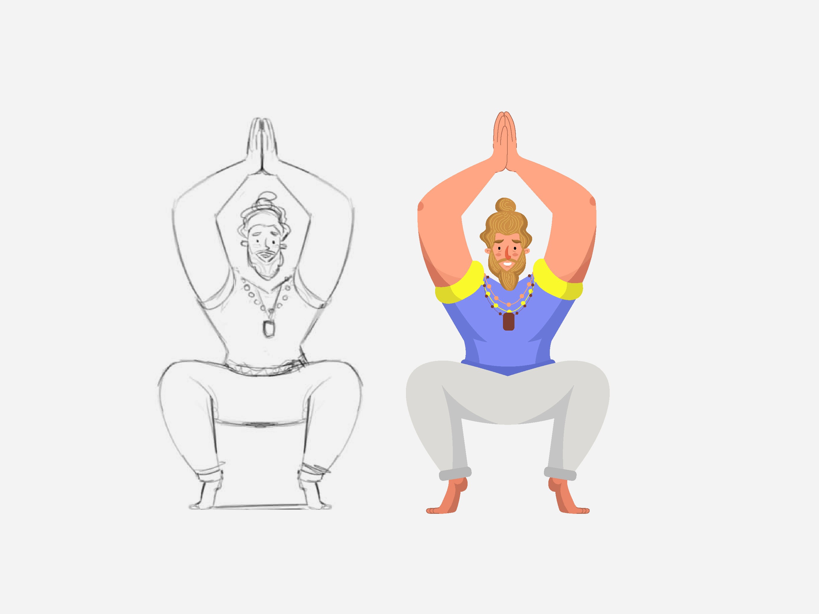
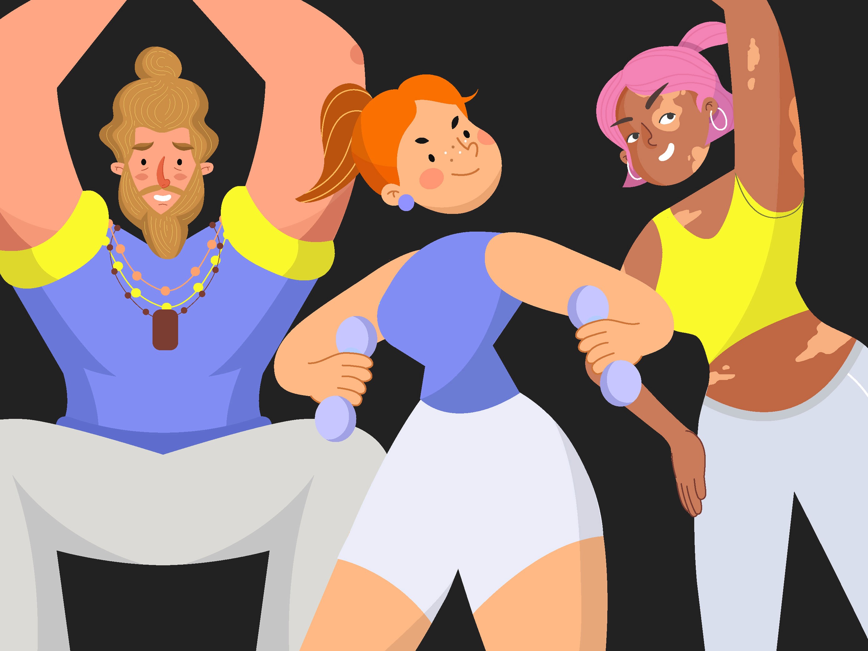
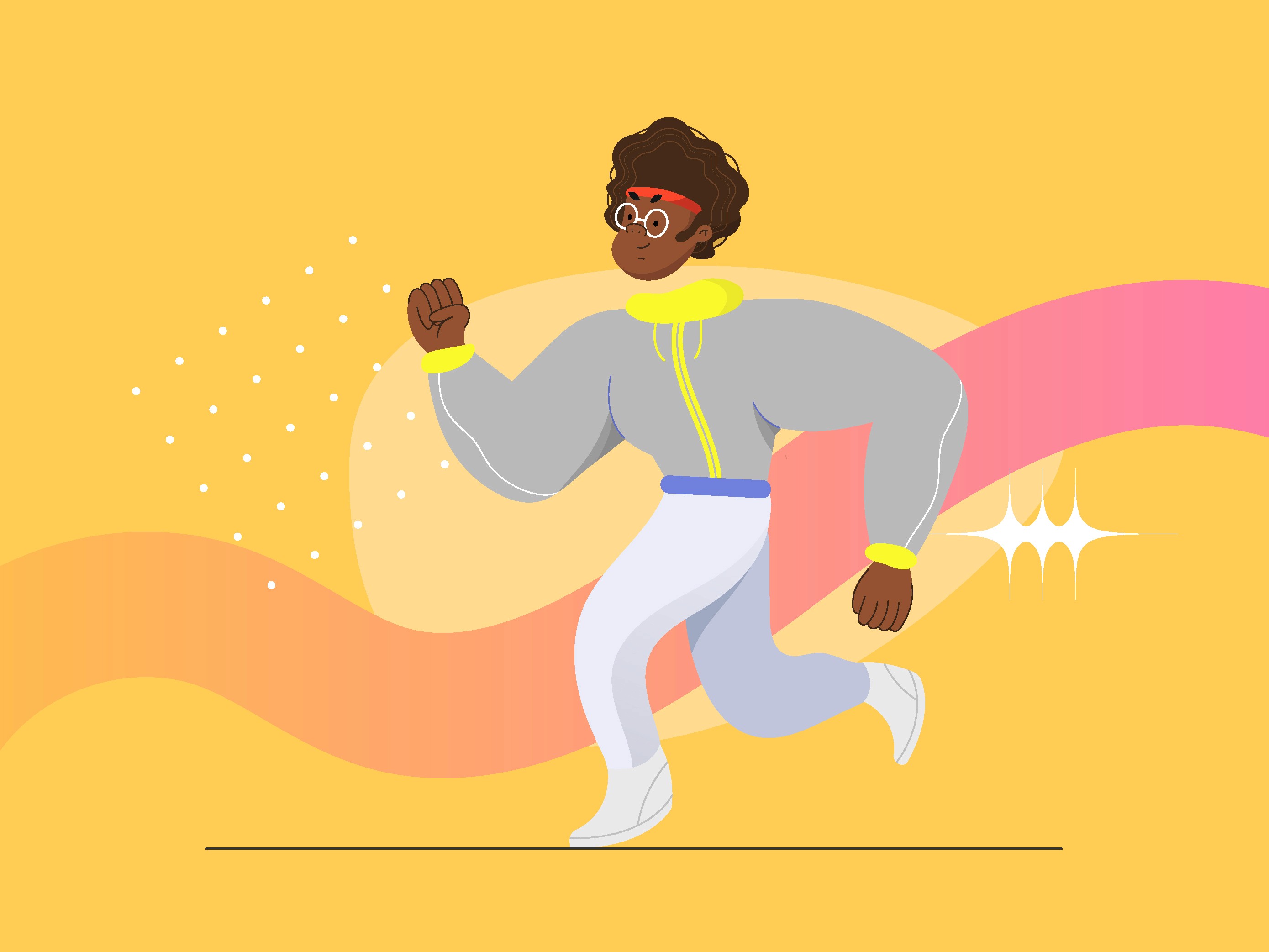
What is AmpleLife? I created AmpleLife as a personal project to challenge myself in a new direction. My objective was to broaden my visual skillset and create a modern aesthetic using vector illustrations. The brand I created was called AmpleLife, an inclusive app with an approachable and friendly aesthetic.
I felt illustration would work well as it would help strip away the feeling of intimidation one might feel from standard fitness brands.
Conceptualisation: I started this project using Dribbble to research projects that incorporated illustrations into their design. I was pleased and inspired to see many illustrators pushing the limits in terms of style and creativity.
I also thought about how I could further push inclusivity into my work and create a suite of illustrated characters that more accurately reflected the diversity of the real world.
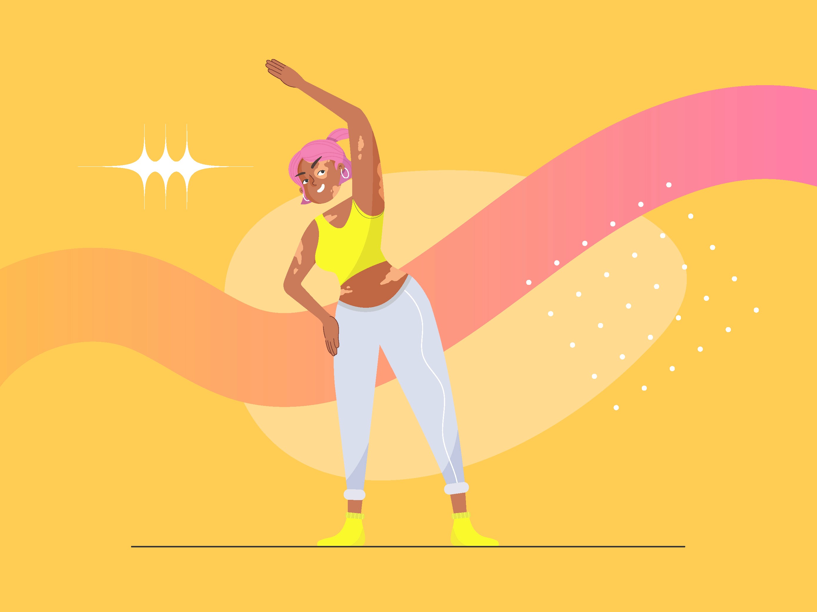



The initial sketch shared with the client.

This animation loop was created for DaRawNature's digital marketing.
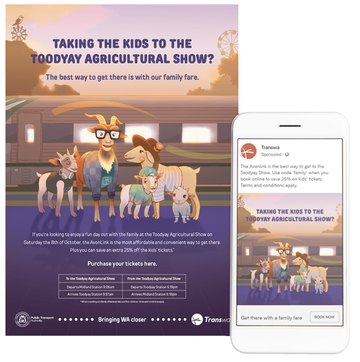
The Toodyay Festival: TransWA commissioned design agency Rare to design a digital and print campaign to promote the Toodyay Festival. I worked with Rare as an Illustrator and Motion Designer to make this happen.
The Toodyay festival is an agricultural event in Western Australia for families to enjoy rides, attractions, live music and see farm animals. The purpose of the campaign is to encourage passengers to book a ticket to the event through TransWA.
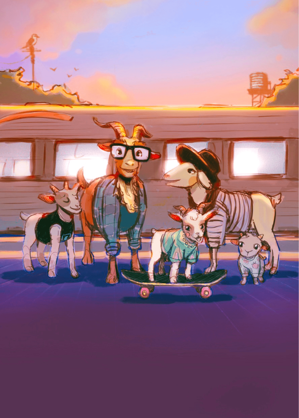
The Brief: Rare’s brief conceptualised a family of goats and their kids, heading to the Toodyay Show. As there was creative freedom regarding how the goats were depicted, I suggested anthropomorphising them into an archetypal Western Australian family, an idea Rare liked.
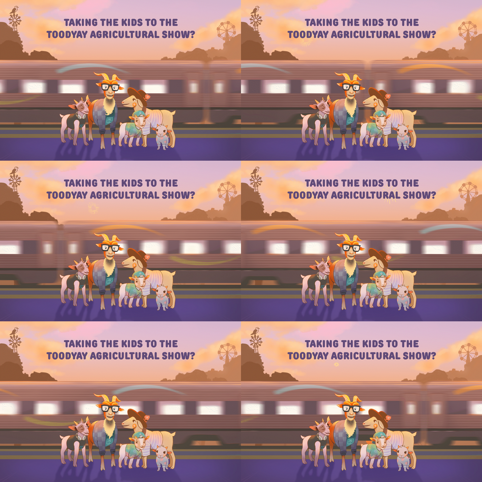
The train needed to animate in the background and be recognisable as one of TransWA’s (indicated by the colour and style). Smaller elements (such as the goats hair) also needed to animate as the train whizzed by.
MOONDYNE FESTIVAL
Designing for the Moondyne Joe Festival.
Designing for the Moondyne Joe Festival.



Conceptualisation: I created coloured sketches which were shared with Rare’s team and the client for feedback. The colour palette I chose was selected to give a sense of warmth to the piece, inspired by photography I’d seen of the festival during golden hour. The client was very pleased with the initial sketches, only requiring me to get rid of the daughters skateboard as they were worried it sent the wrong message with the family being on a train track (a very reasonable request).
The final outcome: Following our design critique, I used Photoshop to create the final artwork, making sure to separate individual items onto their own layer. By doing this, I was able animate the artwork (using both After Effects and Photoshop) and manipulate content according to the various dimensions needed for deliverables. Feedback on the final artwork from both the client and agency was overwhelmingly positive, with praise given to the colour palette, mood and goat family.
Illustration for printed books.
Replica Studios are an ethical AI studio that create customisable AI voice actors to be used in games, films and animation. They’ve already worked with some of the major players in the game space and are rapidly developing into an AI juggernaut. I worked with Replica to create several explainer videos and product teasers for various digital marketing campaigns.
Above is an example of a product teaser video I created for Replica. This teaser video introduces Vox-1, the next generation of Replica software that gives users a host of new features and updates. To create this video I worked closely with Replica’s internal team to convey these new features in a way that was punchy, energetic and visual.
Motion design in the AI space.


The Project: TransWA commissioned design agency Rare to create a digital and print campaign for promoting the Moondyne Festival.
As an Illustrator and Motion Designer, I worked with Rare to make this happen.
The festival celebrates the life of Moondyne Joe, also known as Joseph Bolitho Johns, a notorious bushranger who lived in Western Australia's Avon Valley from 1826-1900.


The Brief: Rare’s brief required Moondyne Joe to be the artworks focal point with the background train still prominent. They also required the illustration to be adaptable for both print and digital formats in various dimensions.
In terms of animation, Rare asked for the extension of Moondyne Joe’s rope to form the word ‘Moondyne’ as the train moves forward and surrounding elements animate in subtle ways.
This assortment features artwork designed for children’s books, book covers and personal projects. I wanted to curate a collection of illustrations that further exemplifies my range as an illustrator.
After my first illustrated children’s book, Stepping Stones, was published, I gained a bit of traction for my ability to illustrate enchanting scenes that exuded a sense of warmth and playfulness. Many of the artwork featured here reflect this period.
In general, I really love working on pieces that feature a message or are conceived in a thought-provoking way.
An example featured in this assortment is the commissioned piece for LGBT Pride Month, depicting modern Australia through its native animals, forming a rainbow.
Book covers: These book covers were created for Oxford University Press, with a distinct concept and message developed for each. Oxford tends to prefer highly conceptual and visually impactful illustrations to appeal to their Higher Education and Secondary audience.
This process requires designers to present several ideas to a team of publishers, authors and marketers, where a final cover is then selected.
The cover for Introduction To The Teaching Profession was nominated for an award at the Australian Book Design Awards. This brief specified a fun and approachable cover to help first-year students into a some-what challenging academic text. After pitching the initial concept of illustrating the ‘anatomy of a teacher’ to OUP’s publishers, I researched various observations made by teachers. These insights were used to populate the surrounding text, which then informed the artwork.


Conceptualisation: Initially, I created coloured sketches for the artwork, which I presented to Rare's team and the client for approval of the direction, mood, and style. Since the deliverables required outputs in various dimensions, I tested the initial sketches with these dimensions to ensure they fit or could be adjusted accordingly.
I chose warm, bold colours to emphasise the mood of the Western Australian outback, as well as give emphasis to the design when showcased on trains, bus’s and online platforms.
The final outcome: Following a design critique and discussion, I used Photoshop to create the final artwork. By separating items onto different layers I was also able animate the artwork (using both After Effects and Photoshop) effectively and iterate the animation based on feedback.
The feedback given on the final artwork from both the client and agency were overwhelmingly positive with praise given to the mood, colour palette and effectiveness at achieving the goals of the campaign.
DARAWNATURE
Rebranding Fremantle's jungle-art cafe.
Rebranding Fremantle's jungle-art cafe.
DARAWNATURE
Designing for the Toodyay Festival.


This animation loop was created for DaRawNature's social media and online marketing presence.
DaRawNature's Background: DaRawNature is a cafe and creative hub in Fremantle, Australia. It's well-known for providing an inclusive and welcoming atmosphere to all who step inside. Tucked away in an alley and surrounded by greenery, the cafe doubles as an art gallery, showcasing owner Dave Folley’s paintings as well as the work of local artists.
As part of a brand refreshment, I designed a suite of illustrated signs and marketing assets to help give the space a fresh look.
The Brief: Dave gave me a lot of creative freedom for this project, but to ensure we were on the same page, I suggested we establish some specific details. The café, despite being one of Fremantle's most attractive locations, was somewhat obscure as it was tucked away down an alleyway. As a result, we both understood that the signage was crucial to the space's visibility. Furthermore, it was important the signage reflected DaRawNature’s unique character and charm. From the initial signage, the other deliverables such as the animation loop and social media posts would be created.


DaRawNature is a warm and inviting space that mixes artistic and cultural influences into something unique.
Conceptualisation: Given DaRawNature’s location on a street with muted, colonial-style buildings, I knew that bright colours were the best way to make the signage stand out. In order to retain DaRawNature’s unique character, I wanted to incorporate Dave’s artwork into the design. Choosing from a wide selection, I felt one particular piece stood out, as it created a beautiful silhouette with minimal strokes, perfect for a logo or branding asset. After getting Dave’s consent to alter the design slightly, I created DaRawNature’s new logo, which was incorporated into the signage illustration.
After brain-storming a few ideas, I felt it would work well to incorporate the colourful stained-glass mirrors within DaRawNature into the illustration somewhere. To create the window, I started with a sketch which I then brought into Adobe Illustrator, where I traced over the outlines.
From there I tried recreating the design in Photoshop and asked Dave as well as Altea (DaRawNature’s manager and fellow artist) to hand-paint different plants and pieces of foliage that I repurposed into the work.
Using After Effects, I also designed an animation loop for the final set of deliverables.
The final outcome: After installing the new signage, Dave expressed immense satisfaction with the final result. He told me that the rebrand helped yield a higher number of patrons and that numerous customers praised how well the signage captured the atmosphere of the space in a creative and modern way.


This animation loop was created for DaRawNature's social media and online marketing presence.
AMPLELIFE
Creating vector artwork for AmpleLife.
Creating vector artwork for AmpleLife.
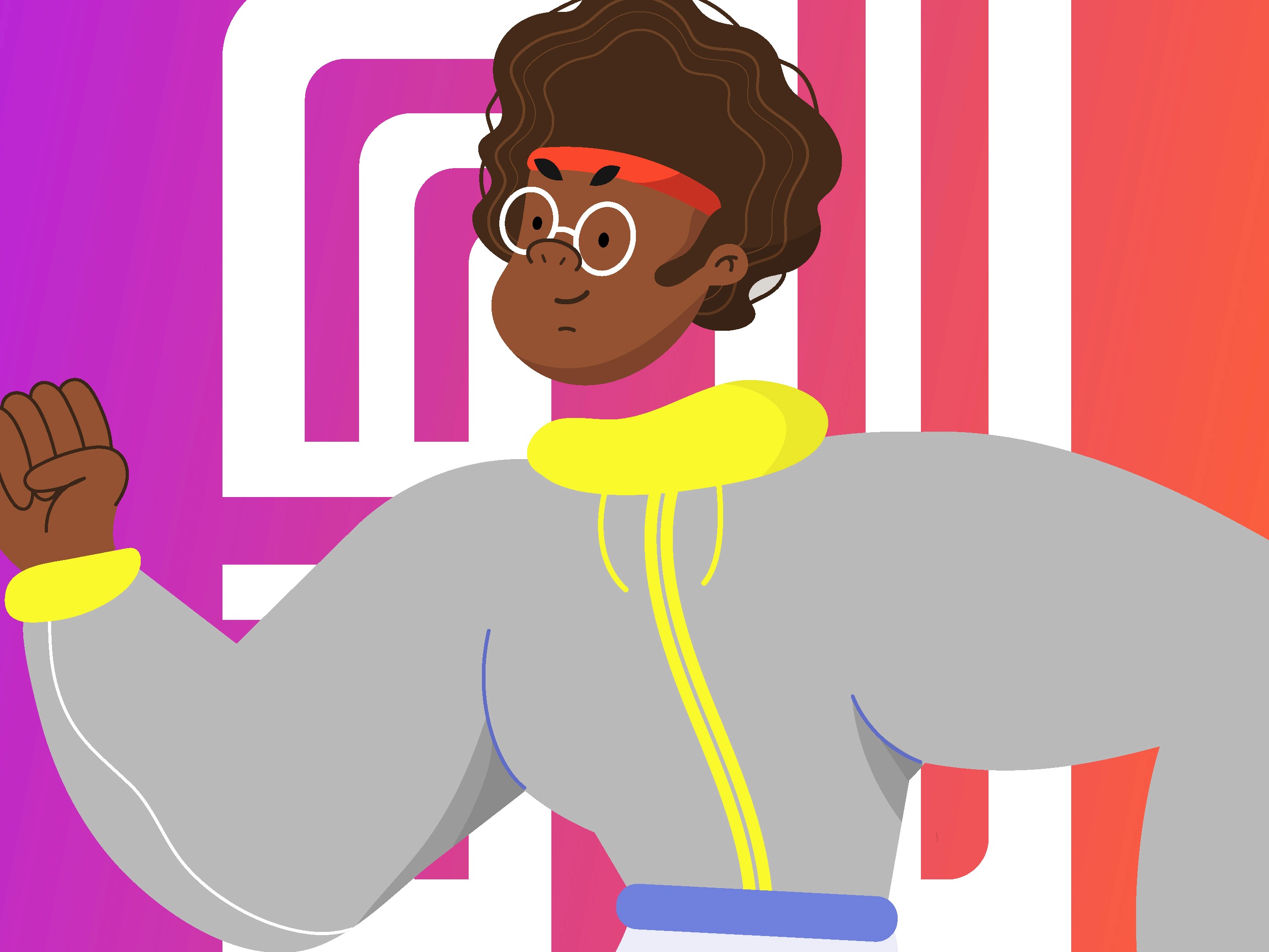
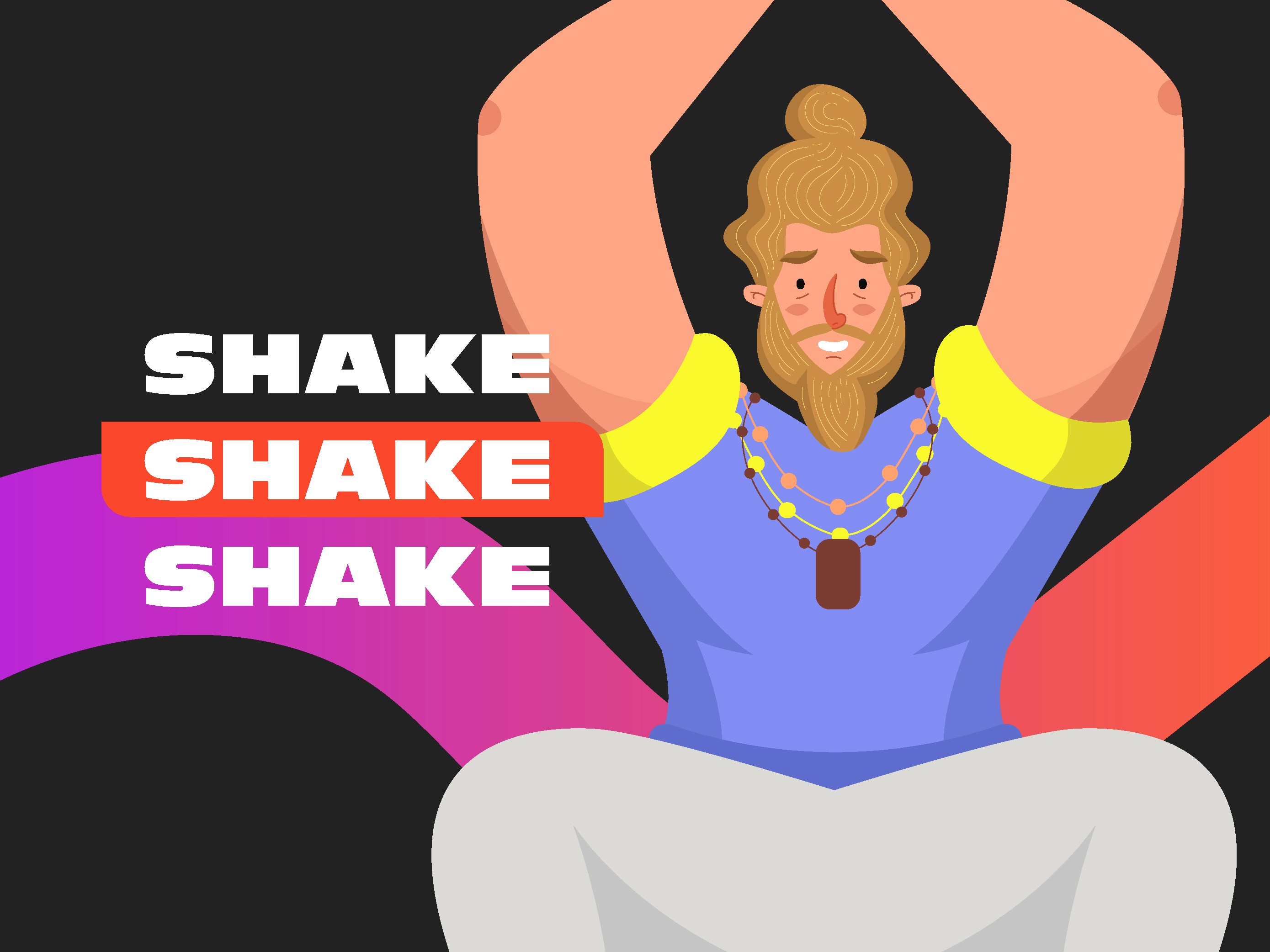
What is AmpleLife? I created AmpleLife as a personal project to challenge myself in a new direction. My objective was to broaden my visual skillset and create a modern aesthetic using vector illustrations. The brand I created was called AmpleLife, an inclusive app with an approachable and friendly aesthetic.
I felt illustration would work well as it would help strip away the feeling of intimidation one might feel from standard fitness brands.
Conceptualisation: I started this project using Dribbble to research projects that incorporated illustrations into their design. I was pleased and inspired to see many illustrators pushing the limits in terms of style and creativity.
I also thought about how I could further push inclusivity into my work and create a suite of illustrated characters that more accurately reflected the diversity of the real world.
Conceptualisation: I created coloured sketches which were shared with Rare’s team and the client for feedback. The colour palette I chose was selected to give a sense of warmth to the piece, inspired by photography I’d seen of the festival during golden hour. The client was very pleased with the initial sketches, only requiring me to get rid of the daughters skateboard as they were worried it sent the wrong message with the family being on a train track (a very reasonable request).
The final outcome: Following our design critique, I used Photoshop to create the final artwork, making sure to separate individual items onto their own layer. By doing this, I was able animate the artwork (using both After Effects and Photoshop) and manipulate content according to the various dimensions needed for deliverables. Feedback on the final artwork from both the client and agency was overwhelmingly positive, with praise given to the colour palette, mood and goat family.
ILLUSTRATION
Illustration for printed books.
REPLICA
Motion design in the AI space.
This assortment features artwork designed for children’s books, book covers and personal projects. I wanted to curate a collection of illustrations that further exemplifies my range as an illustrator.
After my first illustrated children’s book, Stepping Stones, was published, I gained a bit of traction for my ability to illustrate enchanting scenes that exuded a sense of warmth and playfulness. Many of the artwork featured here reflect this period.
In general, I really love working on pieces that feature a message or are conceived in a thought-provoking way.
An example featured in this assortment is the commissioned piece for LGBT Pride Month, depicting modern Australia through its native animals, forming a rainbow.

Book covers: These book covers were created for Oxford University Press, with a distinct concept and message developed for each. Oxford tends to prefer highly conceptual and visually impactful illustrations to appeal to their Higher Education and Secondary audience.
This process requires designers to present several ideas to a team of publishers, authors and marketers, where a final cover is then selected.
The cover for Introduction To The Teaching Profession was nominated for an award at the Australian Book Design Awards. This brief specified a fun and approachable cover to help first-year students into a some-what challenging academic text. After pitching the initial concept of illustrating the ‘anatomy of a teacher’ to OUP’s publishers, I researched various observations made by teachers. These insights were used to populate the surrounding text, which then informed the artwork.
THE TOODYAY FESTIVAL
Illustrating and animating Toodyay.
Replica Studios are an ethical AI studio that create customisable AI voice actors to be used in games, films and animation. They’ve already worked with some of the major players in the game space and are rapidly developing into an AI juggernaut. I worked with Replica to create several explainer videos and product teasers for various digital marketing campaigns.
Above is an example of a product teaser video I created for Replica. This teaser video introduces Vox-1, the next generation of Replica software that gives users a host of new features and updates. To create this video I worked closely with Replica’s internal team to convey these new features in a way that was punchy, energetic and visual.


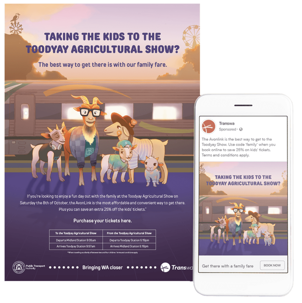
The Toodyay Festival: TransWA commissioned design agency Rare to create a digital and print campaign to promote the Toodyay Festival. I worked with Rare as an Illustrator and Motion Designer to make this happen.
The Toodyay festival is an agricultural event in Western Australia for families to enjoy rides, attractions, live music and see farm animals. The purpose of the campaign is to encourage passengers to book a ticket to the event through TransWA.
The brief: Rare’s brief conceptualised a family of goats and their kids, heading to the Toodyay Show. As there was creative freedom regarding how the goats were depicted, I suggested anthropomorphising them into an archetypal Western Australian family, an idea Rare liked.
The train needed to animate in the background and be recognisable as one of TransWA’s (indicated by the colour and style). Smaller elements (such as the goats hair) also needed to animate as the train whizzed by.
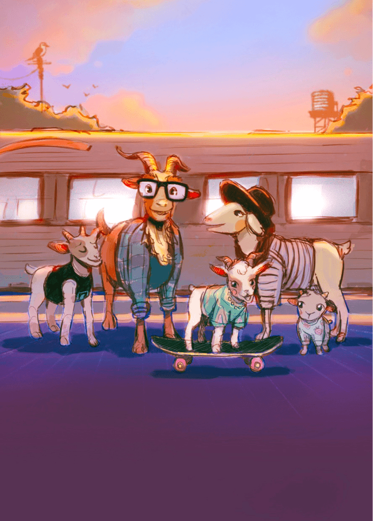




Conceptualisation: I created coloured sketches which were shared with Rare’s team and the client for feedback. The colour palette I chose was selected to give a sense of warmth to the piece, inspired by photography I’d seen of the festival during golden hour. The client was very pleased with the initial sketches, only requiring me to get rid of the daughters skateboard as they were worried it sent the wrong message with the family being on a train track (a very reasonable request).
The final outcome: Following our design critique, I used Photoshop to create the final artwork, making sure to separate individual items onto their own layer. By doing this, I was able animate the artwork (using both After Effects and Photoshop) and manipulate content according to the various dimensions needed for deliverables. Feedback on the final artwork from both the client and agency was overwhelmingly positive, with praise given to the colour palette, mood and goat family.
REPLICA
Motion design in the AI space.
Replica Studios are an ethical AI studio that create customisable AI voice actors to be used in games, films and animation. They’ve already worked with some of the major players in the game space and are rapidly developing into an AI juggernaut. I worked with Replica to create several explainer videos and product teasers for various digital marketing campaigns.
The Toodyay Festival: TransWA commissioned design agency Rare to create a digital and print campaign to promote the Toodyay Festival. I worked with Rare as an Illustrator and Motion Designer to make this happen.
The Toodyay festival is an agricultural event in Western Australia for families to enjoy rides, attractions, live music and see farm animals. The purpose of the campaign is to encourage passengers to book a ticket to the event through TransWA.
Above is an example of a product teaser video I created for Replica. This teaser video introduces Vox-1, the next generation of Replica software that gives users a host of new features and updates. To create this video I worked closely with Replica’s internal team to convey these new features in a way that was punchy, energetic and visual.
The brief: Rare’s brief conceptualised a family of goats and their kids, heading to the Toodyay Show. As there was creative freedom regarding how the goats were depicted, I suggested anthropomorphising them into an archetypal Western Australian family, an idea Rare liked.
The train needed to animate in the background and be recognisable as one of TransWA’s (indicated by the colour and style). Smaller elements (such as the goats hair) also needed to animate as the train whizzed by.


Let's work
together.
This website was designed and
developed by Clay Pixels.
joshuascott888@outlook.com.au
ILLUSTRATION
Illustration for printed books.
Designing for the Toodyay Festival.
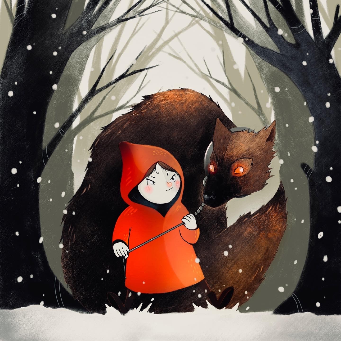


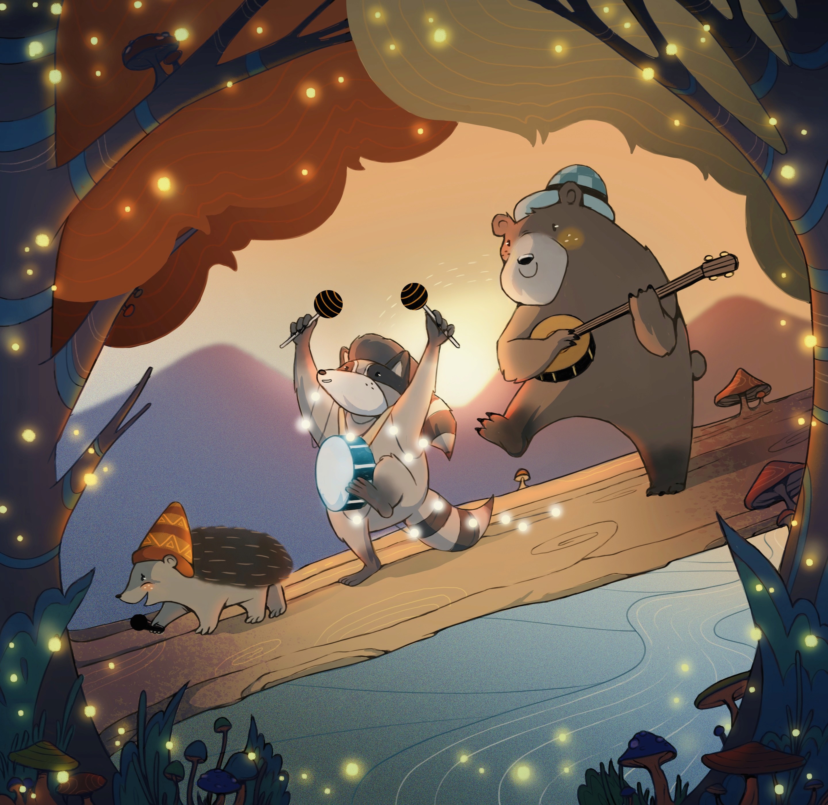


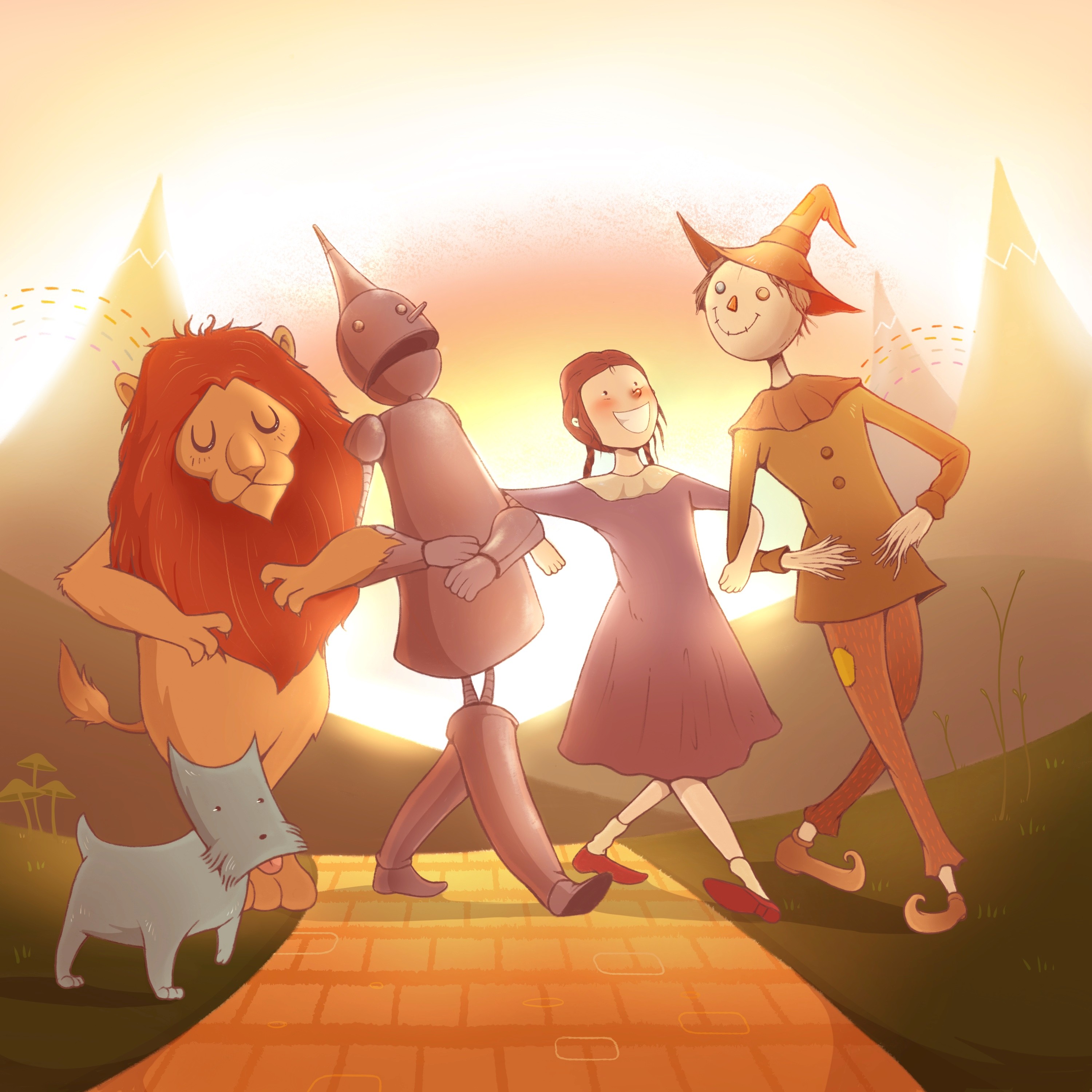


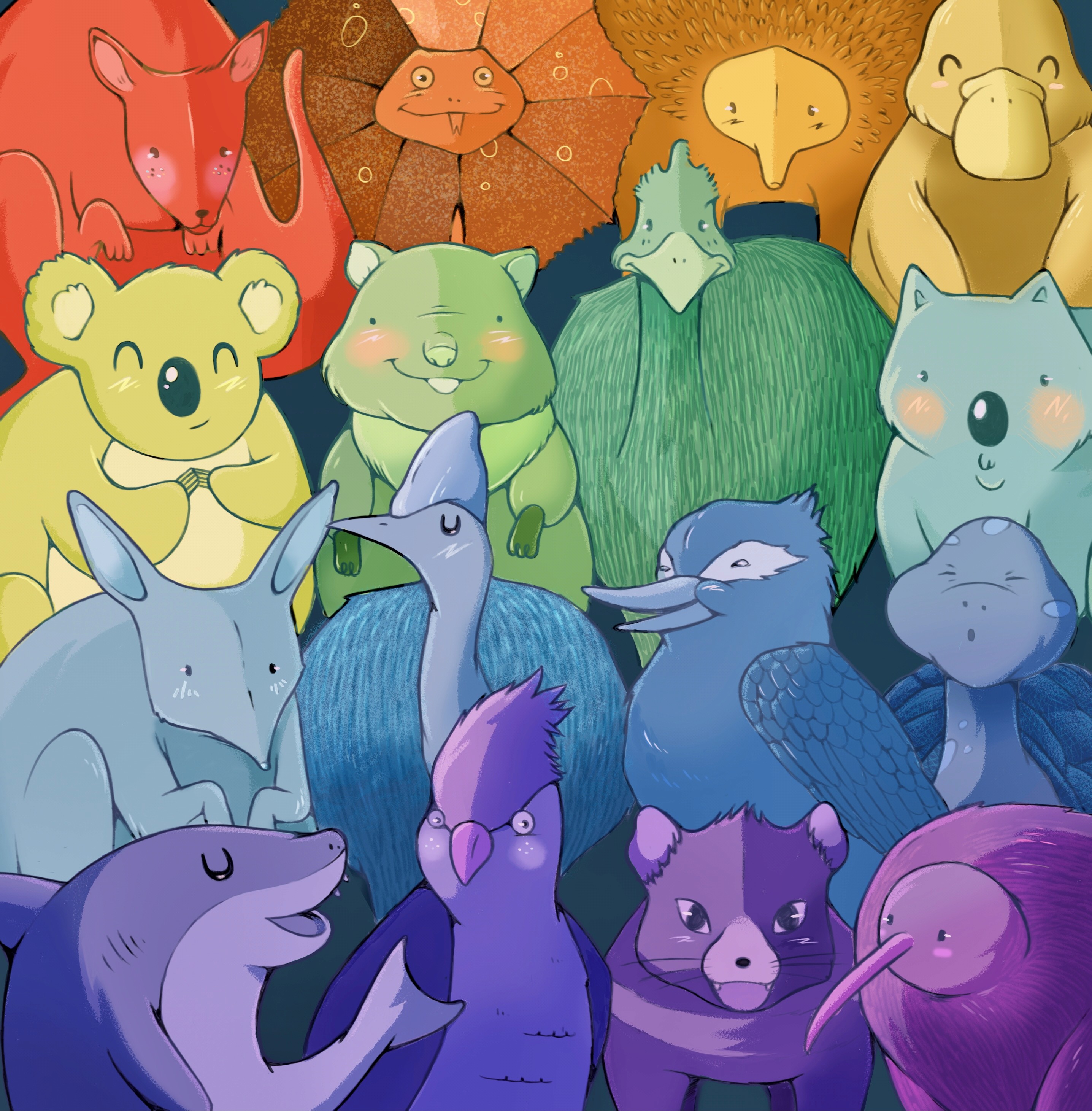


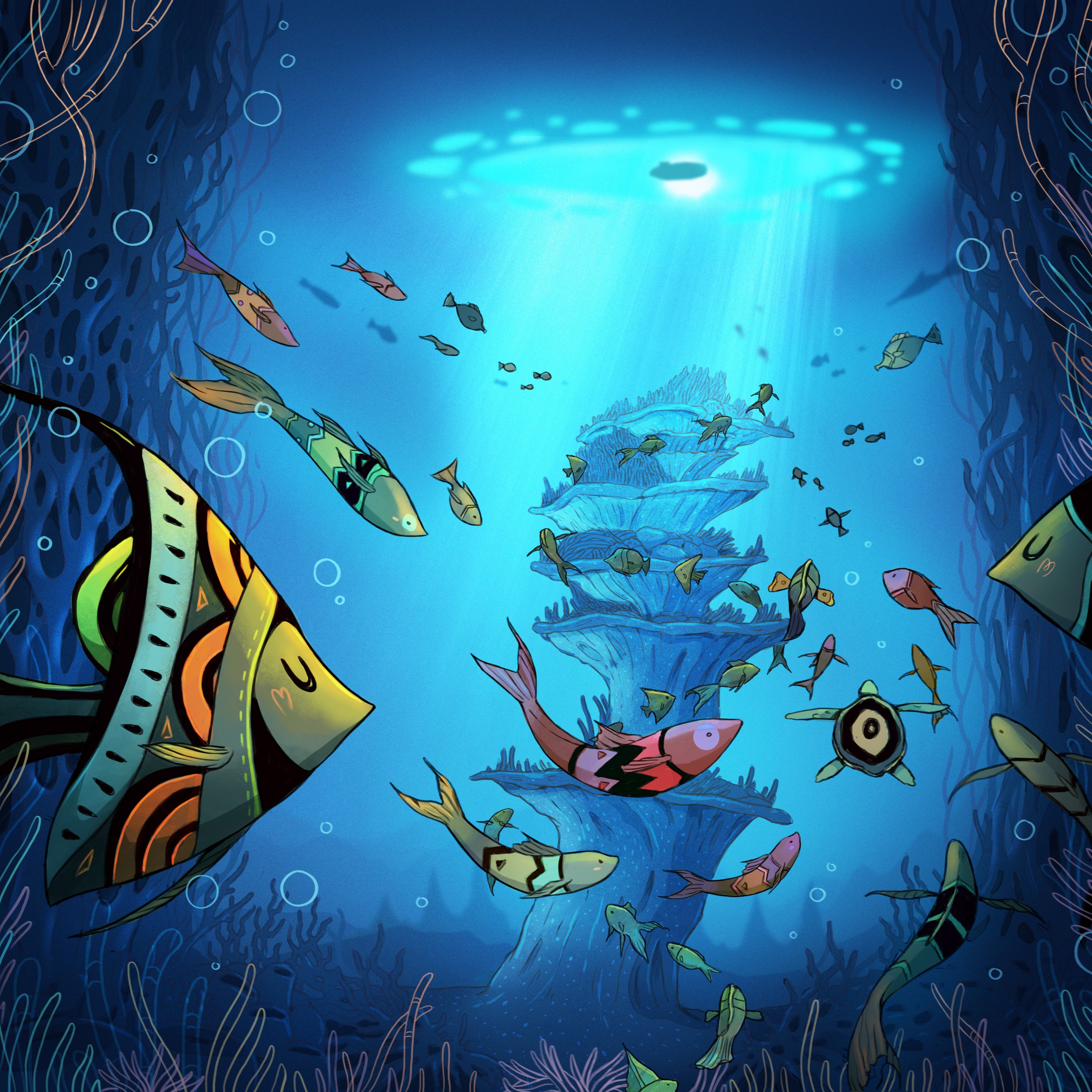


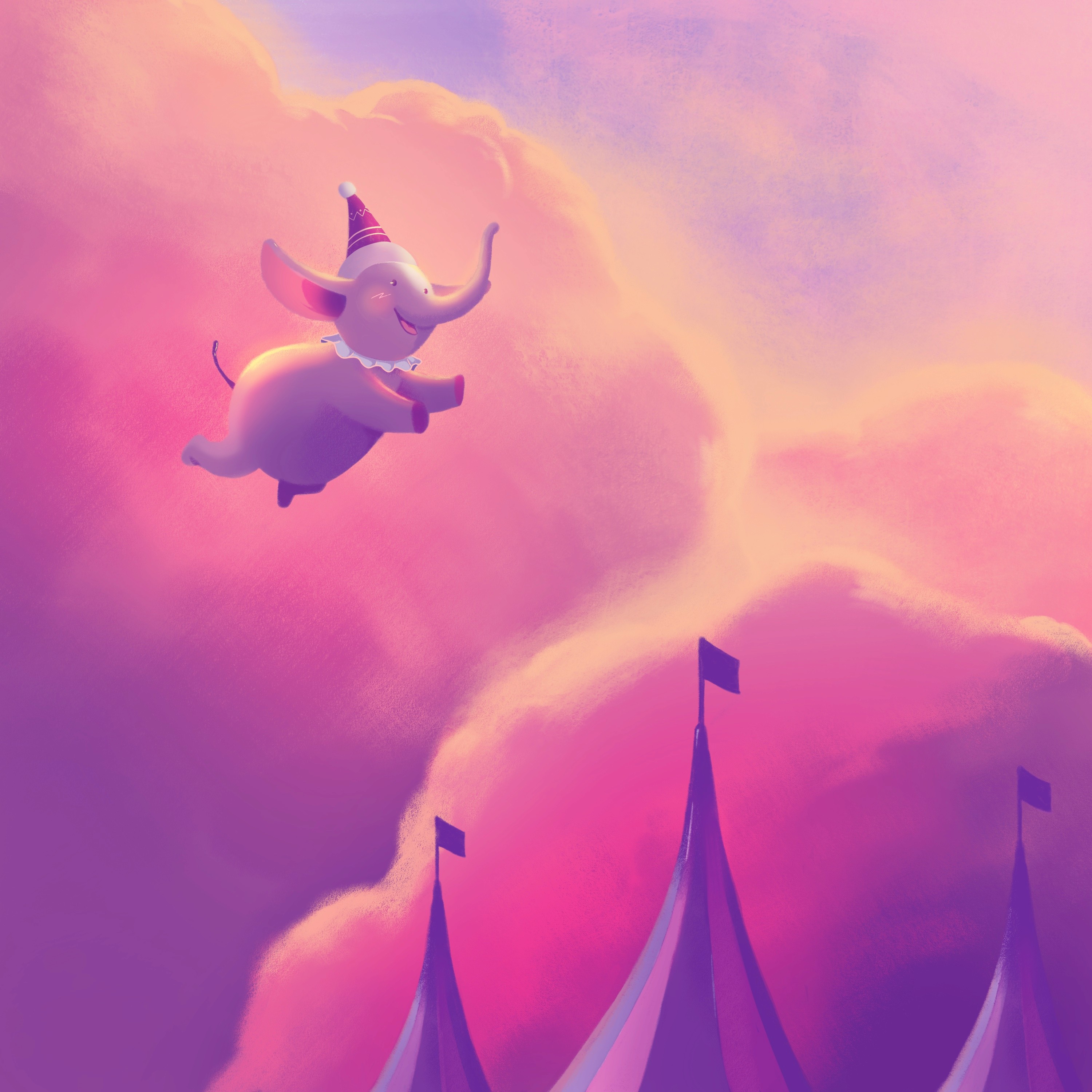


This assortment features artwork designed for children’s books, book covers and personal projects. I wanted to curate a collection of illustrations that further exemplifies my range as an illustrator.
After my first illustrated children’s book, Stepping Stones, was published, I gained a bit of traction for my ability to illustrate enchanting scenes that exuded a sense of warmth and playfulness. Many of the artwork featured here reflect this period.
The Toodyay Festival: TransWA commissioned design agency Rare to create a digital and print campaign to promote the Toodyay Festival. I worked with Rare as an Illustrator and Motion Designer to make this happen.
The Toodyay festival is an agricultural event in Western Australia for families to enjoy rides, attractions, live music and see farm animals. The purpose of the campaign is to encourage passengers to book a ticket to the event through TransWA.
In general, I really love working on pieces that feature a message or are conceived in a thought-provoking way. An example featured in this assortment is the commissioned piece for LGBT Pride Month, depicting modern Australia through its native animals, forming a rainbow.
The brief: Rare’s brief conceptualised a family of goats and their kids, heading to the Toodyay Show. As there was creative freedom regarding how the goats were depicted, I suggested anthropomorphising them into an archetypal Western Australian family, an idea Rare liked.
The train needed to animate in the background and be recognisable as one of TransWA’s (indicated by the colour and style). Smaller elements (such as the goats hair) also needed to animate as the train whizzed by.
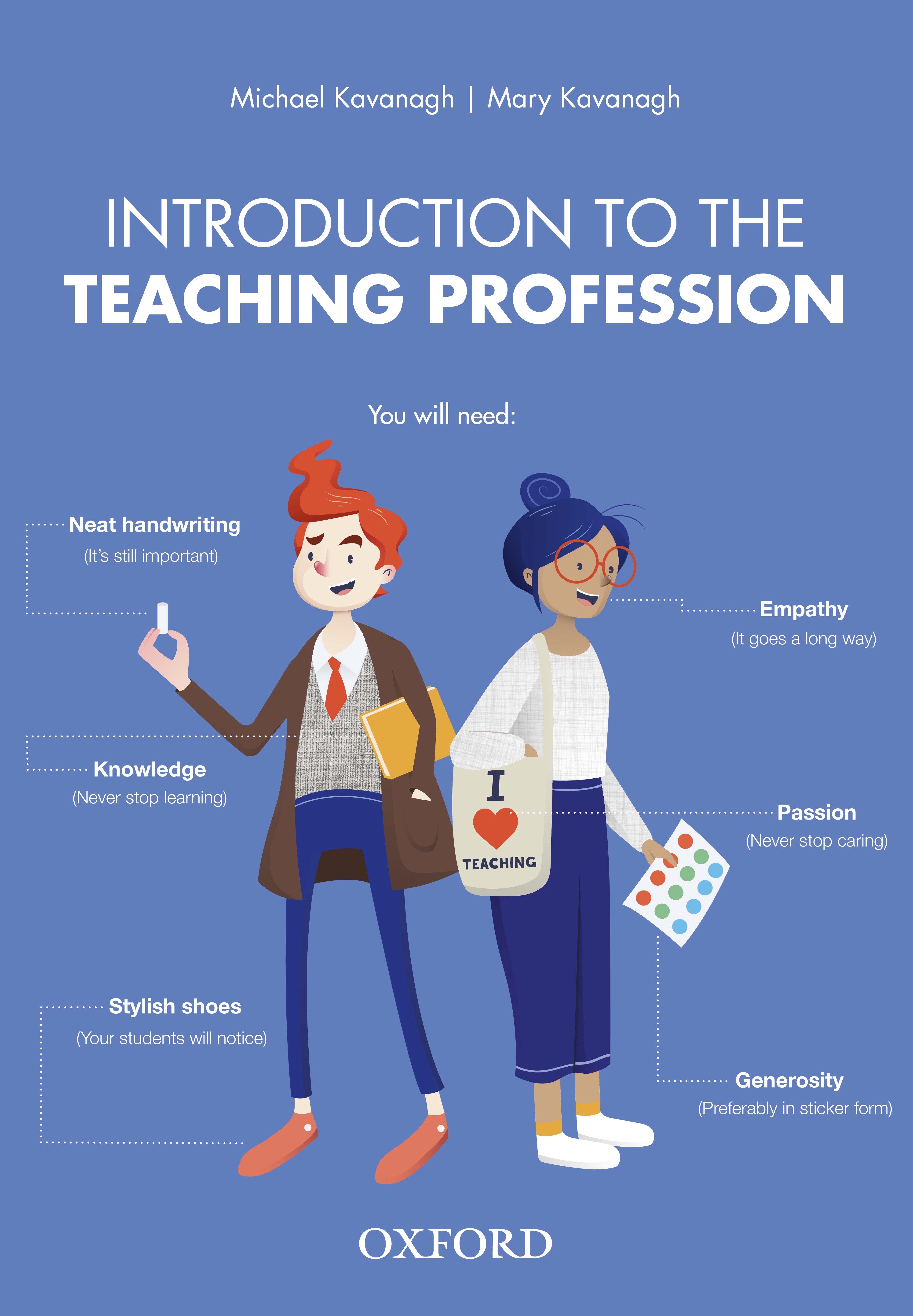


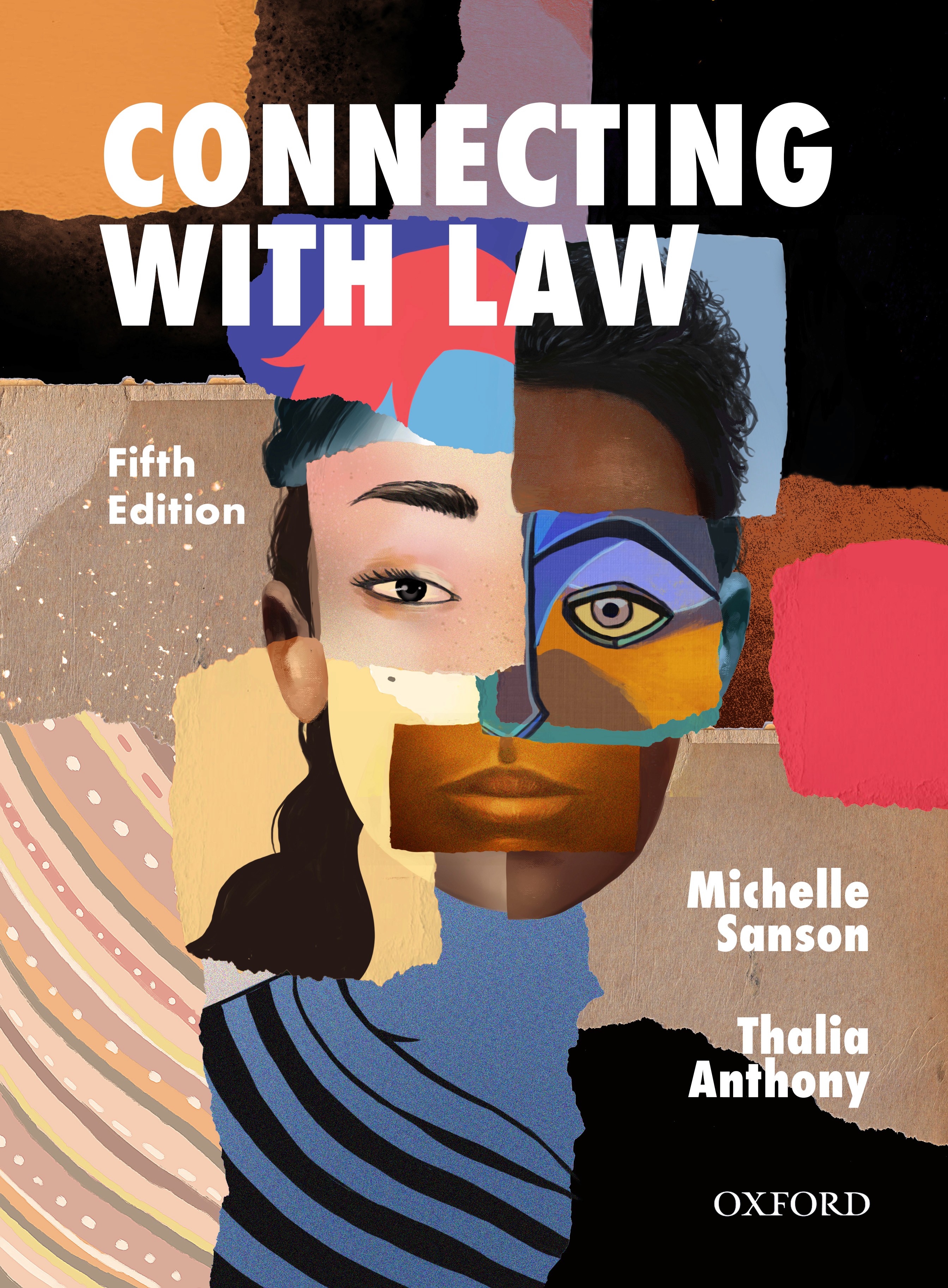


Book covers: These book covers were created for Oxford University Press, with a distinct concept and message developed for each. Oxford tends to prefer highly conceptual and visually impactful illustrations to appeal to their Higher Education and Secondary audience.
This process requires designers to present several ideas to a team of publishers, authors and marketers, where a final cover is then selected.
The cover for Introduction To The Teaching Profession was nominated for an award at the Australian Book Design Awards. This brief specified a fun and approachable cover to help first-year students into a some-what challenging academic text.
After pitching the initial concept of illustrating the ‘anatomy of a teacher’ to OUP’s publishers, I researched various observations made by teachers. These insights were used to populate the surrounding text, which then informed the artwork.
