PRODUCT DESIGN

ART DIRECTION

ILLUSTRATION
PRODUCT DESIGN

ART DIRECTION

ILLUSTRATION
PRODUCT DESIGN

ART DIRECTION

ILLUSTRATION
PRODUCT DESIGN

ART DIRECTION

ILLUSTRATION
Redefining education for Generation Z.
Redefining education for Generation Z.
Redefining education for Generation Z.
Redefining education for Generation Z.


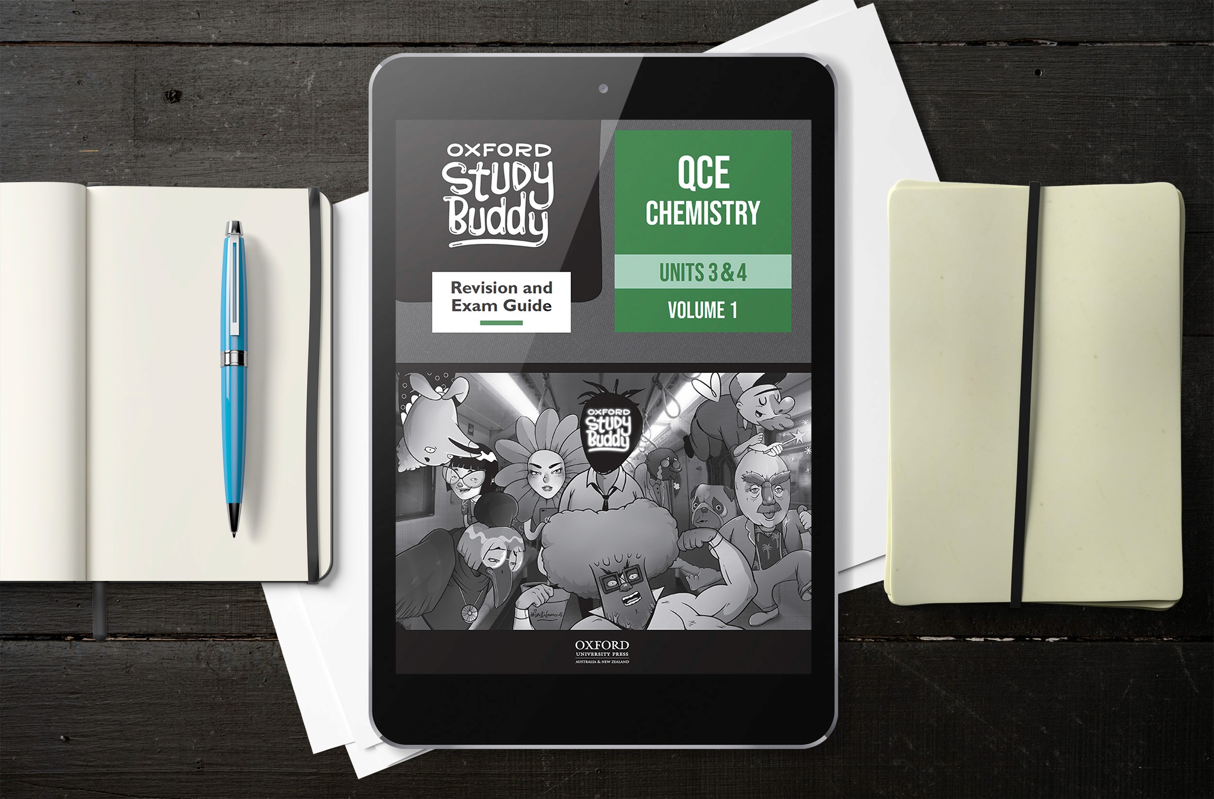
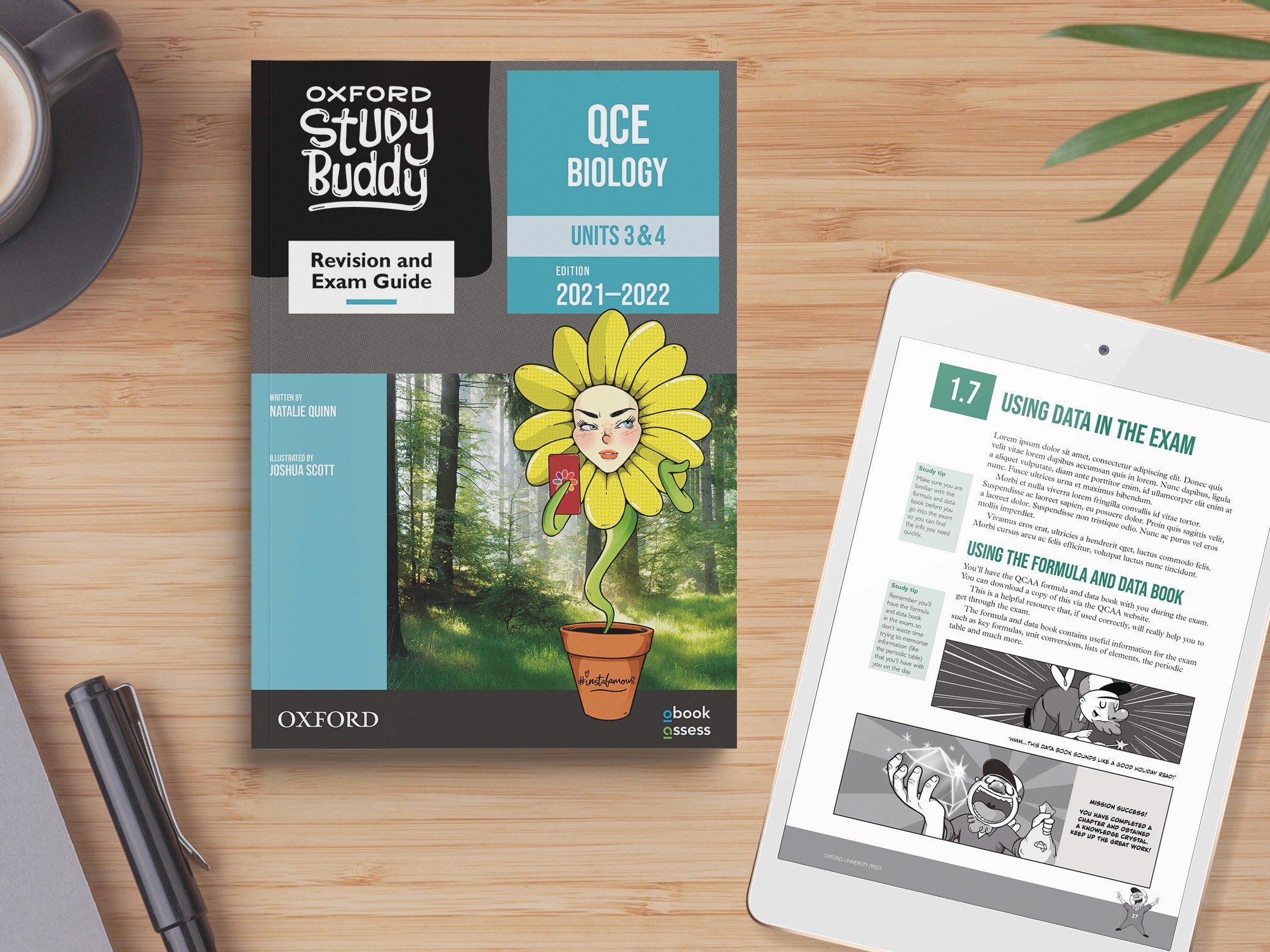
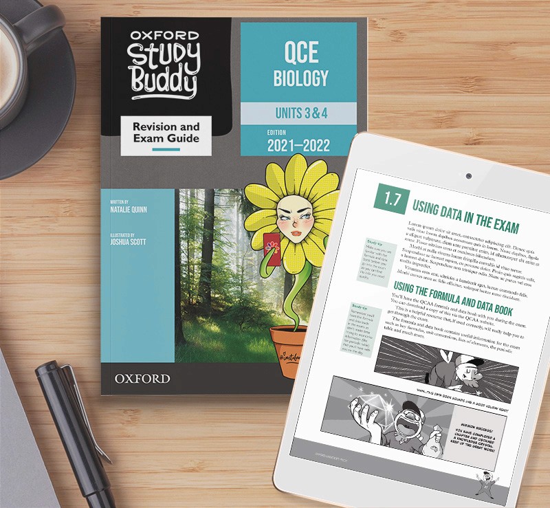
Oxford Study Buddy is an award-winning study series published by Oxford University Press. This nine-part study series addresses the problem of disengagement from users who find traditional educational books dry and difficult to consume. I led the design of this print and digital study series, from the beginning of its lifecycle to the end.
Oxford Study Buddy is an award-winning study series for Oxford University Press. This nine-part study series addresses the problem of disengagement from users who find traditional educational books dry and difficult to consume. I led the design of this print and digital study series, from the beginning of its lifecycle to the end.
Oxford Study Buddy is an award-winning study series for Oxford University Press. This nine-part study series addresses the problem of disengagement from users who find traditional educational books dry and difficult to consume. I led the design of this print and digital study series, from the beginning of its lifecycle to the end.
Oxford Study Buddy is an award-winning study series for Oxford University Press. This nine-part study series addresses the problem of disengagement from users who find traditional educational books dry and difficult to consume. I led the design of this print and digital study series, from the beginning of its lifecycle to the end.
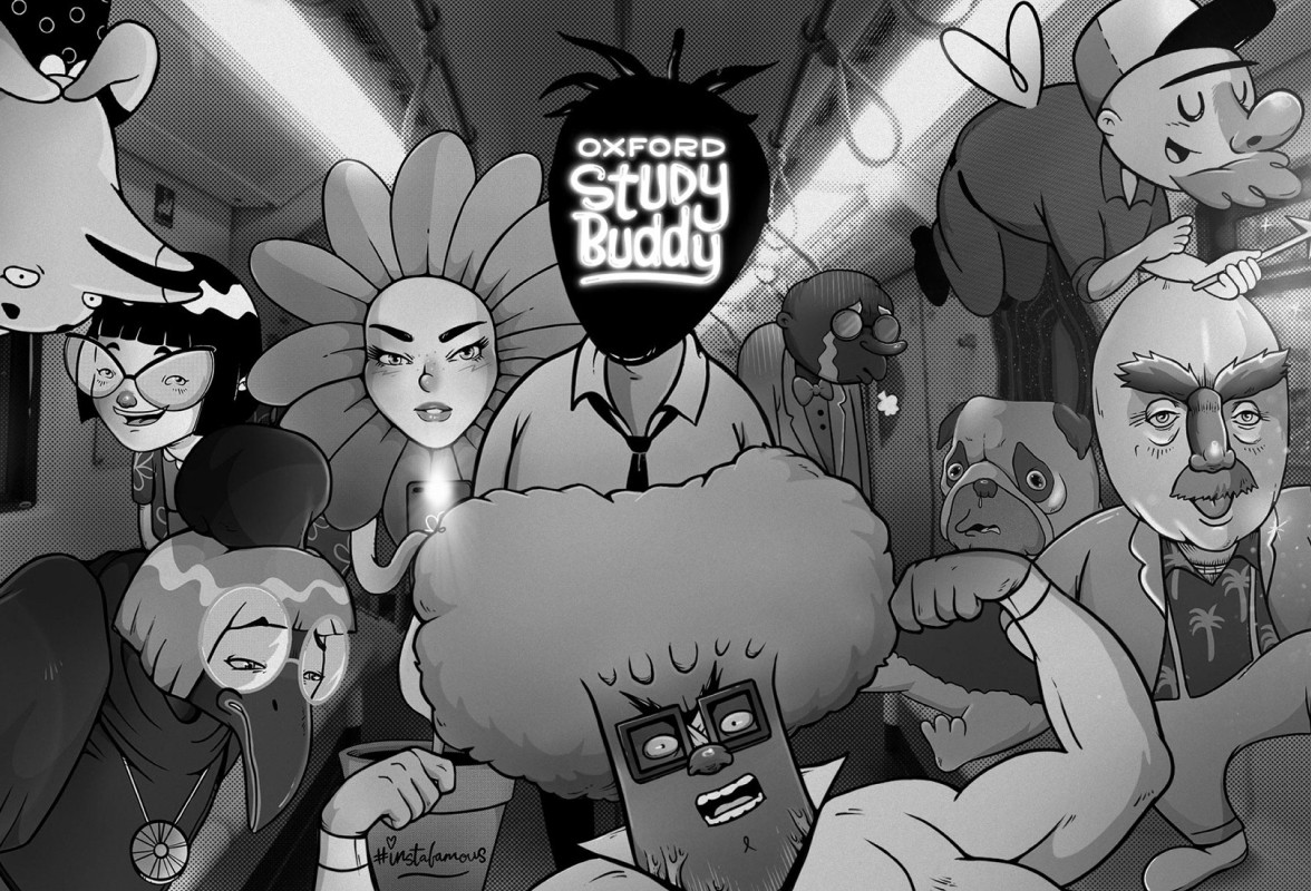

Oxford Study Buddy is a nine-part study series that takes inspiration from Japanese comics, video-games and pop culture to solve the problem of disengagement with its target audience.


MY INVOLVEMENT
My involvement in Oxford Study Buddy.
My involvement in Oxford Study Buddy.
MY INVOLVEMENT
My involvement in this project.


The problem of disengagement.
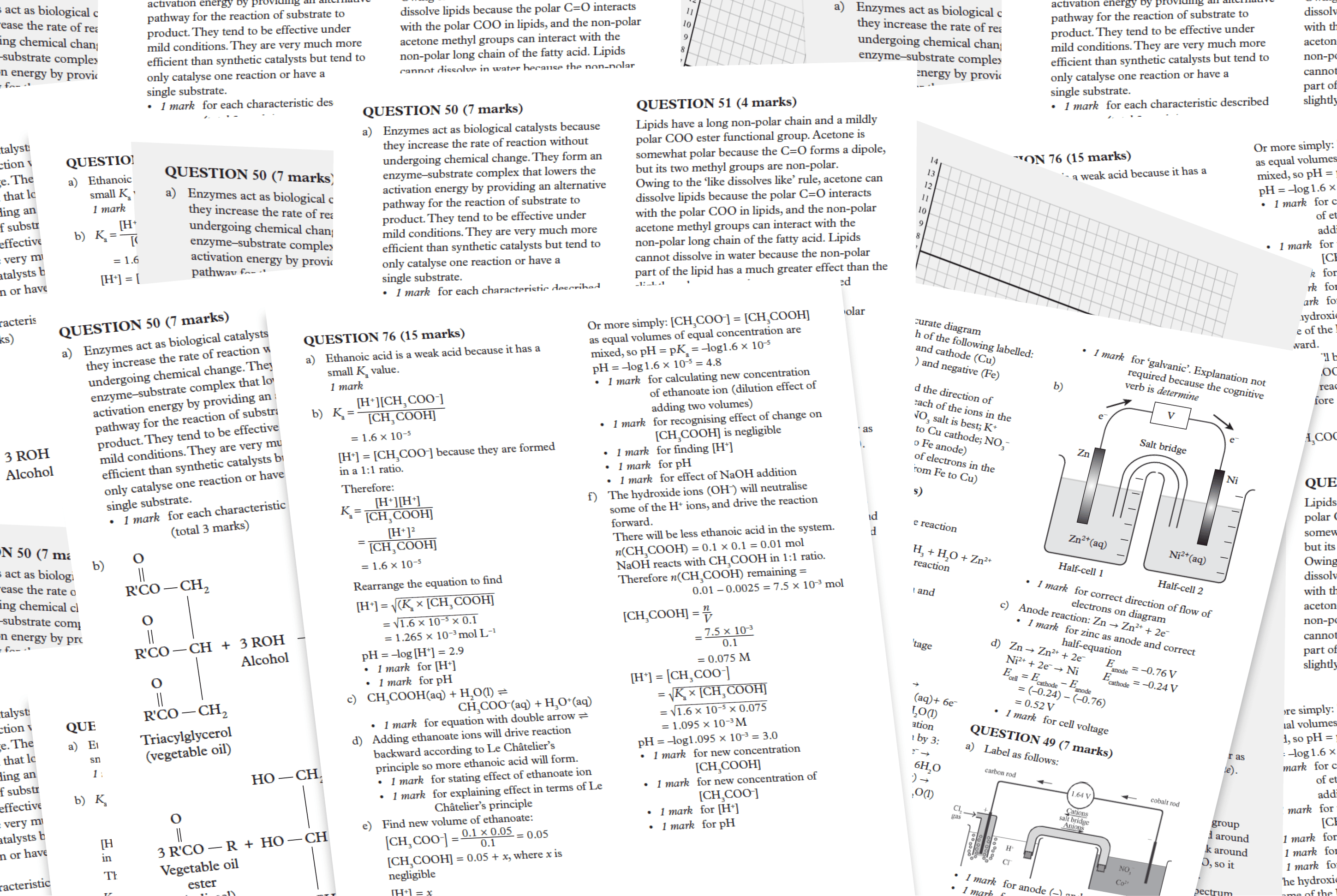

Academic resources are typically page-to-page walls of text.
The stagnant academic resource market has seen little innovation in decades. Students reaching the end of their secondary studies face immense pressure to study for their final exams, but their options for resources are extremely limited and outdated. These resources often lack engagement and fail to consider the human experience, making it difficult for students to learn effectively.
These academic resources are typically page-to-page walls of text, which do little to cater to a diverse range of students, such as kinaesthetic or visual learners. This is further exacerbated by the fact that the modern cohort of secondary students are digital natives who grew up with highly-visual and engaging content.
My involvement in the creation of Oxford Study Buddy was extensive. Overall, my involvement can be broken down into four distinct areas:
UX Research And Brainstorming: I worked closely with OUP’s publishing team to conduct research into understanding our target audience. I then collaborated with the team to generate ideas for the series concept and execution. One of my largest contributions in the brainstorming phase was the proposal of a gamified approach to add an interactive element to the series. I also proposed the inclusion of an overarching comic narrative to further help with engagement.
Design Lead: I worked as the lead designer for this series, overseeing its entire cycle, including its layout, design system, branding, art direction and illustration, collaborating closely with internal stakeholders and publishers to develop this series.
My involvement in the creation of Oxford Study Buddy was extensive. Overall, my involvement can be broken down into four distinct areas:
Research And Brainstorming: I worked closely with OUP’s publishing team to conduct research into understanding our target audience. I then collaborated with the team to generate ideas for the series concept and execution. One of my largest contributions in the brainstorming phase was the proposal of a gamified approach to add an interactive element to the series. I also proposed the inclusion of an overarching comic narrative to further help with engagement.
Design Lead: I worked as the lead designer for this series, overseeing its entire cycle, including its layout, design system, branding, art direction and illustration, collaborating closely with internal stakeholders and publishers to develop this series.
Product Design: I designed the format for the series, which included the typographic hierarchy, grid system and layout. I then created the series Text Design, a 100+ page style guide and design system for OUP's typesetters. This text design communicated all the complex information needed for OUP’s overseas typesetters to layout each book using an automated process.
Illustration: I conceptualised and illustrated the series character designs, ensuring each had a unique personality that would resonate with our readers. Additionally, I illustrated all the comic pages, character artwork and iconography used in all nine books. I also worked with our publishing team to conceptualise and write the comic pages used throughout each volume.
Product Design: I designed the products format, including the typographic hierarchy, grid system and layout. I then created the series Design System, used to inform OUP's typesetters. This system communicated all the complex information needed for OUP’s overseas typesetters to layout each product using an automated process.
Illustration: I conceptualised and illustrated the series character designs, ensuring each had a unique personality that would resonate with our readers. Additionally, I illustrated all the comic pages, character artwork and iconography used in all nine books. I also worked with our publishing team to conceptualise and write the comic pages used throughout each volume.
PROBLEM STATEMENT
The problem of disengagement.
The stagnant academic resource market has seen little innovation in decades. Students reaching the end of their secondary studies face immense pressure to study for their final exams, but their options for resources are extremely limited and outdated. These resources often lack engagement and fail to consider the human experience, making it difficult for students to learn effectively.
These academic resources are typically page-to-page walls of text, which do little to cater to a diverse range of students, such as kinaesthetic or visual learners. This is further exacerbated by the fact that the modern cohort of secondary students are digital natives who grew up with highly-visual and engaging content.


Academic resources are typically page-to-page walls of text.
PROBLEM STATEMENT
The problem of disengagement.


Generation Z are digital natives who are used to visual and interactive ways of learning.


Academic resources are typically page-to-page walls of text.
TARGET AUDIENCE
Defining our target audience.
Defining our target audience.
TARGET AUDIENCE
Defining our target audience.
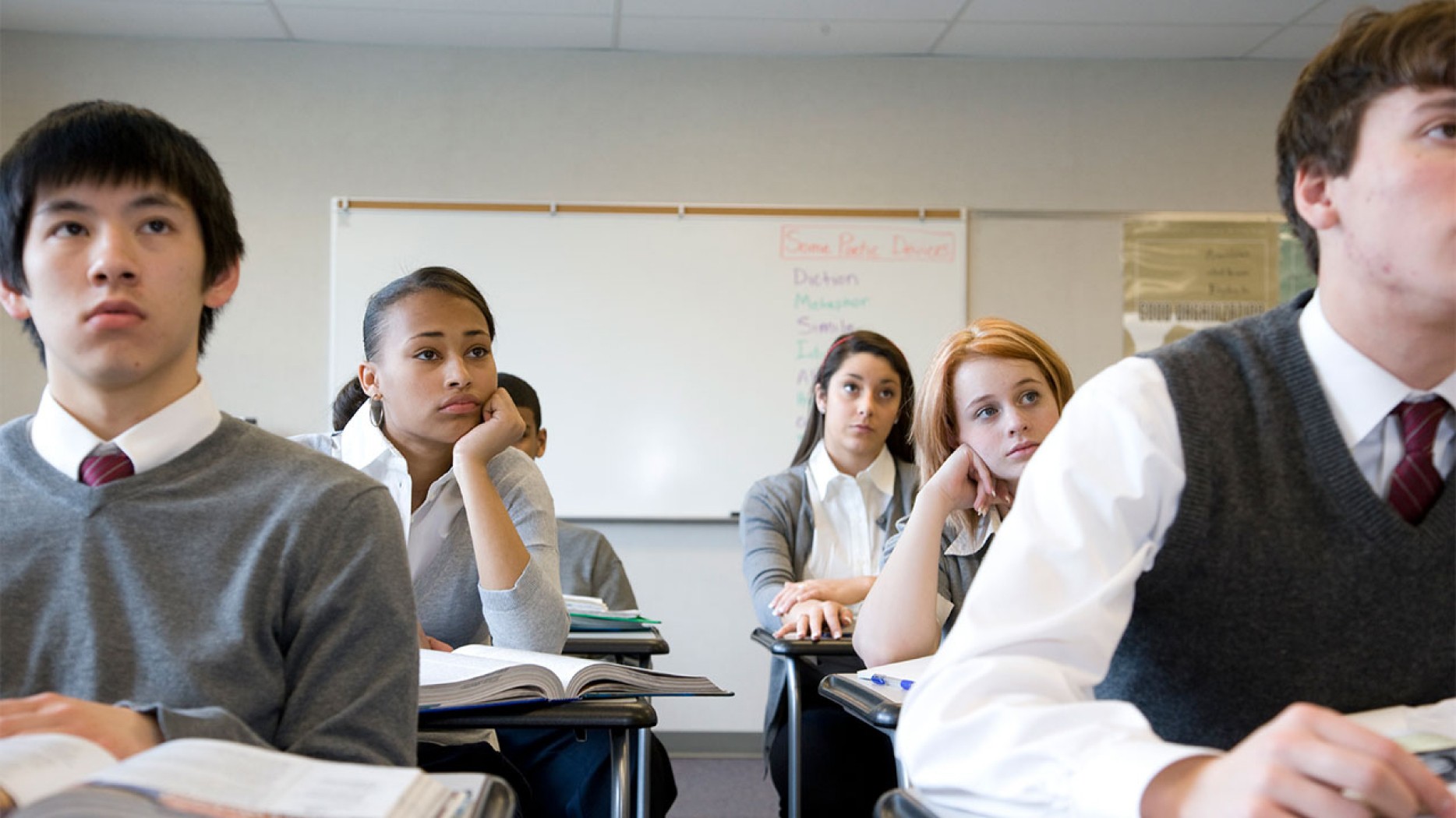


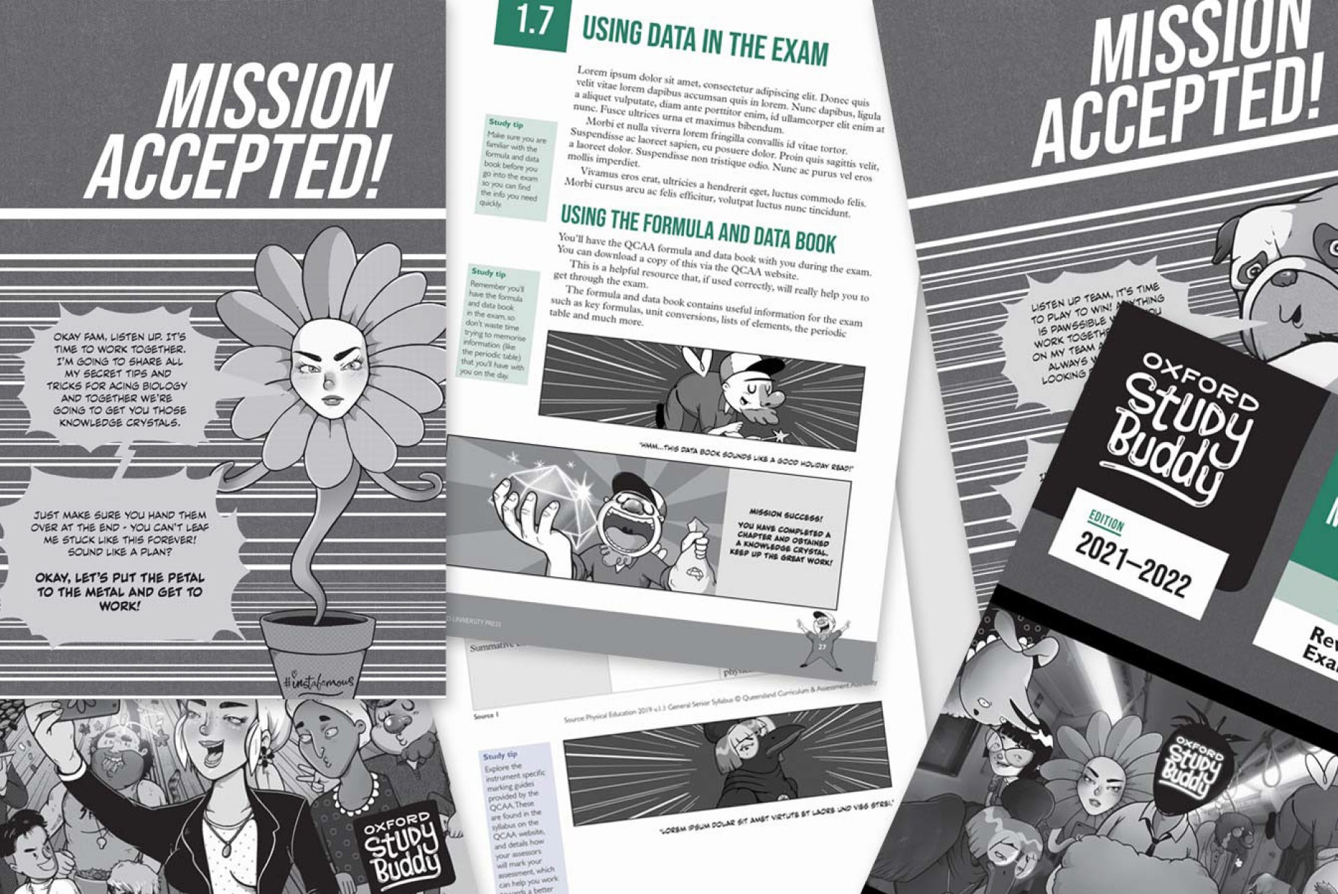

Oxford Study Buddy breaks up walls of text in a fun and interactive way. This helps Generation Z engage in the material.
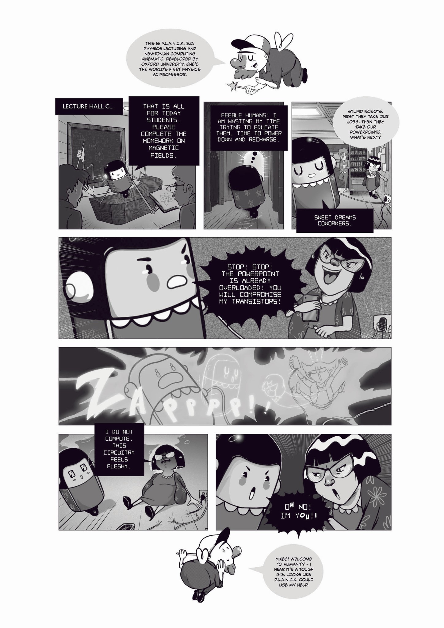
How was this information applied? After understanding our target audience, budgetary constraints and competition, I proposed the solution of a gamified approach for Oxford Study Buddy. This would help with visual and kinaesthetic learners, while giving the series an interactive component. Drawing inspiration from manga, internet culture and video-games, I worked with OUP’s publishers to develop our concept further.
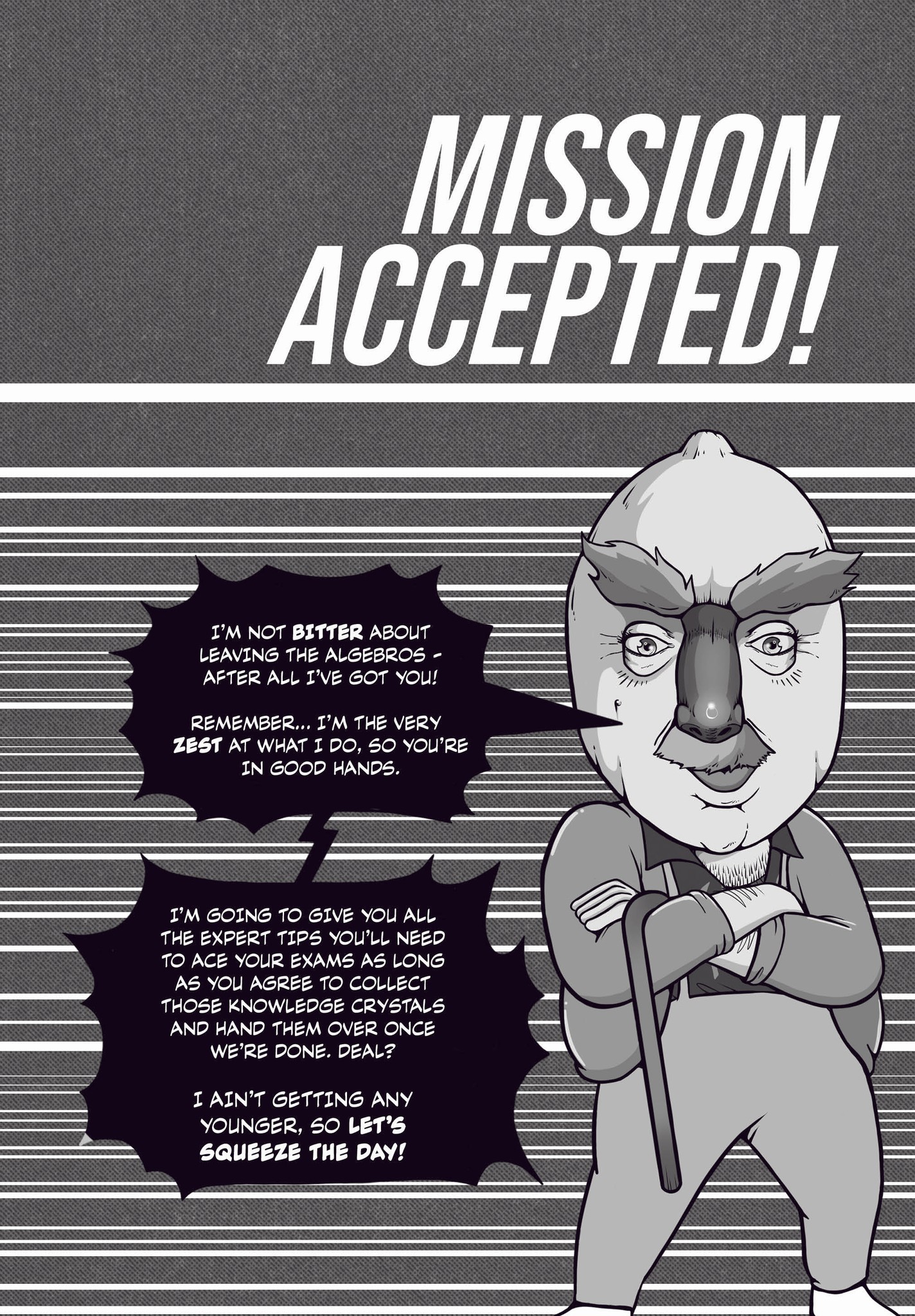
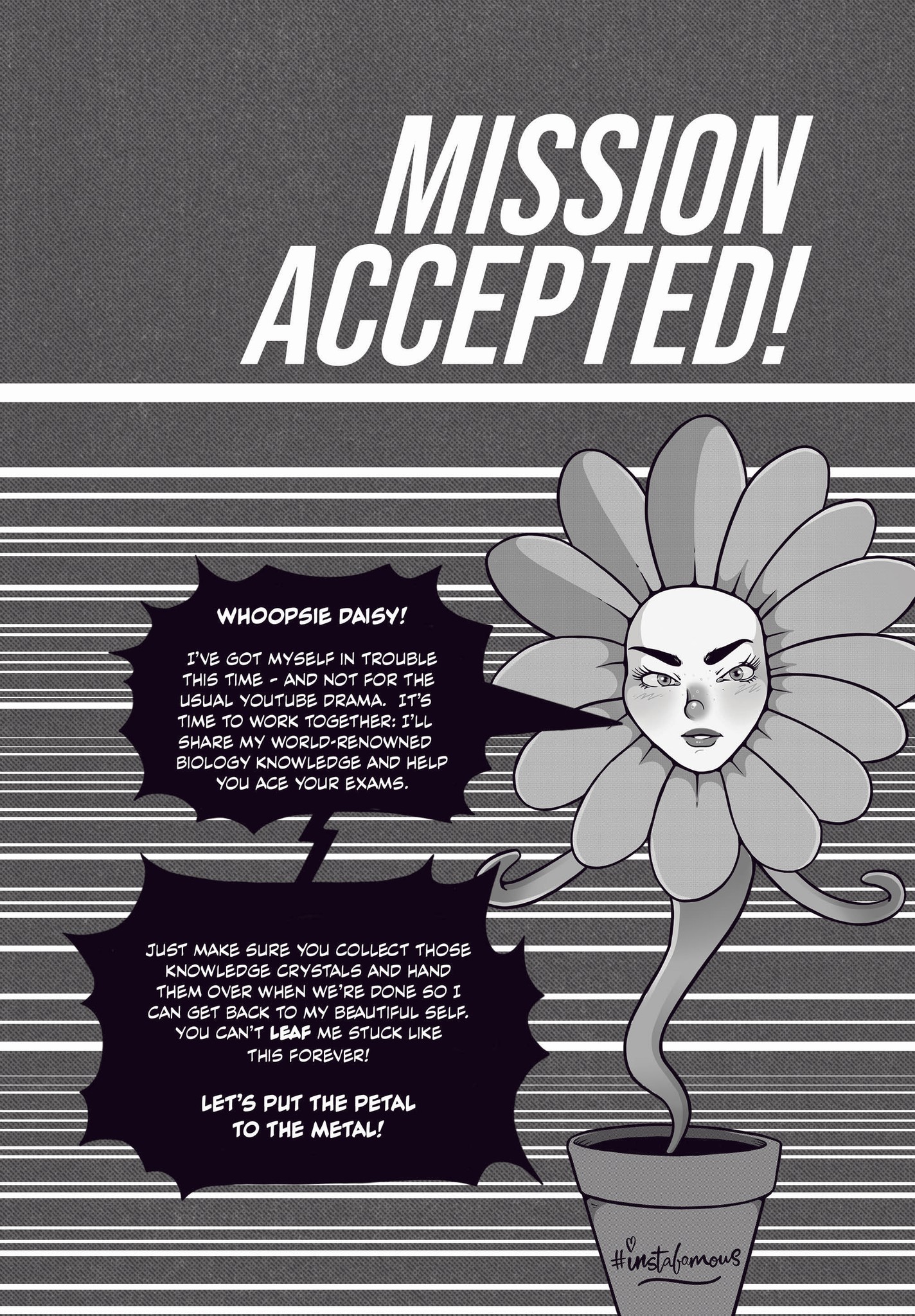
The graphic narrative we developed would feature an Oxford University professor undergoing an accidental transformation and needing the readers help to transform back. After completing chapters, readers are awarded crystals which are used to assist in this transformation. This narrative would be illustrated in the form of comic-pages, book-ending each volume.


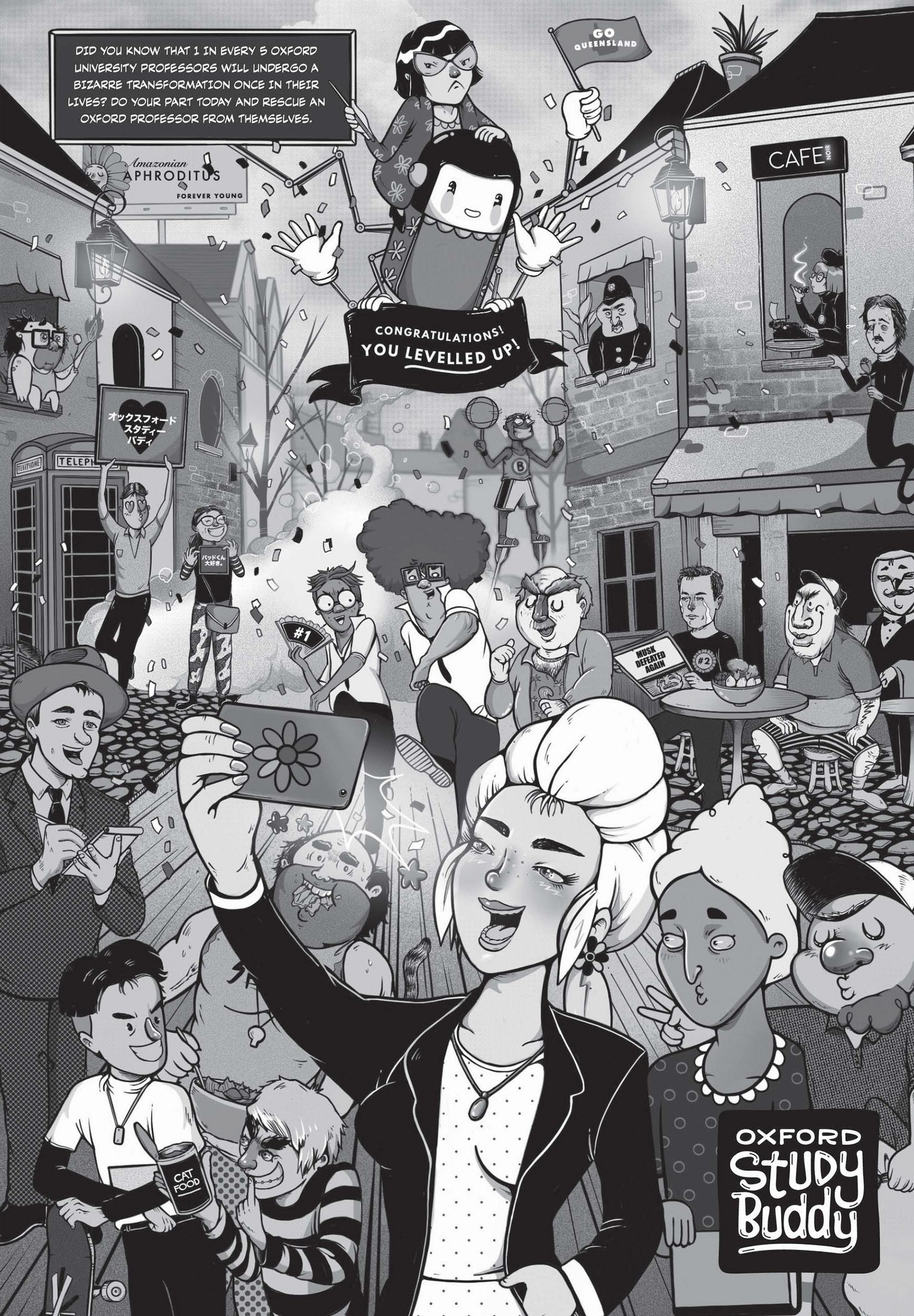
The graphic narrative takes readers on a surreal journey, in the pursuit of knowledge.
This comic formula would serve as the interactive component of the series.
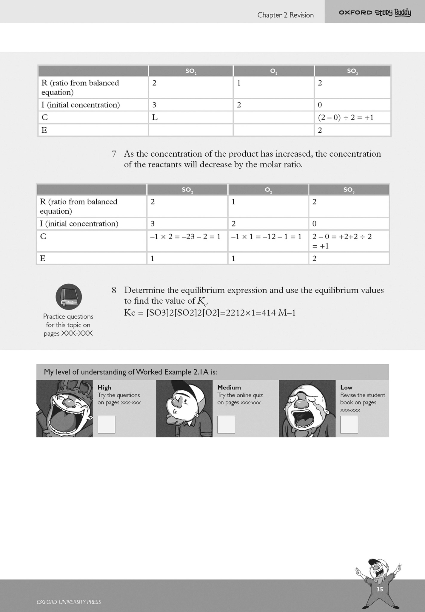
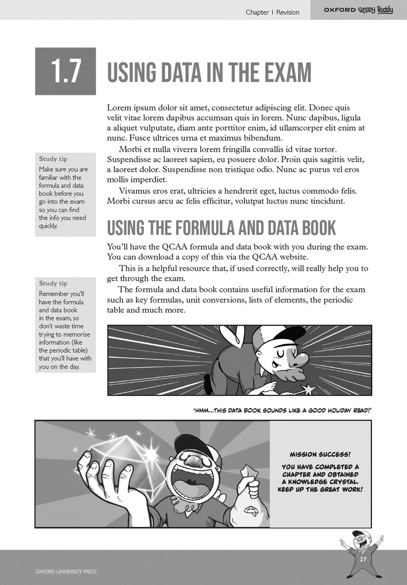
Chapters would also be broken down into different stages, like a video-game, complete with a progress bar and character check-ins. Furthermore, these characters would appear throughout the text to give readers a TLDR (Too Long Didn’t Read) breakdown, making lengthy sections more manageable. This would assist Generation Z with bite-size learning.
Additionally, I thought to leverage our budgetary constraints to our advantage, taking inspiration from Japanese comics that are typically printed on low-quality paper in black and white.
CONSTRAINTS
Understanding the constraints.
Oxford Study Buddy was designed for Australian high school students preparing for their end of year exams. The target audience is Generation Z (those born between 1997 and 2012.)
When researching Generation Z, I discovered many interesting factors that make their style of learning unique from previous generations.
Interactive Content: As Generation Z grew up with digital devices, they are used to content that is interactive, creative and visually appealing.
Personalised Content: Examples of this could be content created for different learning approaches such as kinaesthetic or visual learners. Another approach is gamified learning as it gives users an interactive and more personalised experience.
Bite-size Learning: Generation Z has a shorter attention span and prefers learning materials that are broken down into smaller, more manageable chunks.
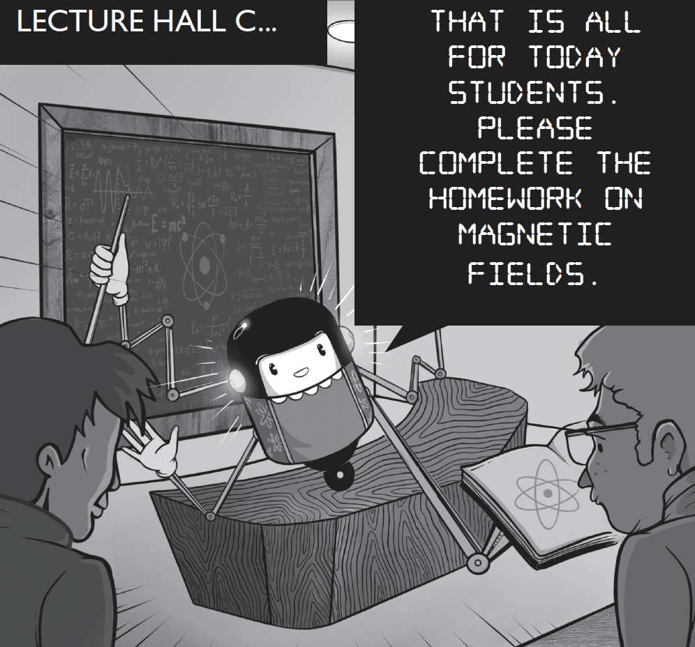

Due to the limitations of being a one-colour print-run, Oxford Study Buddy takes visual inspiration from old cartoons and Japanaese manga, breathing life into its limitations.
With these constraints in mind, I worked hard to ensure the overall aesthetic had strong contrast, working black and mid-tones heavily into the design. To separate the Professor characters from Bud (the narrator of Oxford Study Buddy) I made their speech bubbles black. This not only helped users navigate to the black speech bubbles (for the TLDR breakdowns, if needed) but also helped give the overall aesthetic a more unique and interesting look.
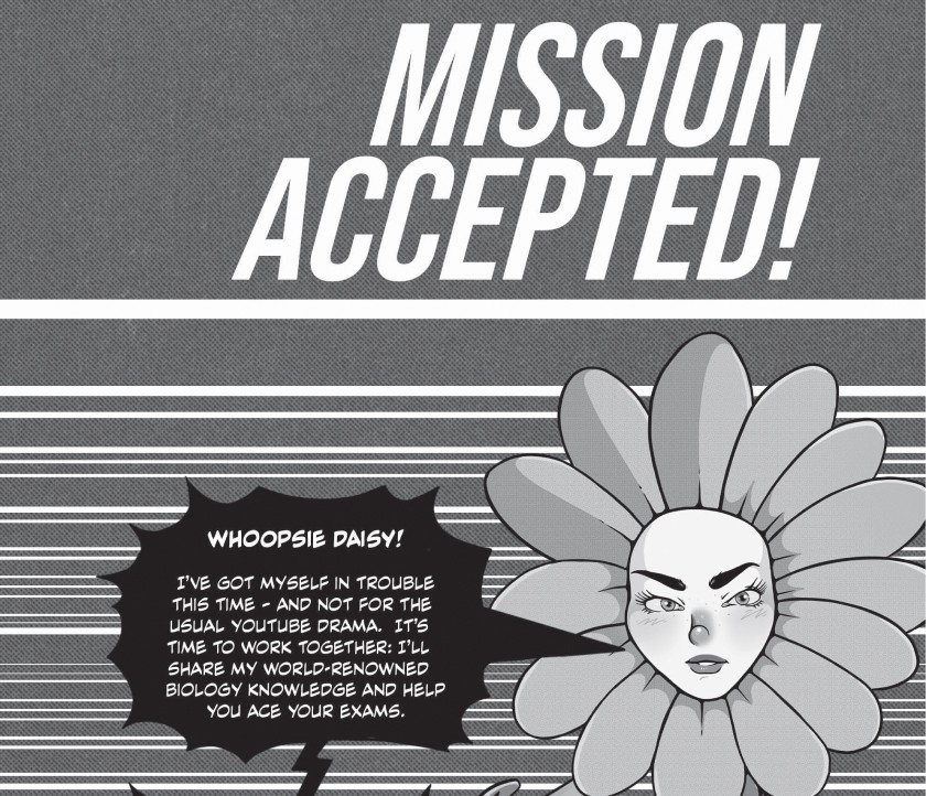

The titular study buddy characters speak using a black speech bubble, differentiating them from other characters in the text. As the study buddies are the ones passing on their knowledge to readers, the black speech-bubbles alert readers to an important piece of text.
Additionally, a lot of work was put into making the series text design (the 100+ page document containing the design system and style guidelines) simple and easy to understand for our typesetters. To help future-proof the lack of in-house intervention needed, each volume would be laid out by an overseas typesetting agency. The text design is the master-document used for the typesetters to set-up their automation process effectively so it needed to be comprehensive and clear.
Due to budgetary constraints, Oxford Study Buddy would be given a one-colour print-run, which would heavily constrain the design choices. In addition to this, it would be laid-out by OUP’s typesetters using an automated system with minimal intervention from OUP’s in-house design team to rectify errors.
With these constraints in mind, I worked hard to ensure the overall aesthetic had strong contrast, working black and mid-tones heavily into the design. To separate the Professor characters from Bud (the narrator of Oxford Study Buddy) I made their speech bubbles black. This not only helped users navigate to the black speech bubbles (for the TLDR breakdowns, if needed) but also helped give the overall aesthetic a more unique and interesting look.
Additionally, a lot of work was put into making the series text design (the 100+ page document containing the design system and style guidelines) simple and easy to understand for our typesetters.
To help future-proof the lack of in-house intervention needed, each volume would be laid out by an overseas typesetting agency. The text design is the master-document used for the typesetters to set-up their automation process effectively so it needed to be comprehensive and clear.
COMPETITIVE ANALYSIS
Doing a competitive analysis.
Doing a competitive analysis.
COMPETITIVE ANALYSIS
Doing a competitive analysis.
Cambridge Checkpoints is a well-established end-of-year exam resource used by students across Australia. Despite being in the market for decades, it has undergone few modifications since its initial print-run and remains a text-heavy resource that does little to cater to diverse learning styles.
Given that Generation Z is comprised of digital natives, there is a growing preference for visual and interactive learning styles that Cambridge Checkpoints is unable to provide.
How was this information applied? After understanding our target audience, budgetary constraints and competition, I proposed the solution of a gamified approach for Oxford Study Buddy. This would help with visual and kinaesthetic learners, while giving the series an interactive component. Drawing inspiration from manga, internet culture and video-games, I worked with OUP’s publishers to develop our concept further.
The graphic narrative we developed would feature an Oxford University professor undergoing an accidental transformation and needing the readers help to transform back. After completing chapters, readers are awarded crystals which are used to assist in this transformation. This narrative would be illustrated in the form of comic-pages, book-ending each volume. This comic formula would serve as the interactive component of the series.
Chapters would also be broken down into different stages, like a video-game, complete with a progress bar and character check-ins. Furthermore, these characters would appear throughout the text to give readers a TLDR (Too Long Didn’t Read) breakdown, making lengthy sections more manageable. This would assist Generation Z with bite-size learning.
Additionally, I thought to leverage our budgetary constraints to our advantage, taking inspiration from Japanese comics that are typically printed on low-quality paper in black and white.
CONSTRAINTS
Understanding the constraints.



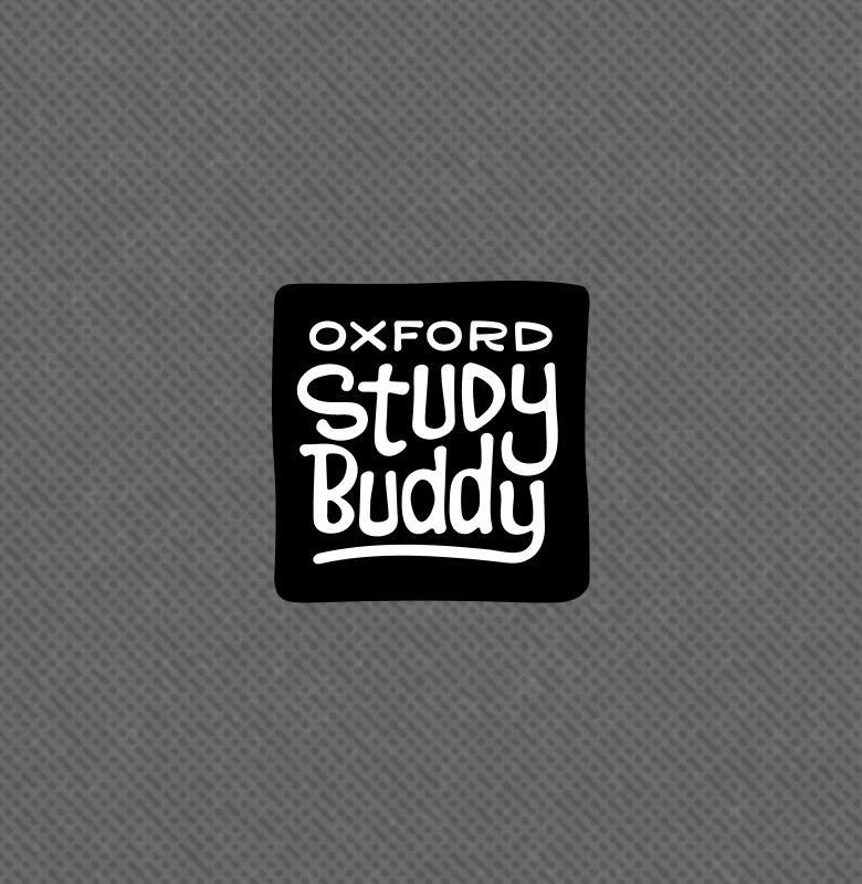

Both a boxed and unboxed version of the logo were designed for horizontal and vertical formats.

We created a 'boxed' version of the logo design which was featured as a 'stamp' in the corner of a page. This was used internally as well as on the books front covers.
Notes given to TUUMIK:
Remove the line under 'Oxford'
Remove the sharp edges on the 'S' of 'Study'
Remove the star
Break the connection between the 'y' of 'Study' and 'd' of 'Buddy'
Remove the extended stroke on the 'B' of 'Buddy'
Remove the horizontal line beneath 'Buddy' and use the descender of the 'y' to curve beneath 'Buddy' creating an outline
Add more shape to the letters by emphasising the contrast between thin and thick segments
Add subtle 'shimmer' lines as per moodboard.
Understanding the constraints.
Due to budgetary constraints, Oxford Study Buddy would be given a one-colour print-run, which would heavily constrain the design choices. In addition to this, it would be laid-out by OUP’s typesetters using an automated system with minimal intervention from OUP’s in-house design team to rectify errors.
Due to budgetary constraints, Oxford Study Buddy would be given a one-colour print-run, which would heavily constrain the design choices. In addition to this, it would be laid-out by OUP’s typesetters using an automated system with minimal intervention from OUP’s in-house design team to rectify errors.
With these constraints in mind, I worked hard to ensure the overall aesthetic had strong contrast, working black and mid-tones heavily into the design. To separate the Professor characters from Bud (the narrator of Oxford Study Buddy) I made their speech bubbles black. This not only helped users navigate to the black speech bubbles (for the TLDR breakdowns, if needed) but also helped give the overall aesthetic a more unique and interesting look.
Additionally, a lot of work was put into making the series text design (the 100+ page document containing the design system and style guidelines) simple and easy to understand for our typesetters. To help future-proof the lack of in-house intervention needed, each volume would be laid out by an overseas typesetting agency. The text design is the master-document used for the typesetters to set-up their automation process effectively so it needed to be comprehensive and clear.
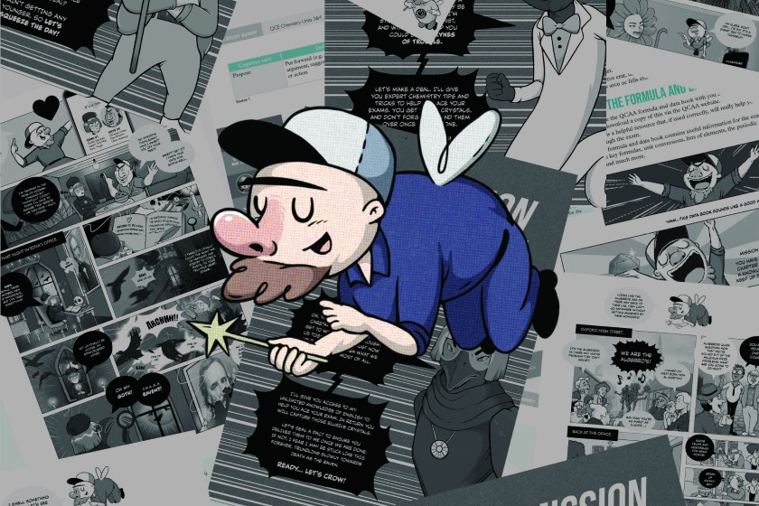


The comic narrative takes readers on a surreal journey in the pursuit of knowledge.
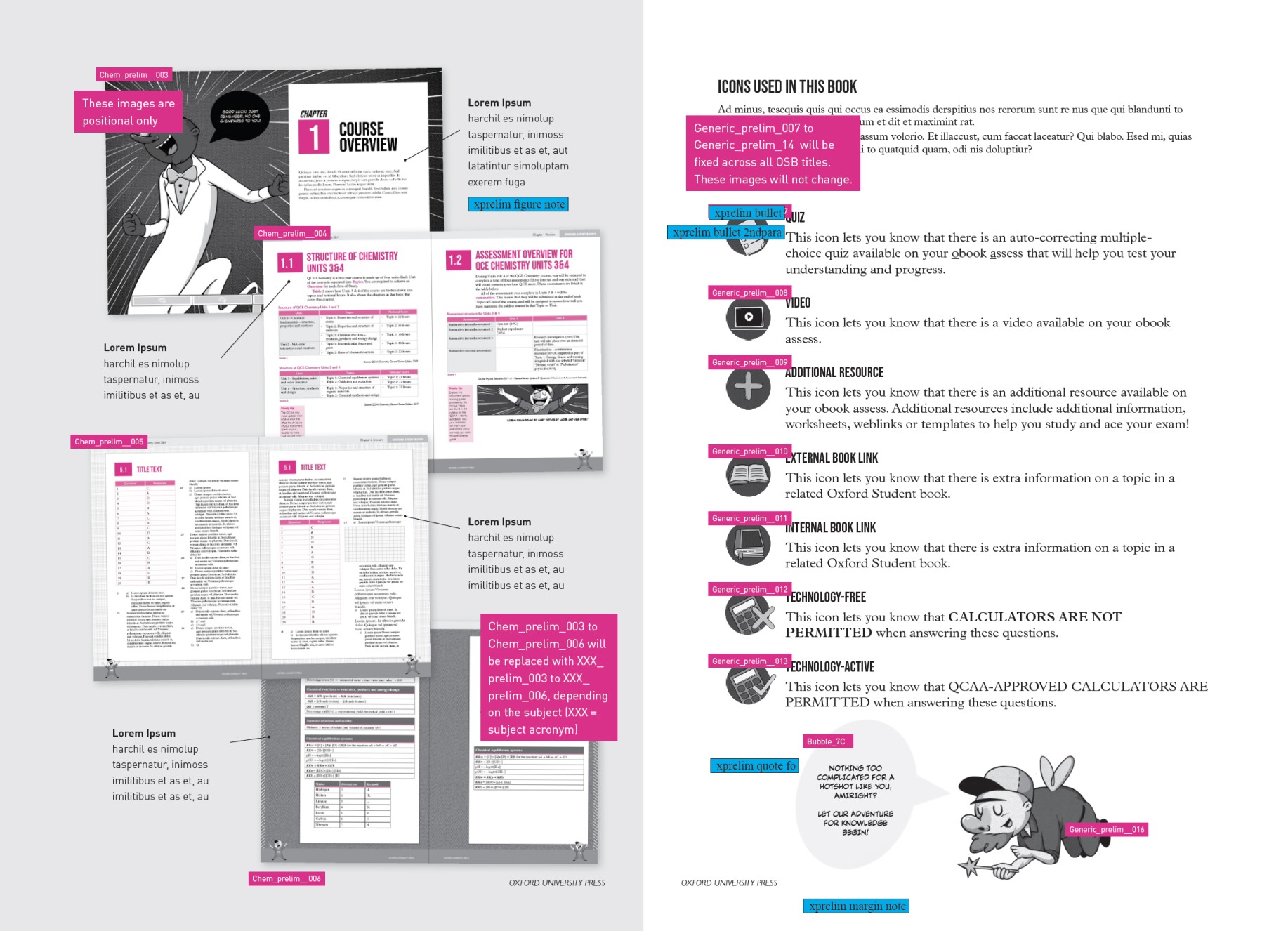


The Text Design features instructions to OUP’s overseas typesetters on laying out each book. It also indicates the paragraph and character styles used throughout all nine volumes.
The Text Design features instructions to OUP’s overseas typesetters on laying out each book. It also indicates the paragraph and character styles used throughout all nine volumes.
The branding process.
The moodboard I created for the series logo design featured funky hand-written styles that drew inspiration from skater brands, streetwear and alternative cartoons.
Initially I tried creating the logo myself but after experimenting with several versions, felt that we needed to outsource this job to an agency specialising in hand-written styles. Specifically, we wanted to work with the agency who designed our favourite logo used in the initial branding moodboard.
From here we tracked down the Estonian design-agency TUUMIK who were more than happy to help. I provided TUUMIK with a moodboard highlighting our goals as well as what we thought would work (and wouldn’t work) based on their own design.
After receiving the first iteration, I provided TUUMIK with detailed feedback to be taken on board.
BRANDING
The branding process.
The branding process.
The moodboard I created for the series logo design featured funky hand-written styles that drew inspiration from skater brands, streetwear and alternative cartoons.
Initially I tried creating the logo myself but after experimenting with several versions, felt that we needed to outsource this job to an agency specialising in hand-written styles. Specifically, we wanted to work with the agency who designed our favourite logo used in the initial branding moodboard.
From here we tracked down the Estonian design-agency TUUMIK who were more than happy to help. I provided TUUMIK with a moodboard highlighting our goals as well as what we thought would work (and wouldn’t work) based on their own design.
After receiving the first iteration, I provided TUUMIK with detailed feedback to be taken on board.
While creating the text design I also worked hard to account for variables and design issues unique to print (orphans, awkward page breaks for tables, etc.) while also considering our typesetters automated procedure and the constraints of external communication. To do this I outlined rules that were included in the guidelines, such as breaking table columns in multiples of two as opposed to one.


The text design was sent to our typesetters as a PDF as well as indesign file. Labels for paragraph and character styles were separated onto different layers, along with gridding guidelines for ease of use.
In total there were over one hundred paragraph styles created for this series. These were created to account for the various activities and sections unique to each volume. To do this I was given sample text created by the publishing team, which were given XML tags so I would know what section of the book they corresponded with.
The process of converting this sample text to a hierarchical format was time-consuming and required multiple rounds of edits from our publishing and editorial team. Not only was it super important that the text be pedagogical but it also needed to work with automation, which required a lot of pre-emptive thinking.
The illustration process.


Notes given to TUUMIK:
Remove the line under 'Oxford'
Remove the sharp edges on the 'S' of 'Study'
Remove the star
Break the connection between the 'y' of 'Study' and 'd' of 'Buddy'
Remove the extended stroke on the 'B' of 'Buddy'
Remove the horizontal line beneath 'Buddy' and use the descender of the 'y' to curve beneath 'Buddy' creating an outline
Add more shape to the letters by emphasising the contrast between thin and thick segments
Add subtle 'shimmer' lines as per moodboard.
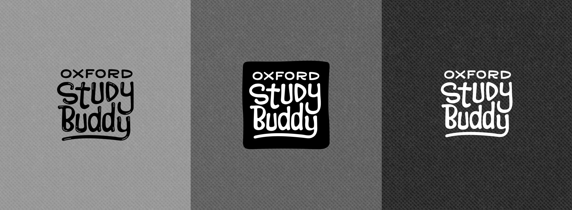


Both a boxed and unboxed version of the logo were designed for horizontal and vertical formats.
Both a boxed and unboxed version of the logo were designed for horizontal and vertical formats.
DESIGN
The process of creating a design system.
The process of creating a design system.
DESIGN
Creating a design system.
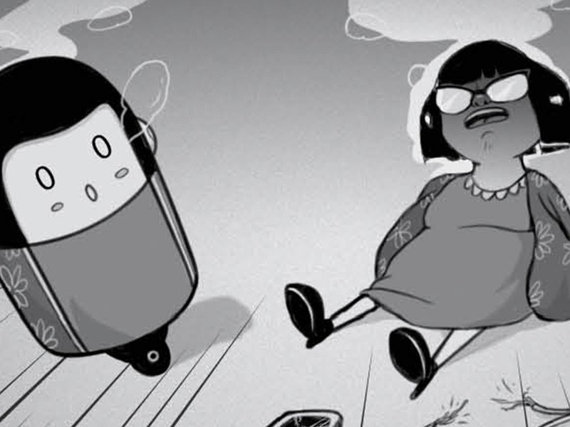

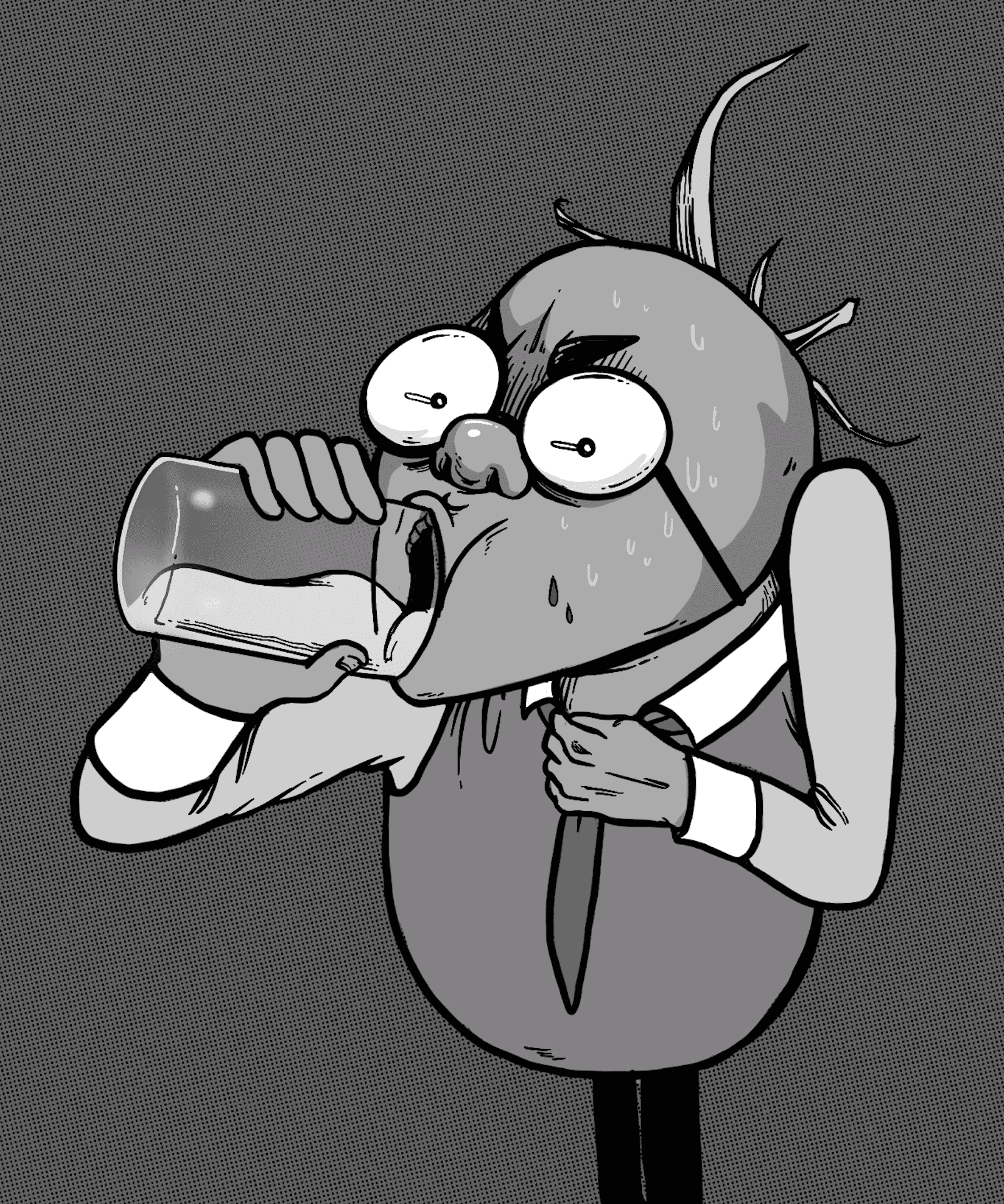


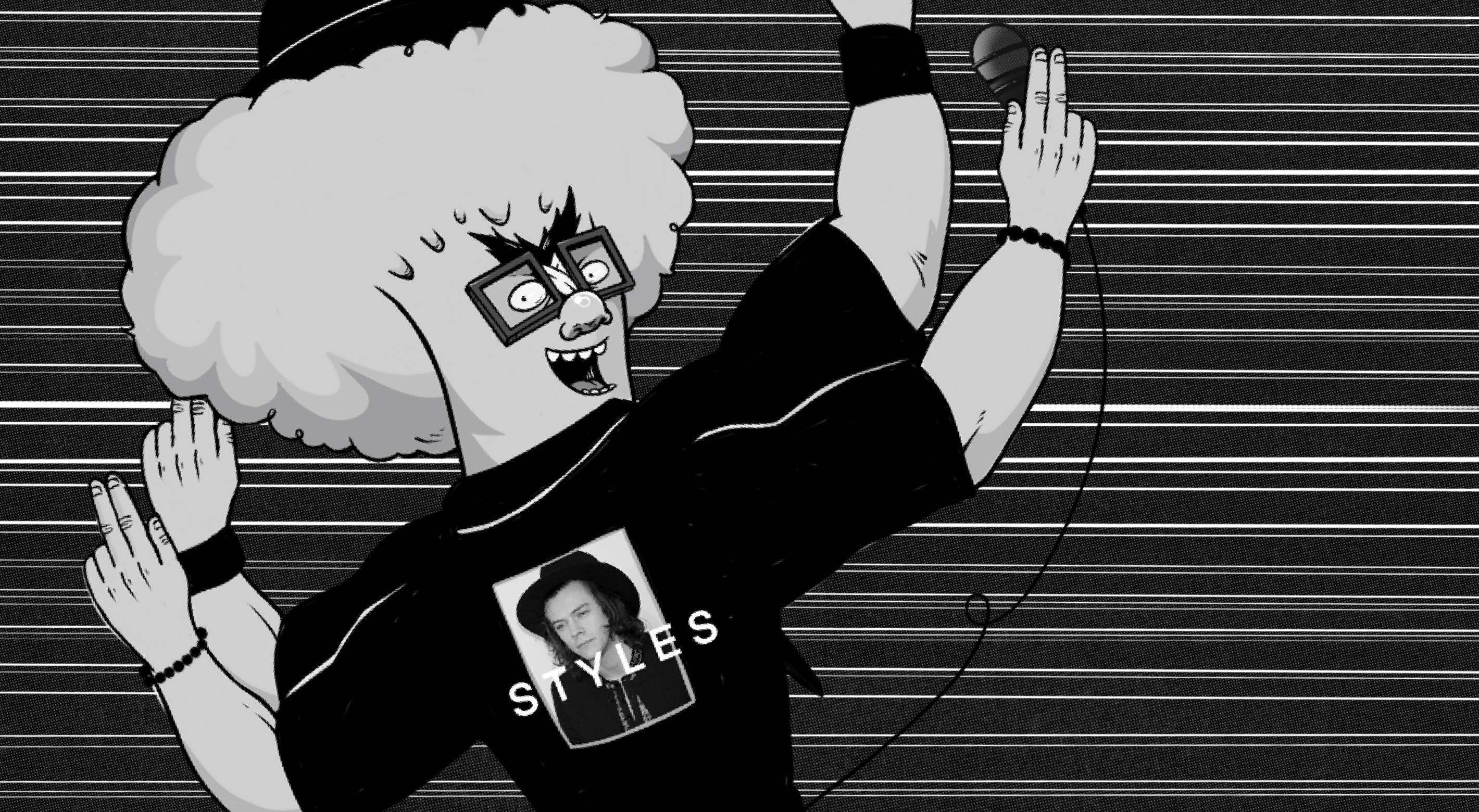

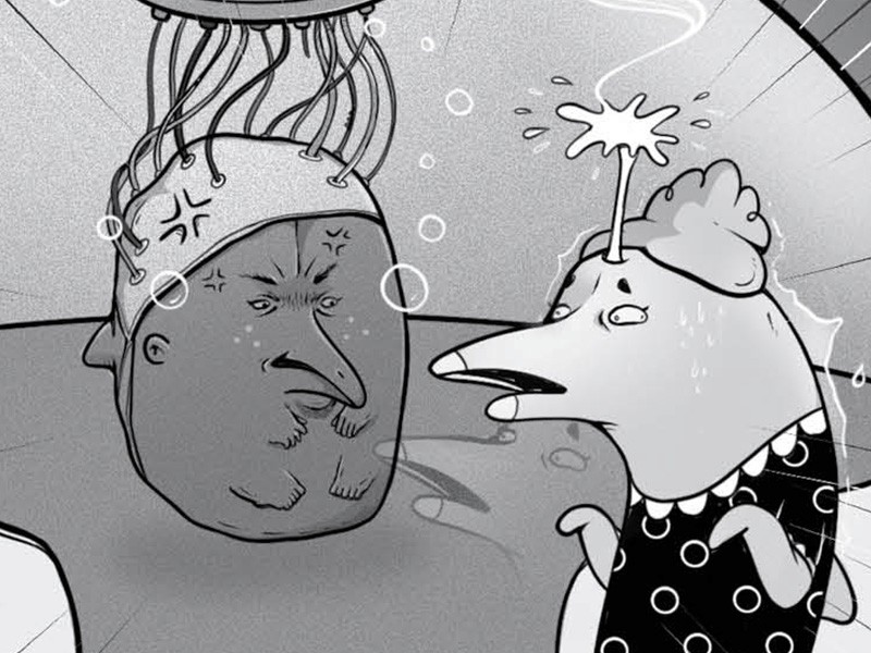

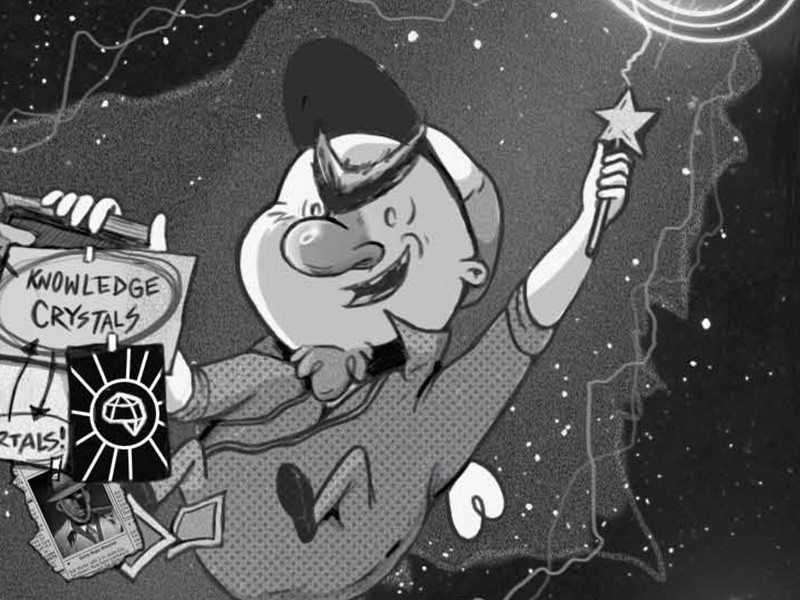

These designs were also tested with high-school students related to our team to get early feedback.
As secondary texts don’t usually feature illustrated characters, I felt it was important for the art direction not to appear too juvenile, which I also emphasised to our publishers in relation to the character dialogue used throughout.
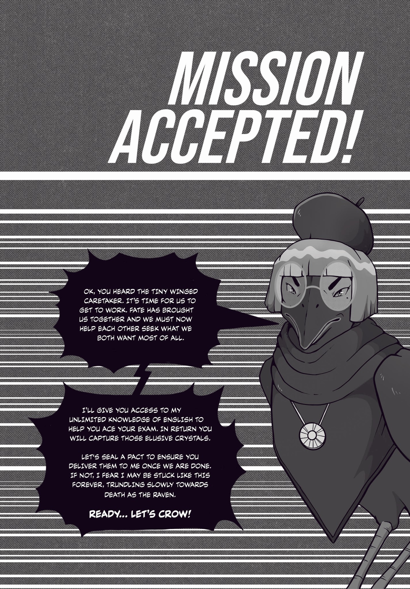
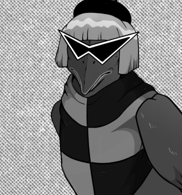
We also knew it was important to tie subject-specific references into the world itself. As an example, the English professor, Dr. Edna Allan Crow’s storyline revolves around finding love in the modern world. Unhappy with online dating, she performs a seance to be united with her unrequited love, Edgar Allan Poe. When the seance goes horribly wrong she’s transformed into a crow which she spends the remainder of the volume trying to break out of.
Each of the titular study buddy characters were also given names relevant to their specific subject, such as Coach Phil D’Burn for P.E., Professor Al Gorithm for Mathematics and Dr. Bronsen Burner for Chemistry. The world-building was fun for the whole team to be a part of and really added a creative edge that we felt would appeal to educators as well as students.
As Lead Designer, one of my main priorities was creating the series design system for Oxford Study Buddy. The design system takes all the complex information of an academic text and simplifies it in user-friendly segments.
With our secondary market being digital I also wanted to ensure Oxford Study Buddy translated effectively across various readers and platforms..
While creating the design system I also worked hard to account for variables and design issues unique to print (orphans, awkward page breaks for tables, etc.) while also considering our typesetters automated procedure and the constraints of external communication. To do this I outlined rules that were included in the guidelines, such as breaking table columns in multiples of two as opposed to one.


We also knew it was important to tie subject-specific references into the world itself. As an example, the English professor, Dr. Edna Allan Crow’s storyline revolves around finding love in the modern world. Unhappy with online dating, she performs a seance to be united with her unrequited love, Edgar Allan Poe. When the seance goes horribly wrong she’s transformed into a crow which she spends the remainder of the volume trying to break out of.
Each of the titular study buddy characters were also given names relevant to their specific subject, such as Coach Phil D’Burn for P.E., Professor Al Gorithm for Mathematics and Dr. Bronsen Burner for Chemistry. The world-building was fun for the whole team to be a part of and really added a creative edge that we felt would appeal to educators as well as students.


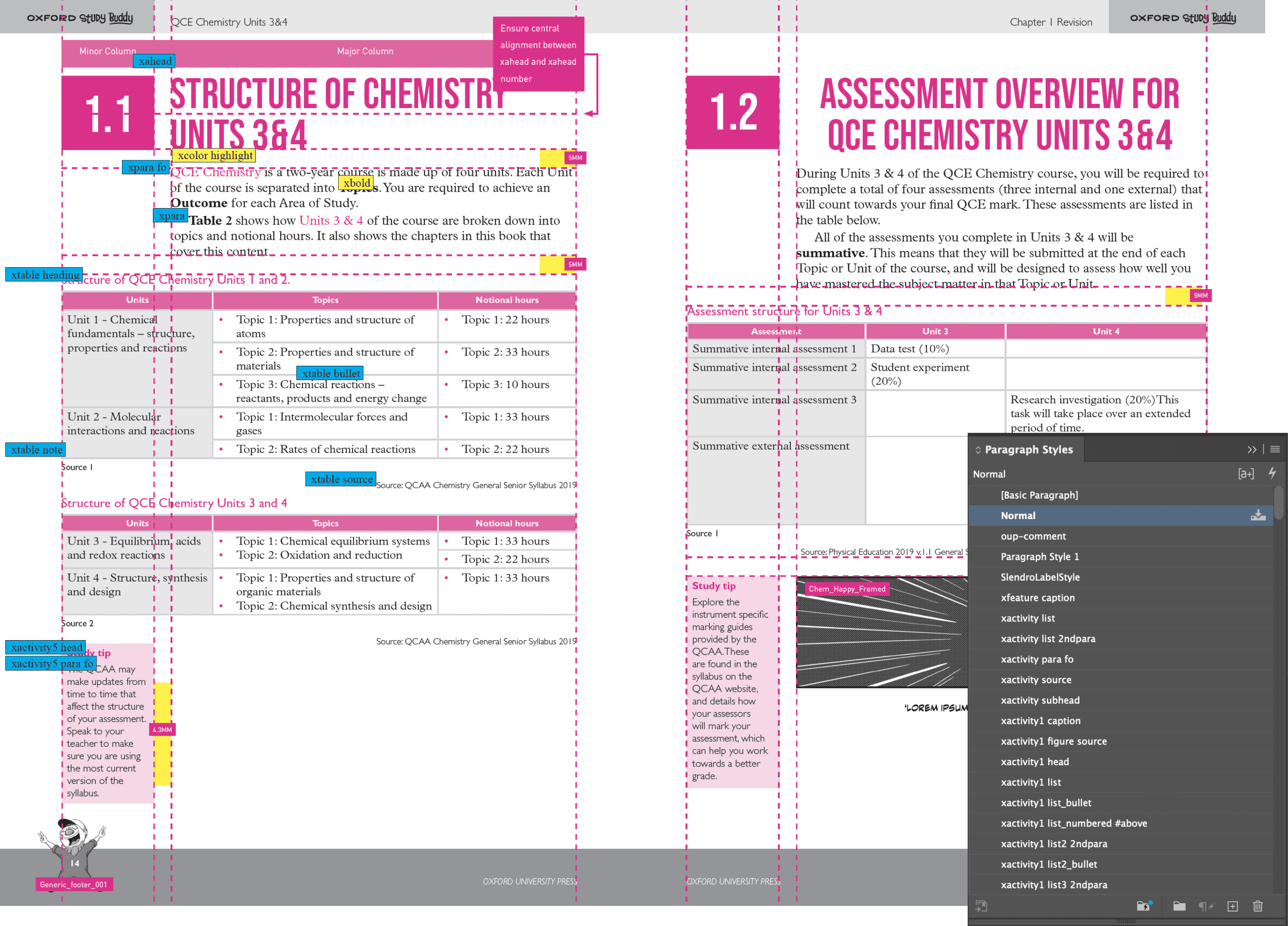


The text design was sent to our typesetters as a PDF as well as indesign file. Labels for paragraph and character styles were separated onto different layers, along with gridding guidelines for ease of use.
The text design was sent to our typesetters as a PDF as well as indesign file. Labels for paragraph and character styles were separated onto different layers, along with gridding guidelines for ease of use.
In total there were over one hundred paragraph styles created for this series. These were created to account for the various activities and sections unique to each volume. To do this I was given sample text created by the publishing team, which were given XML tags so I would know what section of the book they corresponded with.
The process of converting this sample text to a hierarchical format was time-consuming and required multiple rounds of edits from our publishing and editorial team. Not only was it super important that the text be pedagogical but it also needed to work with automation, which required a lot of pre-emptive thinking.
What I would do differently.
ILLUSTRATION
The illustration process.
The illustration process.


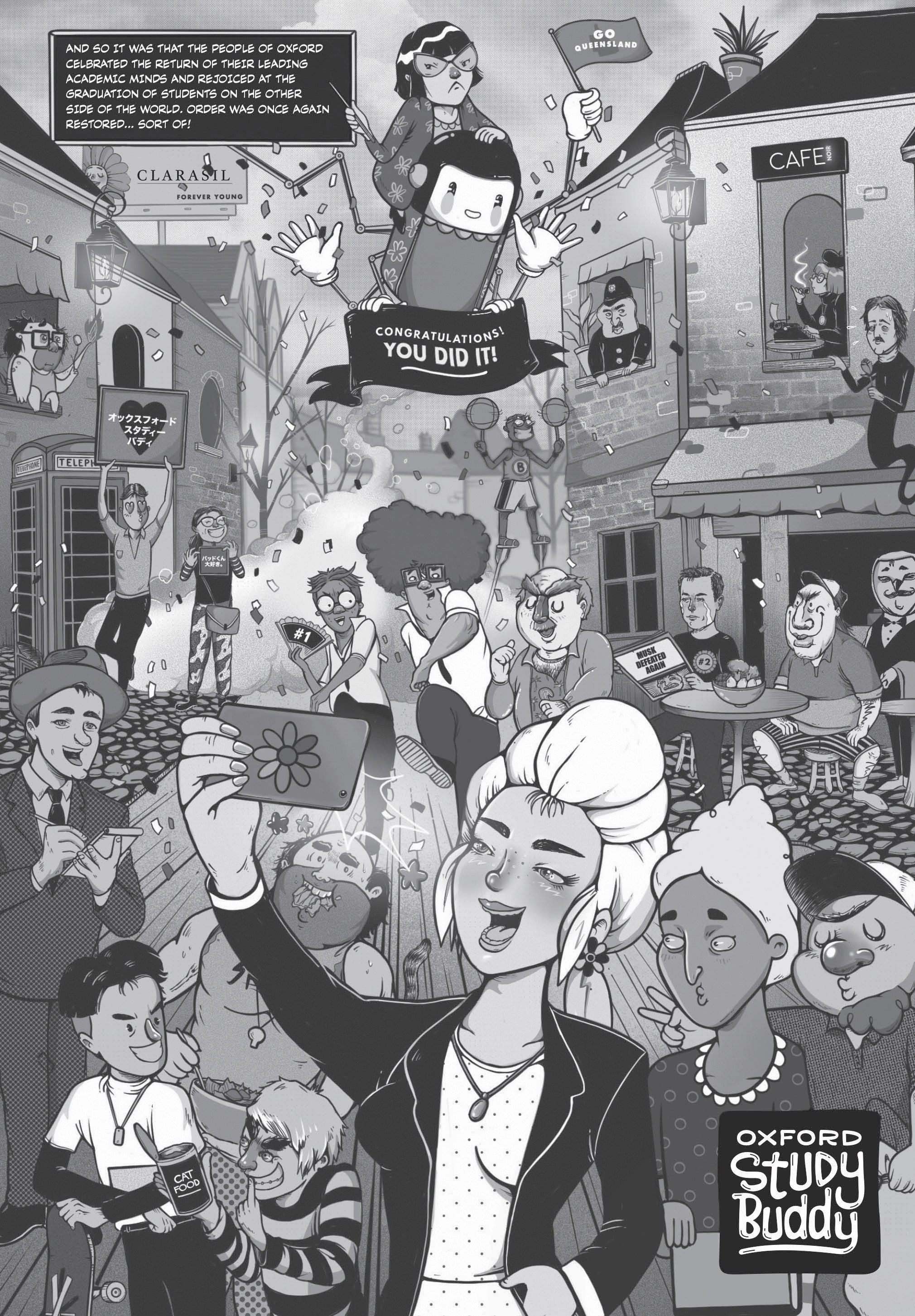
As an illustrator I created the entire universe of Oxford Study Buddy, including its unique characters, comic and splash pages as well as iconography. This artwork spans nine books with bespoke comic-pages created for each.
Drawing inspiration from an array of sources, such as manga and Adult Swim, I crafted a unique art direction balancing cute, weird and humorous designs catered to different personalities.
These designs were also tested with high-school students to get early feedback.
As secondary texts don’t usually feature illustrated characters, I felt it was important for the art direction not to appear too juvenile, which I also emphasised to our publishers in relation to the character dialogue used throughout.


Let's work
together.
This website was designed and
developed by Clay Pixels.
joshuascott888@outlook.com.au


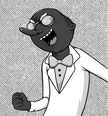


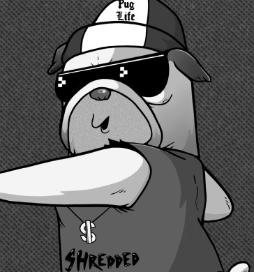


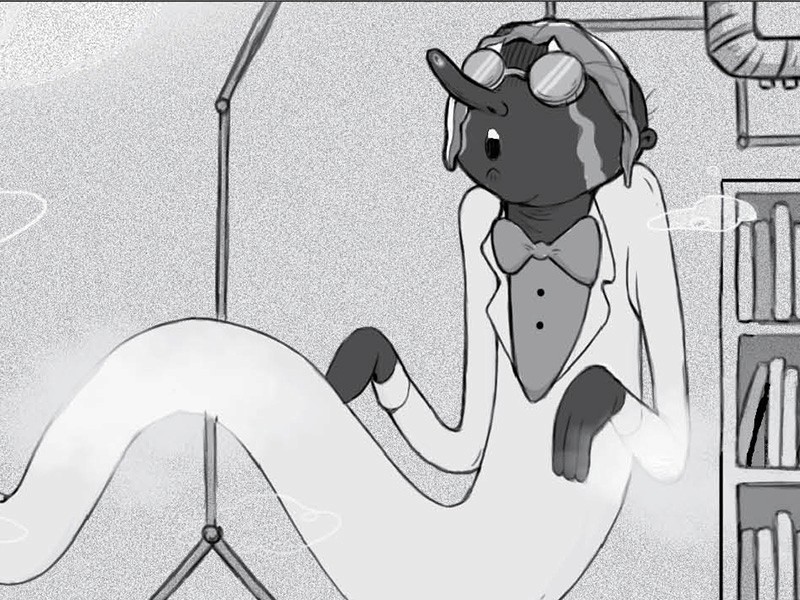


We also knew it was important to tie subject-specific references into the world itself. As an example, the English professor, Dr. Edna Allan Crow’s storyline involves finding love in the modern world. Unhappy with online dating, she performs a seance to be united with her unrequited love, Edgar Allan Poe. When the seance goes horribly wrong she’s transformed into a crow which she spends the remainder of the volume trying to break out of.
Each of the titular study buddy characters were also given names relevant to their specific subject, such as Coach Phil D’Burn for P.E., Professor Al Gorithm for Mathematics and Dr. Bronsen Burner for Chemistry. The world-building was fun for the whole team to be a part of and really added a creative edge that we felt would appeal to educators as well as students.

AWARDS
The Educational Publishing Awards, 2022.
The Educational Publishing Awards, 2022.
AWARDS
The Educational Publishing Awards Australia, 2022.
The Educational Publishing Awards is the top award for publishers in Australia. Excitingly, Oxford Study Buddy won best reference resource for secondary students in 2022. This was remarkable for a new series.
The judge's comments: “Based on principles of cognitive science, Oxford Study Buddy Revision and Exam Guides is an original suite of reference resources that address the stress associated with exam study and supports students as they master and retain knowledge and skills.
The unique inclusion of comic stories, a sarcastic sense of humour and pop culture references help to engage students. Aligned to the descriptors of the Queensland state curriculum, this reference resource provides depth, while clearly breaking down exam revision in a meaningful way for students.
Both the print and online resources are user friendly and easy to navigate, and support students in flexible ways at different times and at different stages of their study.”
REFLECTIONS
Reflecting on what I would do differently.
Reflecting on what I would do differently.
With the series now available in book stores across Australia, I'd like to take a moment to reflect on areas where we could have made improvements. First and foremost, I would prioritise even more audience testing and feedback-gathering, in order to ensure our concept and designs were as effective as possible. Although we did test our designs, I feel a more formal and rigorous approach would have been benificial.
With the series now available in book stores across Australia, I'd like to take a moment to reflect on areas where we could have made improvements. First and foremost, I would prioritise even more audience testing and feedback-gathering, in order to ensure our concept and designs were as effective as possible. Although we did test our designs, I feel a more formal and rigorous approach would have been benificial.
Additionally, I would love to see Oxford Study Buddy expand its marketing in unique and creative ways. I think there is a lot of opportunity for Oxford Study Buddy to build a strong social media presence, as well as be a part of various content and viral marketing campaigns.
Additionally, I would love to see Oxford Study Buddy expand its marketing in unique and creative ways. I think there is a lot of opportunity for Oxford Study Buddy to build a strong social media presence, as well as be a part of various content and viral marketing campaigns.
