
UI DESIGN
UI DESIGN

UX DESIGN
UX DESIGN
Transforming the user experience for sports fans.
Transforming the user experience for sports fans.
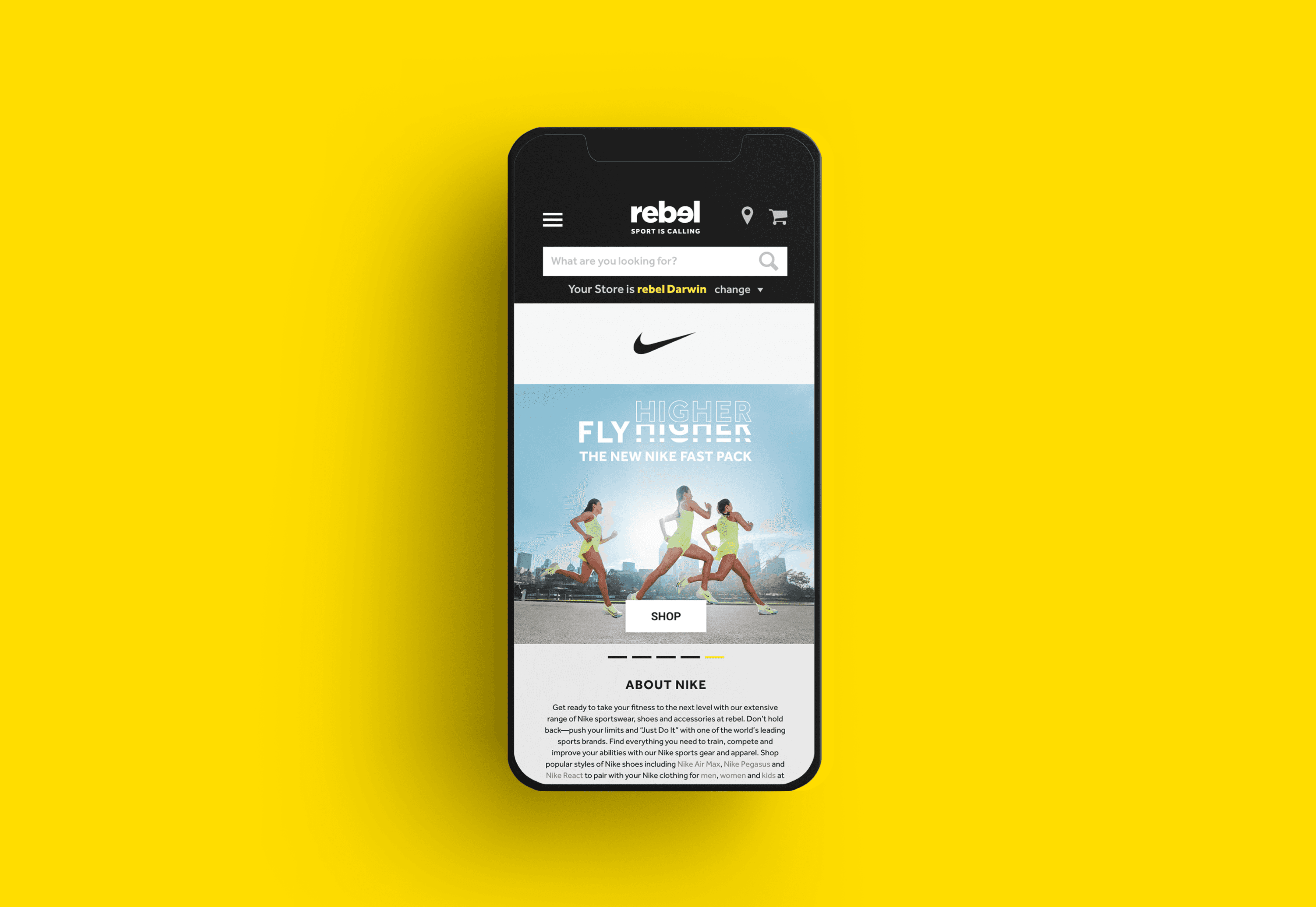
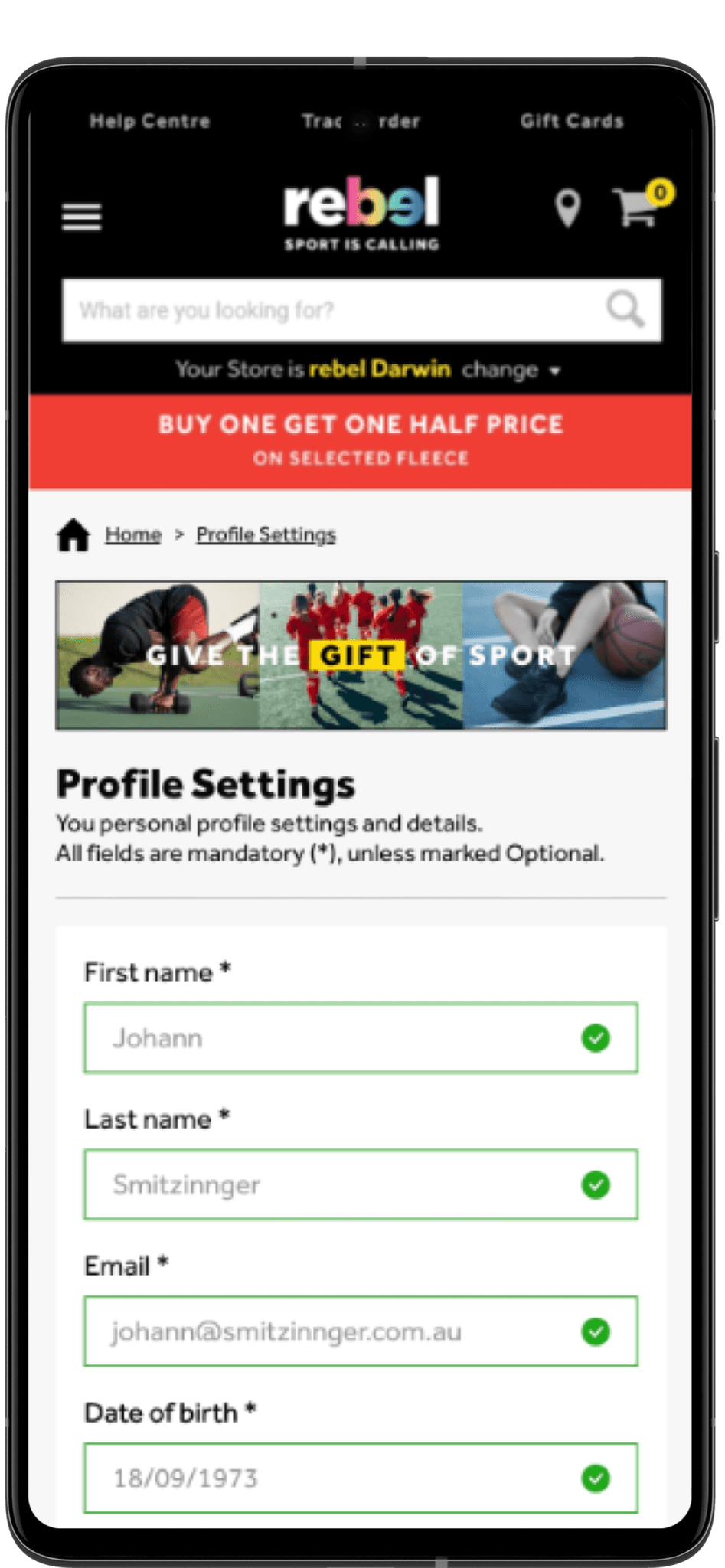
Rebel Sport is Australia's largest sports retailers with a website averaging five million visits per month. Being one of Australia's largest retailers, they enlisted the services of CX-agency YUZA to revamp their online shopping experience. Throughout the redesign, I served as both a UI/UX Designer for YUZA and a Visual Designer for Rebel's internal team at different stages of the project. My role included analysing usability issues across the website and then working hands on to implement solutions.
Rebel Sport is Australia's largest sport retailer with a website averaging five million visits per month. Being one of Australia's largest retailers, they enlisted the services of CX-agency YUZA to revamp their online shopping experience. Throughout the redesign, I served as both a UI/UX Designer for YUZA and Rebel's internal team at different stages of the project. My role included analysing usability issues across the website and then working hands on to implement solutions.
Rebel Sport is Australia's largest sport retailer with a website averaging five million visits per month. Being one of Australia's largest retailers, they enlisted the services of CX-agency YUZA to revamp their online shopping experience. Throughout the redesign, I served as both a UI/UX Designer for YUZA and Rebel's internal team at different stages of the project. My role included analysing usability issues across the website and then working hands on to implement solutions.
My involvement in this project.
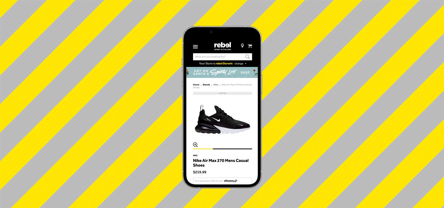

As a UI/UX Designer, I collaborated closely with the team at YUZA to identify user pain points, develop wireframes and implement solutions to improve overall usability.
Key areas of focus included:
1. The purchase journey
2. Membership dashboard
3. The user profile
4. Order history.
As a UI Designer, I was also responsible for translating these solutions into pixel-perfect designs across mobile, tablet and desktop devices. I also played a role in developing and maintaining Rebel’s design system to ensure consistency and scalability across all platforms.
Lastly, I worked directly with Rebels internal team to edit product and brand photography to help build the companies visual identity during a time of transition.
Addressing usability issues.
The previous iteration of Rebel Sports website had several usability issues that needed to be addressed to provide users an optimal experience. In addition to usability issues, Rebel wanted to expand upon user membership, requiring new areas of the site to be built. In summary our deliverables included:
Building and implementing Rebel’s design system, based on updated style guidelines
Editing product photography to help build Rebel's visual library
Brainstorming and implementing solutions to all areas of membership, including a membership dashboard for centralised information
Performing user testing on updated areas of the website
Addressing pain points surrounding: order history, user profiles, the user checkout and more.
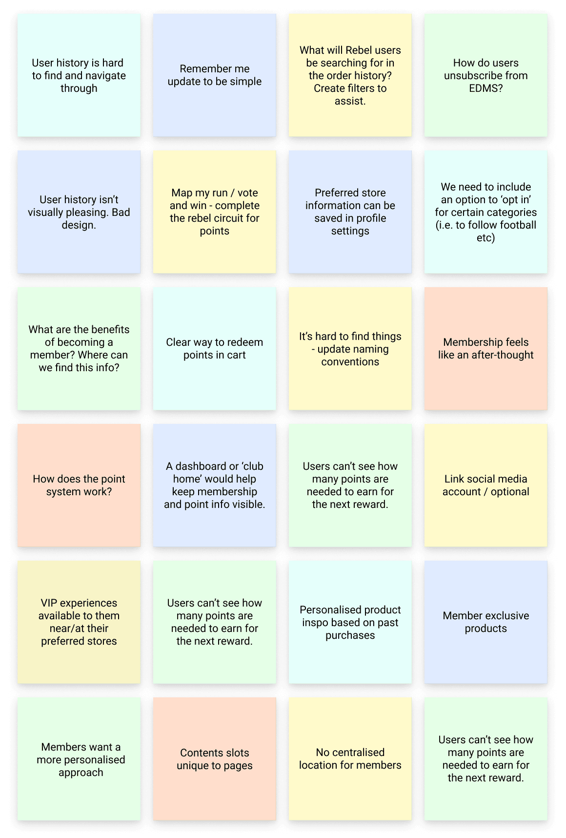

Miro board notes from one of our internal brainstorming sessions.
Understanding Rebels audience.
With over 160 stores across Australia, Rebel Sports target audience is quite broad. Aimed at sports enthusiasts of all demographics, Rebel offers products for all Australians looking for high-quality sporting equipment.
Having said this, according to web analytics, the average consumer at Rebel’s website is female, between the ages of 25-34. Also 95% of their consumer base are contained within Australia with browsing habits catered to the lifestyle and fashion industries.
In addition to these shoppers, Rebel Sport also offer products to professional athletes and teams at various levels.

Rebel Sports Vision Statement.
Building Rebel's design system.
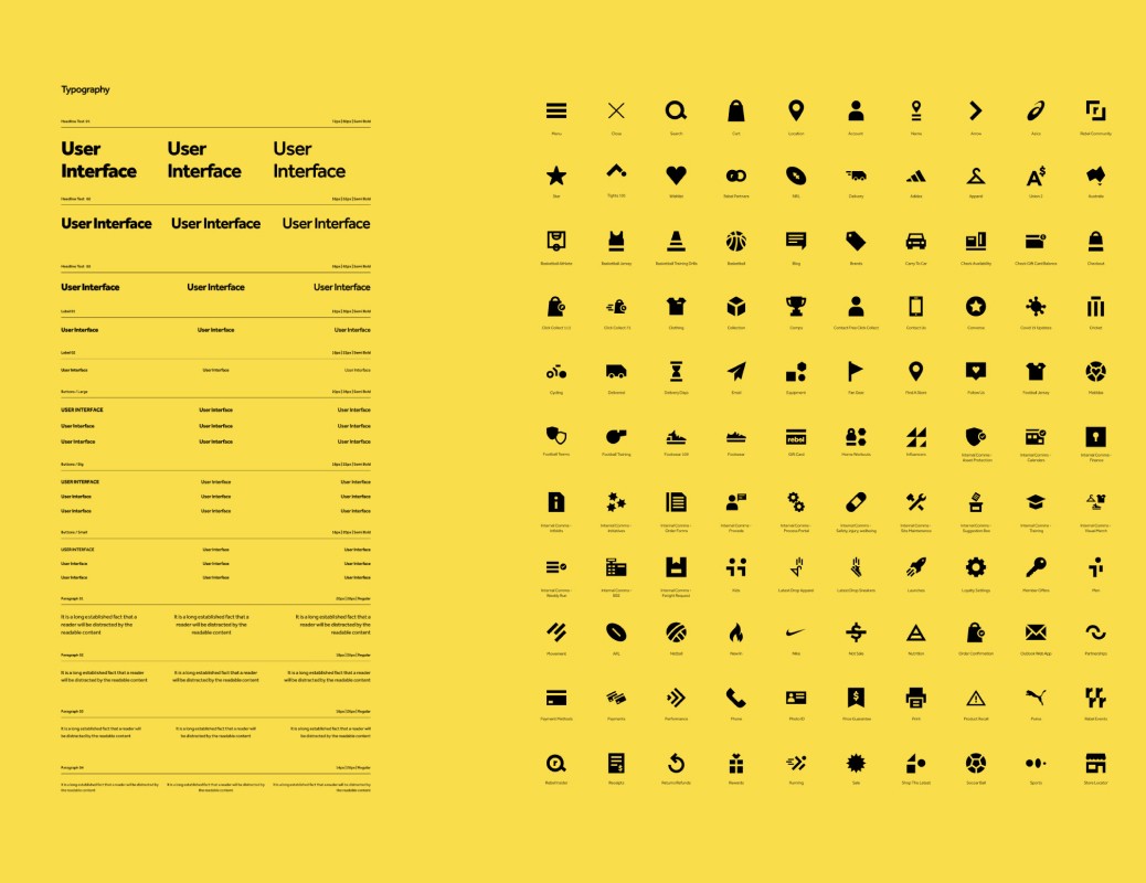

YUZA was presented a unique challenge when working with Rebel. Despite having a large marketing team, Rebel had no official design team. As previous iterations of the website had been made externally and the brand was undergoing a transformation, we were tasked with the responsibility of creating a design system from scratch.
We knew it was extremely important to establish this design system early, to ensure consistency across the entire project. After conducting research on Rebel’s brand guidelines, we gained an in-depth understanding of the design specifics and then began building their design system.
The design system encompassed many elements and components, including:
The colour palette
The typographic scale (for desktop and mobile)
Bootstrap 4 grid system (for desktop, tablet and mobile)
Padding elements
Iconography
Atomic components
Molecular components
Component organisms.
Given our timeframe, many of our designers were tasked with starting the design of several areas of the website while the design system was still being developed. While this wasn’t ideal, we carried out these designs as incomplete (yet high-fidelity) mockups to present to Rebel’s internal team for early feedback.
Despite the fact that the majority of our design choices needed to be in accordance with Rebels pre-established guidelines, we were able to explore creative solutions to certain components. These included Rebel’s product cards (included in the case study below).
For ease of scalability, our designers also worked with the 8 point grid system to ensure consistency. This helped keep the overall design neat and clean. All padding, margins between elements, iconography and line heights were created in strict adherence to this principle.
Once the design system was complete, we retro-actively polished up our initial designs to fit the new system. Despite being less than optimal, we agreed that this was the smartest and most efficient way to work, given the obstacles.
Adding to Rebel's visual design.
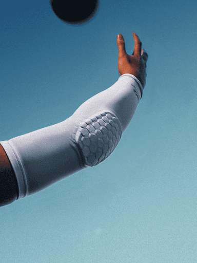
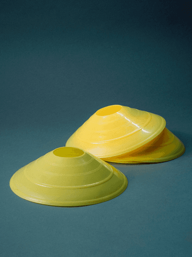
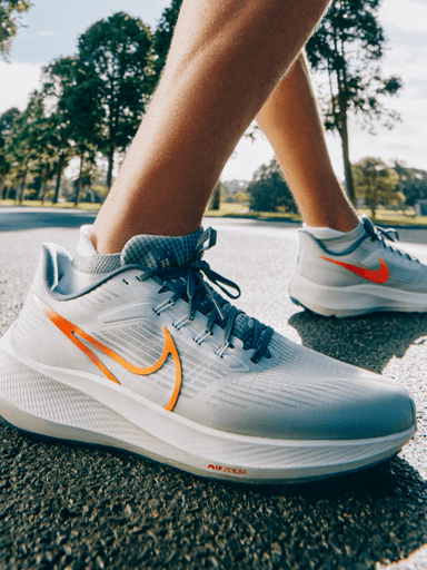
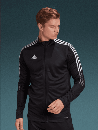
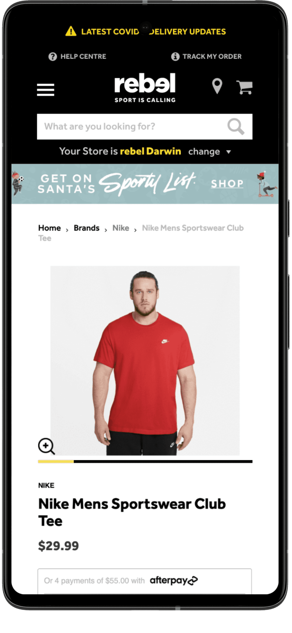
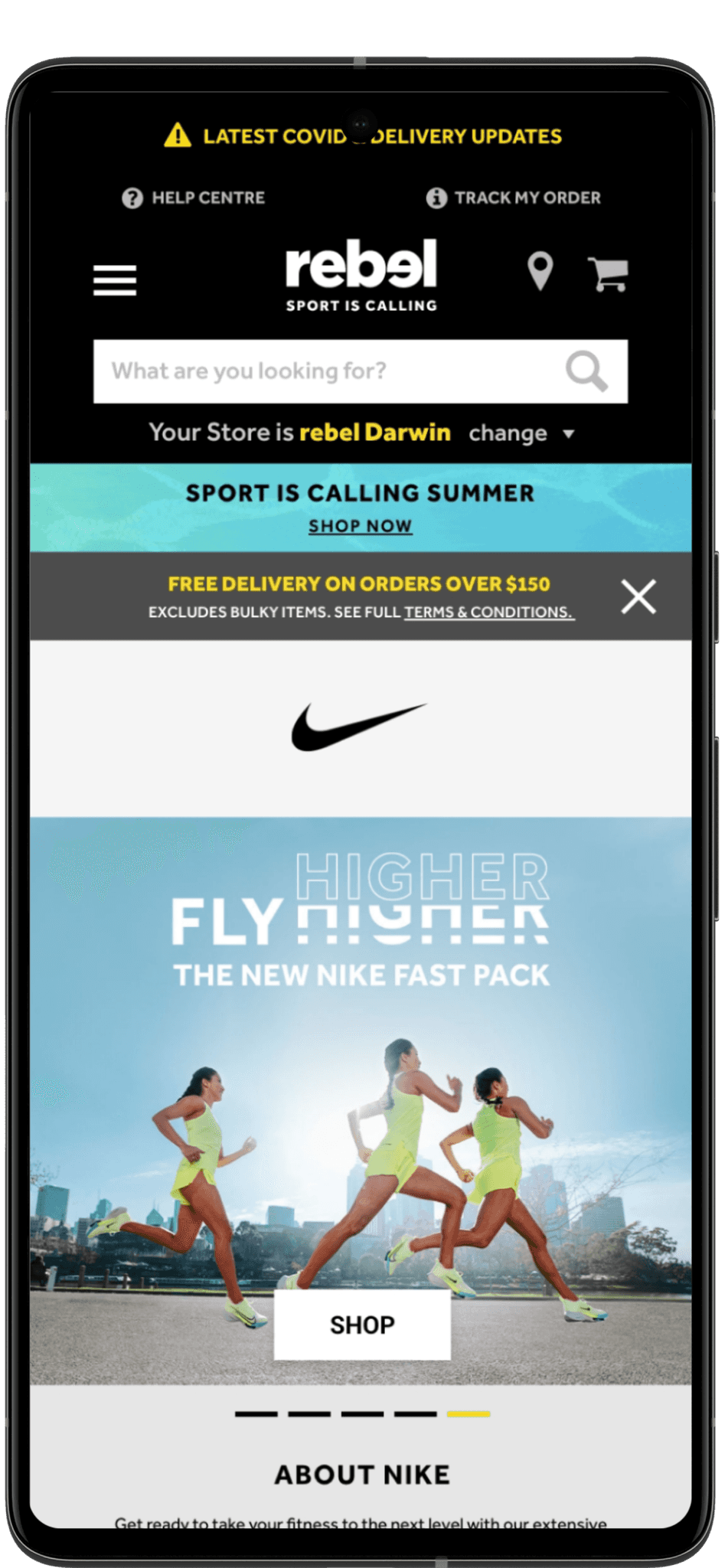
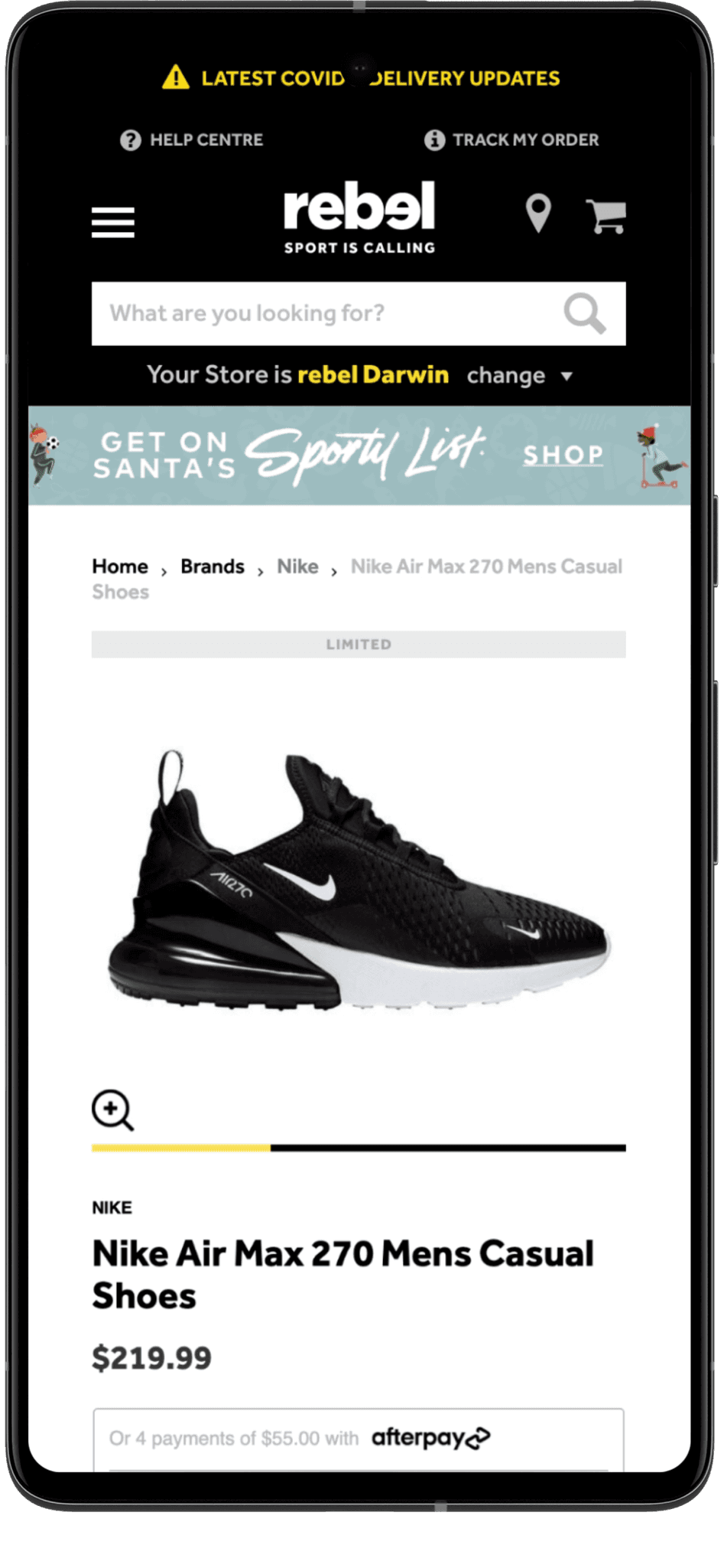
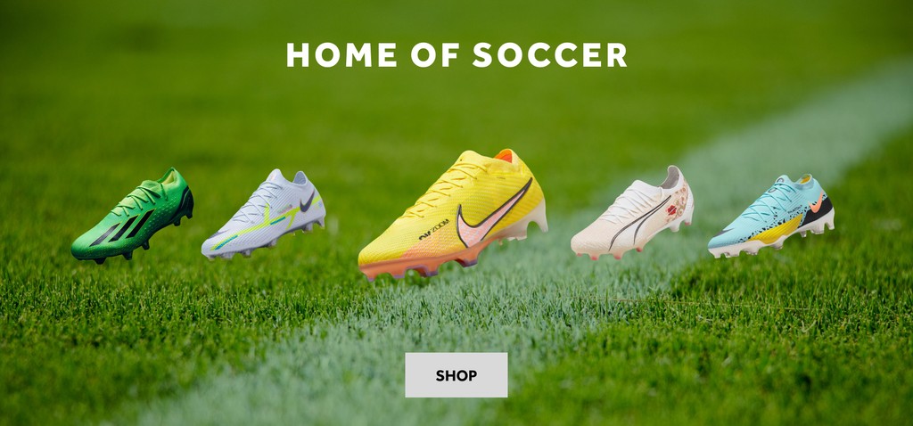
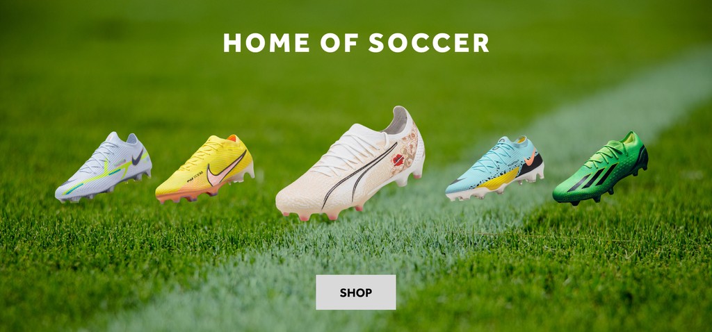
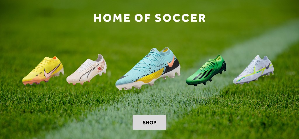
In addition to working with YUZA’s UI/UX team, I worked with Rebel’s internal marketing team during quieter stages of the project, to assist with product image retouching and photo manipulation. Both Rebel and YUZA found it beneficial to work with a UI/Visual Designer with a background in Graphic Design.
A lot of this work involved masking out subjects from backgrounds that were photographed in a sub-optimal conditions (low contrasting, complicated backgrounds). Luckily I have many years of experience as an illustrator using a Wacom tablet.
Adding to the complexity were composite shots, requiring me to build backgrounds using gradients and distortions to ground certain products.
In addition to retouching and masking, I also helped build Rebel’s product inventory with some creative involvement that took into consideration the look and feel of their new rebrand. This involved a bit more creativity, which I always enjoy being a part of.
Creating a members dashboard.
The information gathered from our team indicated that users were unhappy with most experiences related to membership. Accessing information felt disjointed, as if being a Rebel Active member was an after-thought and not an exclusive opportunity as they were lead to believe.
One of the key issues was related to how membership information was dispersed. With the previous design, users accessed information via a dropdown menu taking them to a new page. This created a cluttered experience as the site lacked a centralised location for all membership content.
The selections available were also limited. With the collaboration of Rebel’s internal team, our team also took the opportunity to explore further user incentives.
What were the constraints?
After discussing our prospects with the development team, I was given the constraint of working with a right fly-out menu as the fixed design for our dashboard. This was due to an already created fly-out menu used for membership sign-up and the labour costs involved with creating an entirely new dashboard.
This constraint wasn’t problematic but it did mean information needed to be compartmentalised for deeper level storage. For this I explored three options of storage, which included navigation tabs, accordions and right and left arrows for users to move back and forth.
Analysing member dashboards.
I investigated three less-direct competitors of Rebel to better understand how their membership incentives work. These three memberships included Nike Plus, Adiclub and Northface’s XPLR Pass.
What I learned from this analysis was that although all three companies offered basic perks like early access to new products and free shipping, Nike Plus and Adiclub offered additional rewards for completing challenges (such as 5km runs).
This analysis highlighted the importance of customer engagement, particularly in the sporting retail market, where users already take pride in completing challenges to gain rewards.
Furthermore, all three companies made it easy for users to access information by creating a centralised location for all membership content.
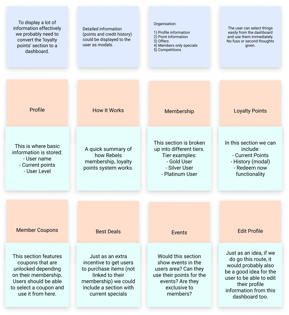
Some notes from the Miro board presentation.
Applying this information.
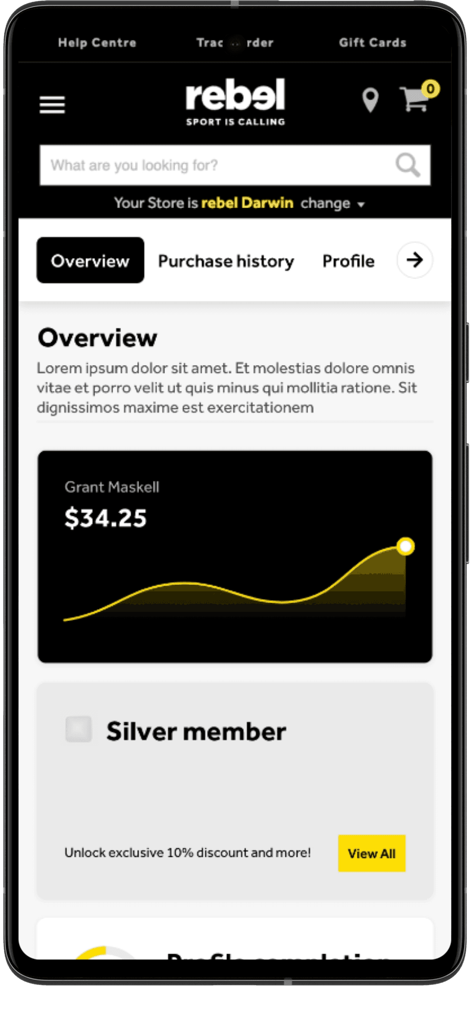
After presenting the competitive analysis to the team, I was given the task of designing the dashboard. The main objective, of course, was to provide users with easy access to all their membership information. It also needed to be intuitive, user-friendly, and visually appealing.
To start with, I included all the essential features such as the membership tier system, Rebel Active memberships, and profile information. This allowed users to quickly access their membership status, personal details, and other critical information in one central location.

Mockups of the members dashboard.
Additionally, we wanted to include features such as active credit, user wishlists, and order history to provide users with a comprehensive overview of their past and present purchases. These features were also essential as they allowed users to track their order history, monitor their purchases, and manage their accounts more efficiently.
I also included options for various incentives, such as coupons, offers, recommended events, and competitions. These incentives would provide users with a personalised experience based on their preferences and interests.
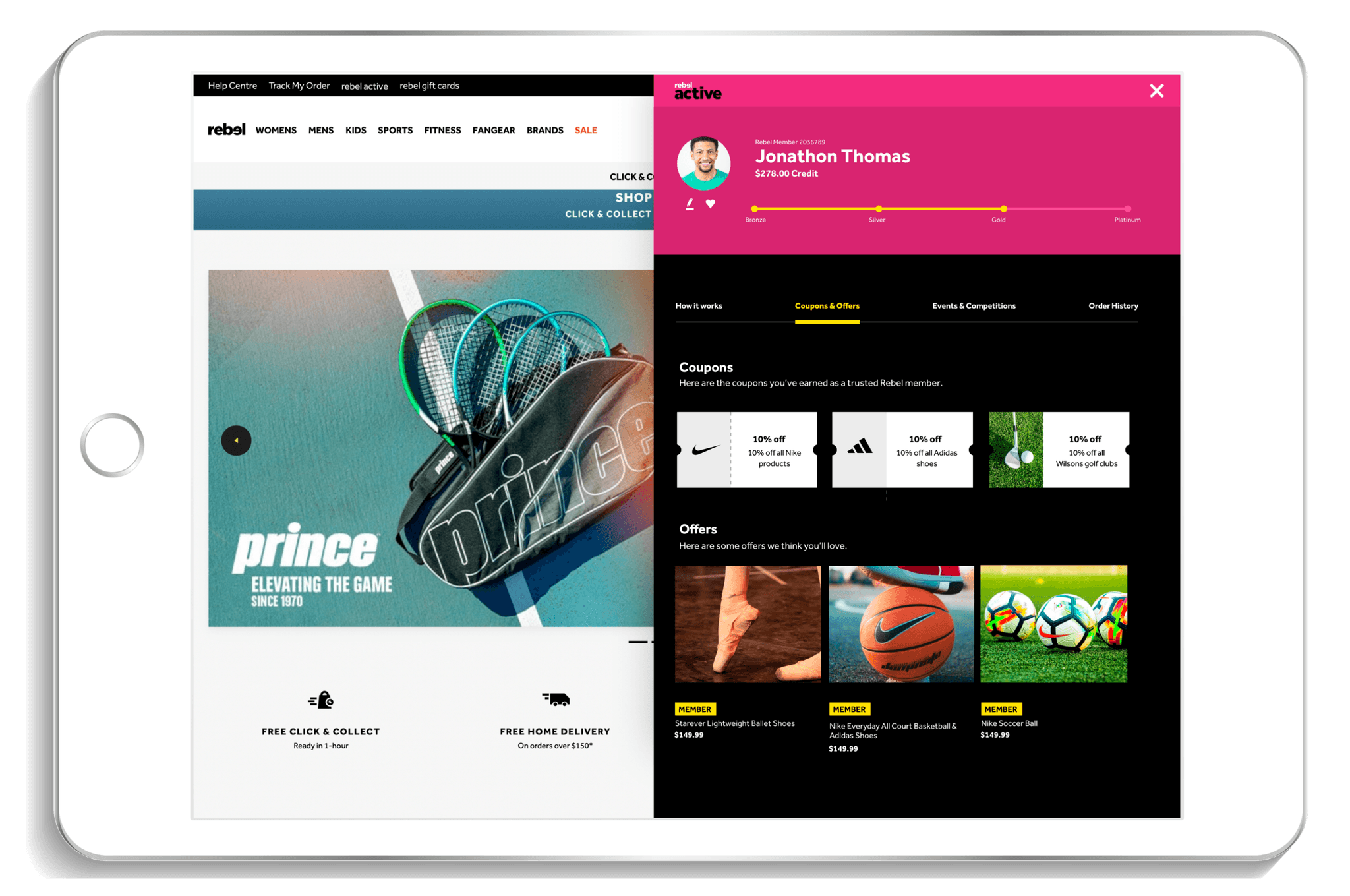
A mockup of the members dashboard for tablet devices.
Applying this information.
The final designs took into consideration all user feedback from our initial usability sessions, along with internal and external brainstorming sessions. For even more options, our other designers included their own solutions, which were included in this discussion.
At the time of writing this case study, the final design for the member dashboard is still pending, based on even further feedback and evaluation from users. The live date for the first iteration of this product redesign is still several months away and while I would love to include a final outcome in this case study, it has yet to be determined.
Having said this, I’m happy to see our team and Rebel place such high importance on thorough usability testing. I’m also excited to see the final results when they eventually go live later on in development.
Creating new product cards.
I had the opportunity to redesign Rebels product cards as the previous design used outdated styling.
My main priority was to create a clean and simple product card that would entice the user, not overwhelm them. The most important thing was to use a clear hierarchy of information and give enough space for the product images to do most of the work.
I wasn’t given too many constraints, just to make sure the designs adhered to the 8 point grid system, using multiples of 8 to pad elements within the cards.
In terms of how these products cards would be displayed on mobile, we agreed that a carousel would most likely be used in the order history section with the product cards on the shopping page to be stacked vertically. This would allow the images and information to entice users as effectively as possible.
I designed several options which I then presented to the team. In the end, the final design was an amalgamation between my work and the work of our other designers.
After doing a thorough competitive analysis, our team gathered to discuss ideas. As we were looking for a streamlined yet comprehensive design tackling both the users past and pending orders, one of our designers suggested a flyout menu.
This was a great solution because it would allow us to design within a much wider space than a table of rows and columns. The idea being that users would select their orders from a table and expand to a flyout if needed. This expanded view could contain all sorts of information.
Streamlining the order history section.
YUZA’s research found that users had issues navigating through their order history and pending order information.
One issue was due to the lack of filters or search functionality, making it difficult for users to locate specific orders. Over all though (and most notably) users found the page to be cluttered and tables to be difficult to consume.
Other users had issues with a lack of detailed information (such as a proper invoice breakdown).
From doing a thorough competitive analysis (more information below), there’s no reason why this needed to be the case. In fact, despite being an information-heavy part of the website, there’s no reason why it couldn’t be redesigned in a functional yet streamlined way, information intact.
All the successful examples discovered in the competitive analysis had strong use of negative space as well as text and information hierarchy.
Doing a competitive analysis of order history information:
Making the order history information accessible: Order history information needs to be easy to locate. This was incorporated into our previous usability solution of creating a centralised dashboard.
User-friendly: Successful designs simplified things, using negative space, product photography and typographic hierarchy effectively.
Compartmentalisation: Successful designs compartmentalised information with tabs, accordions and buttons to show more details.
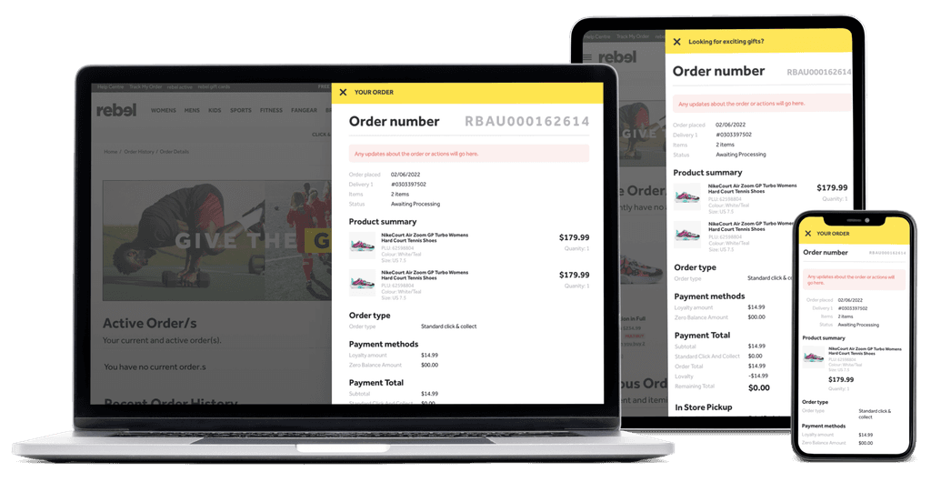
An expanded view of the users order history was designed as a flyout menu. Users select their orders from a table to see a comprehensive breakdown.
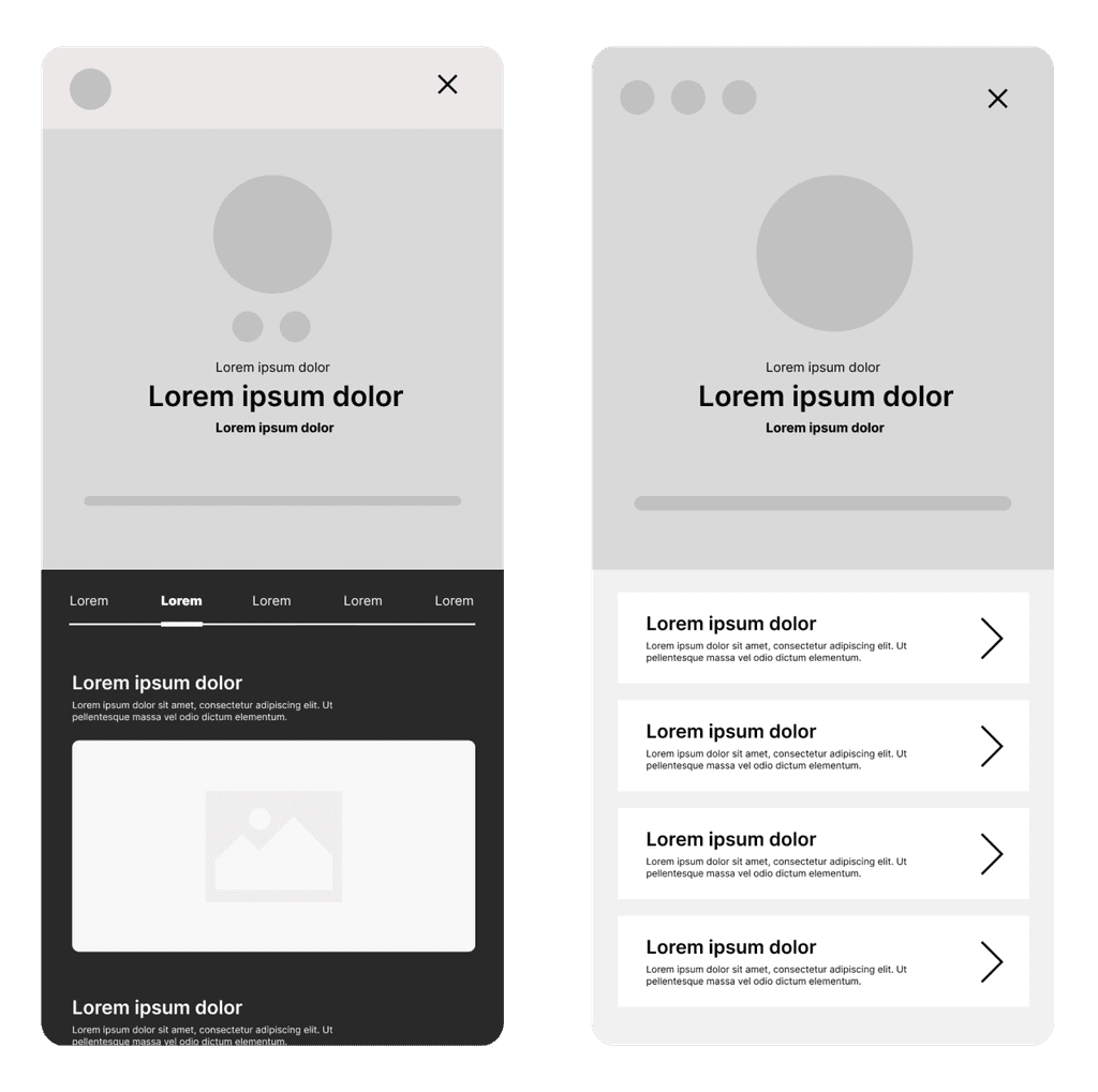
Wireframes of the members dashboard.
Creating pixel perfect designs.
A large part of this role involved me working as a UI Designer in a hands-on capacity to create pixel-perfect designs.
Our newly created design system served as a foundation for the rest of our work. As previously mentioned, we worked with the 8 point grid system to ensure a clean and consistent rhythm was upheld across all devices. For each part of the user journey we created desktop, tablet and mobile variations.
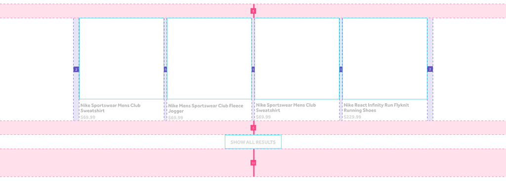

During this time, our team coordinated regularly, despite remote-working conditions, to ensure consistency was upheld across all screens.
Upon completion we would hand over screens to the development team to be implemented.
What I would do differently.


Offering more feedback: My approach to design is to question everything. I love tearing designs apart and reassembling them with all the elements on the table for discussion. With this approach, no designer is in control of the outcome and the end result is usually an amalgamation of all of our work. With this said, I feel I could have worked harder to be more hands-on with my feedback. I also feel YUZA could have benefited from closer, more collaborative meetings where all aspects of design are discussed at greater detail.
I’d love to take a moment to explore what myself and the team could have done better during this project.
More user testing: Although user testing was conducted at several stages of the project, I believe we could have done more. An example of this are with the product card redesigns. I'm a strong ambassador for rigorous user-testing and although I understand that it isn't always possible, with every stage of the project, I think both YUZA and Rebel would benefit greatly with more user testing and feedback gathering.
joshuascott888@outlook.com.au
This website was designed and
developed by Clay Pixels.

Let's work
together.
MY INVOLVEMENT
My involvement in Rebel Sports redesign.
As a UI/UX Designer, I collaborated closely with the team at YUZA to identify user pain points, develop wireframes and implement solutions to improve overall usability.
Key areas of focus included:
1. The purchase journey
2. Membership dashboard
3. The user profile
4. Order history.
As a UI Designer, I was also responsible for translating these solutions into pixel-perfect designs across mobile, tablet and desktop devices. I also played a role in developing and maintaining Rebel’s design system to ensure consistency and scalability across all platforms.
Lastly, I worked directly with Rebels internal team to edit product and brand photography to help build the companies visual identity during a time of transition.


TAREGET AUDIENCE
Understanding Rebels audience.
The previous iteration of Rebel Sports website had several usability issues that needed to be addressed to provide users an optimal experience. In addition to usability issues, Rebel wanted to expand upon user membership, requiring new areas of the site to be built. In summary our deliverables included:
Building and implementing Rebel’s design system, based on updated style guidelines
Editing product photography to help build Rebel's visual library
Brainstorming and implementing solutions to all areas of membership, including a membership dashboard for centralised information
Performing user testing on updated areas of the website
Addressing pain points surrounding: order history, user profiles, the user checkout and more.
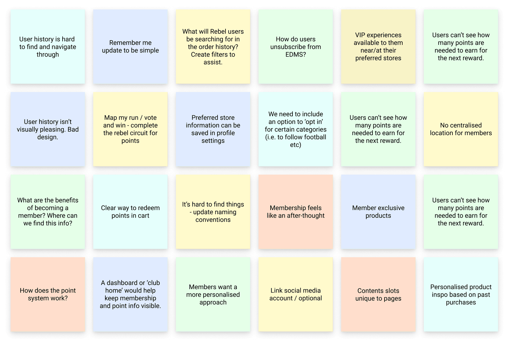

Miro board notes from one of our internal brainstorming sessions.
With over 160 stores across Australia, Rebel Sports target audience is quite broad. Aimed at sports enthusiasts of all demographics, Rebel offers products for all Australians looking for high-quality sporting equipment.
Having said this, according to web analytics, the average consumer at Rebel’s website is female, between the ages of 25-34. Also 95% of their consumer base are contained within Australia with browsing habits catered to the lifestyle and fashion industries.
In addition to these shoppers, Rebel Sport also offer products to professional athletes and teams at various levels.

Rebel Sports Vision Statement.
PROBLEM STATEMENT
Addressing usability issues.
MY INVOLVEMENT
My involvement in Rebel Sports redesign.
As a UI/UX Designer, I collaborated closely with the team at YUZA to identify user pain points, develop wireframes and implement solutions to improve overall usability.
Key areas of focus included:
1. The purchase journey
2. Membership dashboard
3. The user profile
4. Order history.
As a UI Designer, I was also responsible for translating these solutions into pixel-perfect designs across mobile, tablet and desktop devices.
I also played a role in developing and maintaining Rebel’s design system to ensure consistency and scalability across all platforms.
Lastly, I worked directly with Rebels internal team to edit product and brand photography to help build the companies visual identity during a time of transition.
For ease of scalability, our designers also worked with the 8 point grid system to ensure consistency. This helped keep the overall design neat and clean. All padding, margins between elements, iconography and line heights were created in strict adherence to this principle.
Once the design system was complete, we retro-actively polished up our initial designs to fit the new system. Despite being less than optimal, we agreed that this was the smartest and most efficient way to work, given the obstacles.

PROBLEM STATEMENT
Addressing usability issues.
The previous iteration of Rebel Sports website had several usability issues that needed to be addressed to provide users an optimal experience. In addition to usability issues, Rebel wanted to expand upon user membership, requiring new areas of the site to be built. In summary our deliverables included:
Building and implementing Rebel’s design system, based on updated style guidelines
Editing product photography to help build Rebel's visual library
Brainstorming and implementing solutions to all areas of membership, including a membership dashboard for centralised information
Performing user testing on updated areas of the website
Addressing pain points surrounding: order history, user profiles, the user checkout and more.
For ease of scalability, our designers also worked with the 8 point grid system to ensure consistency. This helped keep the overall design neat and clean. All padding, margins between elements, iconography and line heights were created in strict adherence to this principle.
Once the design system was complete, we retro-actively polished up our initial designs to fit the new system. Despite being less than optimal, we agreed that this was the smartest and most efficient way to work, given the obstacles.

Miro board notes from one of our internal brainstorming sessions.
YUZA was presented a unique challenge when working with Rebel. Despite having a large marketing team, Rebel had no official design team. As previous iterations of the website had been made externally and the brand was undergoing a transformation, we were tasked with the responsibility of creating a design system from scratch.
We knew it was extremely important to establish this design system early, to ensure consistency across the entire project. After conducting research on Rebel’s brand guidelines, we gained an in-depth understanding of the design specifics and then began building their design system.
The design system encompassed many elements and components, including:
The colour palette
The typographic scale (for desktop and mobile)
Bootstrap 4 grid system (for desktop, tablet and mobile)
Padding elements
Iconography
Atomic components
Molecular components
Component organisms.
DESIGN SYSTEM
Building Rebel's design system.
TARGET AUDIENCE
Understanding Rebels audience.
Given our timeframe, many of our designers were tasked with starting the design of several areas of the website while the design system was still being developed. While this wasn’t ideal, we carried out these designs as incomplete (yet high-fidelity) mockups to present to Rebel’s internal team for early feedback.
Despite the fact that the majority of our design choices needed to be in accordance with Rebels pre-established guidelines, we were able to explore creative solutions to certain components. These included Rebel’s product cards (included in the case study below).
For ease of scalability, our designers also worked with the 8 point grid system to ensure consistency. This helped keep the overall design neat and clean. All padding, margins between elements, iconography and line heights were created in strict adherence to this principle.
Once the design system was complete, we retro-actively polished up our initial designs to fit the new system. Despite being less than optimal, we agreed that this was the smartest and most efficient way to work, given the obstacles.
With over 160 stores across Australia, Rebel Sports target audience is quite broad. Aimed at sports enthusiasts of all demographics, Rebel offers products for all Australians looking for high-quality sporting equipment.
Having said this, according to web analytics, the average consumer at Rebel’s website is female, between the ages of 25-34. Also 95% of their consumer base are contained within Australia with browsing habits catered to the lifestyle and fashion industries.
In addition to these shoppers, Rebel Sport also offer products to professional athletes and teams at various levels.

Rebel Sports Vision Statement.
The information gathered from our team indicated that users were unhappy with most experiences related to membership. Accessing information felt disjointed, as if being a Rebel Active member was an after-thought and not an exclusive opportunity as they were lead to believe.
One of the key issues was related to how membership information was dispersed. With the previous design, users accessed information via a dropdown menu taking them to a new page. This created a cluttered experience as the site lacked a centralised location for all membership content.
The selections available were also limited. With the collaboration of Rebel’s internal team, our team also took the opportunity to explore further user incentives.
What were the constraints? After discussing our prospects with the development team, I was given the constraint of working with a right fly-out menu as the fixed design for our dashboard. This was due to an already created fly-out menu used for membership sign-up and the labour costs involved with creating an entirely new dashboard.
This constraint wasn’t problematic but it did mean information needed to be compartmentalised for deeper level storage. For this I explored three options of storage, which included navigation tabs, accordions and right and left arrows for users to move back and forth.
COMPETITIVE ANALYSIS
Analysing member dashboards.
I investigated three less-direct competitors of Rebel to better understand how their membership incentives work. These three memberships included Nike Plus, Adiclub and Northface’s XPLR Pass.
What I learned from this analysis was that although all three companies offered basic perks like early access to new products and free shipping, Nike Plus and Adiclub offered additional rewards for completing challenges (such as 5km runs).
This analysis highlighted the importance of customer engagement, particularly in the sporting retail market, where users already take pride in completing challenges to gain rewards.
Furthermore, all three companies made it easy for users to access information by creating a centralised location for all membership content.

Some notes from the Miro board presentation.
After presenting the competitive analysis to the team, I was given the task of designing the dashboard. The main objective, of course, was to provide users with easy access to all their membership information. It also needed to be intuitive, user-friendly, and visually appealing.
To start with, I included all the essential features such as the membership tier system, Rebel Active memberships, and profile information. This allowed users to quickly access their membership status, personal details, and other critical information in one central location.
Additionally, we wanted to include features such as active credit, user wishlists, and order history to provide users with a comprehensive overview of their past and present purchases. These features were also essential as they allowed users to track their order history, monitor their purchases, and manage their accounts more efficiently.
I also included options for various incentives, such as coupons, offers, recommended events, and competitions.
These incentives would provide users with a personalised experience based on their preferences and interests.
The final designs took into consideration all user feedback from our initial usability sessions, along with internal and external brainstorming sessions. For even more options, our other designers included their own solutions, which were included in this discussion.
At the time of writing this case study, the final design for the member dashboard is still pending, based on even further feedback and evaluation from users. The live date for the first iteration of this product redesign is still several months away and while I would love to include a final outcome in this case study, it has yet to be determined.
Having said this, I’m happy to see our team and Rebel place such high importance on thorough usability testing. I’m also excited to see the final results when they eventually go live later on in development.
ORDER HISTORY
Streamlining the order history section.
DESIGN SYSTEM
Building Rebel’s design system.
YUZA was presented a unique challenge when working with Rebel. Despite having a large marketing team, Rebel had no official design team. As previous iterations of the website had been made externally and the brand was undergoing a transformation, we were tasked with the responsibility of creating a design system from scratch.
We knew it was extremely important to establish this design system early, to ensure consistency across the entire project. After conducting research on Rebel’s brand guidelines, we gained an in-depth understanding of the design specifics and then began building their design system.
The design system encompassed many elements and components, including:
The colour palette
The typographic scale (for desktop and mobile)
Bootstrap 4 grid system (for desktop, tablet and mobile)
Padding elements
Iconography
Atomic components
Molecular components
Component organisms.

Given our timeframe, many of our designers were tasked with starting the design of several areas of the website while the design system was still being developed. While this wasn’t ideal, we carried out these designs as incomplete (yet high-fidelity) mockups to present to Rebel’s internal team for early feedback.
Despite the fact that the majority of our design choices needed to be in accordance with Rebels pre-established guidelines, we were able to explore creative solutions to certain components. These included Rebel’s product cards (included in the case study below).
For ease of scalability, our designers also worked with the 8 point grid system to ensure consistency. This helped keep the overall design neat and clean. All padding, margins between elements, iconography and line heights were created in strict adherence to this principle.
Once the design system was complete, we retro-actively polished up our initial designs to fit the new system. Despite being less than optimal, we agreed that this was the smartest and most efficient way to work, given the obstacles.
VISUAL DESIGN
Adding to Rebel's visual design.
Adding to Rebel's visual design.
REFLECTIONS
Reflecting on what I would do differently.
I’d love to take a moment to explore what myself and the team could have done better during this project.
More user testing: Although user testing was conducted at several stages of the project, I believe we could have done more. An example of this are with the product card redesigns. I'm a strong ambassador for rigorous user-testing and although I understand that it isn't always possible, with every stage of the project, I think both YUZA and Rebel would benefit greatly with more user testing and feedback gathering.
Offering more feedback: My approach to design is to question everything. I love tearing designs apart and reassembling them with all the elements on the table for discussion. With this approach, no designer is in control of the outcome and the end result is usually an amalgamation of all of our work. With this said, I feel I could have worked harder to be more hands-on with my feedback. I also feel YUZA could have benefited from closer, more collaborative meetings where all aspects of design are discussed at greater detail.
PIXEL PERFECTION
Creating pixel perfect designs.
In addition to working with YUZA’s UI/UX team, I worked with Rebel’s internal marketing team during quieter stages of the project, to assist with product image retouching and photo manipulation. Both Rebel and YUZA found it beneficial to work with a UI Designer with a background in Graphic Design.
A lot of this work involved masking out subjects from backgrounds that were photographed in a sub-optimal conditions (low contrasting, complicated backgrounds). Luckily I have many years of experience as an illustrator using a Wacom tablet.
Adding to the complexity were composite shots, requiring me to build backgrounds using gradients and distortions to ground certain products.
In addition to retouching and masking, I also helped build Rebel’s product inventory with some creative involvement that took into consideration the look and feel of their new rebrand. This involved a bit more creativity, which I always enjoy being a part of.
MEMBERS DASHBOARD
Creating a members dashboard.
Creating a members dashboard.
The information gathered from our team indicated that users were unhappy with most experiences related to membership. Accessing information felt disjointed, as if being a Rebel Active member was an after-thought and not an exclusive opportunity as they were lead to believe.
One of the key issues was related to how membership information was dispersed. With the previous design, users accessed information via a dropdown menu taking them to a new page. This created a cluttered experience as the site lacked a centralised location for all membership content.
The selections available were also limited. With the collaboration of Rebel’s internal team, our team also took the opportunity to explore further user incentives.
What were the constraints? After discussing our prospects with the development team, I was given the constraint of working with a right fly-out menu as the fixed design for our dashboard. This was due to an already created fly-out menu used for membership sign-up and the labour costs involved with creating an entirely new dashboard.
This constraint wasn’t problematic but it did mean information needed to be compartmentalised for deeper level storage. For this I explored three options of storage, which included navigation tabs, accordions and right and left arrows for users to move back and forth.
COMPETITIVE ANALYSIS
Analysing member dashboards.
I investigated three less-direct competitors of Rebel to better understand how their membership incentives work. These three memberships included Nike Plus, Adiclub and Northface’s XPLR Pass.
What I learned from this analysis was that although all three companies offered basic perks like early access to new products and free shipping, Nike Plus and Adiclub offered additional rewards for completing challenges (such as 5km runs).
This analysis highlighted the importance of customer engagement, particularly in the sporting retail market, where users already take pride in completing challenges to gain rewards.
Furthermore, all three companies made it easy for users to access information by creating a centralised location for all membership content.

Some notes from the Miro board presentation.
APPLICATION
Applying all of this information.
Applying all of this information.


Wireframes of the members dashboard.
After presenting the competitive analysis to the team, I was given the task of designing the dashboard. The main objective, of course, was to provide users with easy access to all their membership information. It also needed to be intuitive, user-friendly, and visually appealing.
To start with, I included all the essential features such as the membership tier system, Rebel Active memberships, and profile information. This allowed users to quickly access their membership status, personal details, and other critical information in one central location.
Additionally, we wanted to include features such as active credit, user wishlists, and order history to provide users with a comprehensive overview of their past and present purchases. These features were also essential as they allowed users to track their order history, monitor their purchases, and manage their accounts more efficiently.
I also included options for various incentives, such as coupons, offers, recommended events, and competitions. These incentives would provide users with a personalised experience based on their preferences and interests.
The final designs took into consideration all user feedback from our initial usability sessions, along with internal and external brainstorming sessions. For even more options, our other designers included their own solutions, which were included in this discussion.
At the time of writing this case study, the final design for the member dashboard is still pending, based on even further feedback and evaluation from users. The live date for the first iteration of this product redesign is still several months away and while I would love to include a final outcome in this case study, it has yet to be determined.
Having said this, I’m happy to see our team and Rebel place such high importance on thorough usability testing. I’m also excited to see the final results when they eventually go live later on in development.

Wireframes of the members dashboard.

Mockups of the members dashboard.

A mockup of the members dashboard for tablet devices.
PRODUCT CARDS
Creating options for new product cards.
Creating options for new product cards.
I had the opportunity to redesign Rebels product cards as the previous design used outdated styling.
My main priority was to create a clean and simple product card that would entice the user, not overwhelm them. The most important thing was to use a clear hierarchy of information and give enough space for the product images to do most of the work.
I wasn’t given too many constraints, just to make sure the designs adhered to the 8 point grid system, using multiples of 8 to pad elements within the cards.
In terms of how these products cards would be displayed on mobile, we agreed that a carousel would most likely be used in the order history section with the product cards on the shopping page to be stacked vertically. This would allow the images and information to entice users as effectively as possible.
I designed several options which I then presented to the team. In the end, the final design was an amalgamation between my work and the work of our other designers.
ORDER HISTORY
Streamlining the order history section.
YUZA’s research found that users had issues navigating through their order history and pending order information.
One issue was due to the lack of filters or search functionality, making it difficult for users to locate specific orders. Over all though (and most notably) users found the page to be cluttered and tables to be difficult to consume.
Other users had issues with a lack of detailed information (such as a proper invoice breakdown).
From doing a thorough competitive analysis (more information below), there’s no reason why this needed to be the case. In fact, despite being an information-heavy part of the website, there’s no reason why it couldn’t be redesigned in a functional yet streamlined way, information intact.
All the successful examples discovered in the competitive analysis had strong use of negative space as well as text and information hierarchy.
Doing a competitive analysis of order history information:
Making the order history information accessible: Order history information needs to be easy to locate. This was incorporated into our previous usability solution of creating a centralised dashboard.
User-friendly: Successful designs simplified things, using negative space, product photography and typographic hierarchy effectively.
Compartmentalisation: Successful designs compartmentalised information with tabs, accordions and buttons to show more details.
APPLICATION
Applying this information.
Applying this information.
After doing a thorough competitive analysis, our team gathered to discuss ideas. As we were looking for a streamlined yet comprehensive design tackling both the users past and pending orders, one of our designers suggested a flyout menu.
This was a great solution because it would allow us to design within a much wider space than a table of rows and columns. The idea being that users would select their orders from a table and expand to a flyout if needed. This expanded view could contain all sorts of information.
The flyout would contain all the relevant information from their invoice, such as: the date purchased, the order number, the order status, the full item name, cost, image, payment method, payment total and more.
I worked on these solutions with our wider team, starting with sketched-wireframes before working on high-fidelity designs. The designs evolved over the course of a few weeks as all our designers contributed their input.

An expanded view of the users order history was designed as a flyout menu. Users select their orders from a table to see a comprehensive breakdown.
PIXEL PERFECTION
Creating pixel-perfect designs.
A large part of this role involved me working as a UI Designer in a hands-on capacity to create pixel-perfect designs.
Our newly created design system served as a foundation for the rest of our work. As previously mentioned, we worked with the 8 point grid system to ensure a clean and consistent rhythm was upheld across all devices. For each part of the user journey we created desktop, tablet and mobile variations.
During this time, our team coordinated regularly, despite remote-working conditions, to ensure consistency was upheld across all screens.
Upon completion we would hand over screens to the development team to be implemented.

REFLECTIONS
Reflecting on what I would do differently.
I’d love to take a moment to explore what myself and the team could have done better during this project.
More user testing: Although user testing was conducted at several stages of the project, I believe we could have done more. An example of this are with the product card redesigns. I'm a strong ambassador for rigorous user-testing and although I understand that it isn't always possible, with every stage of the project, I think both YUZA and Rebel would benefit greatly with more user testing and feedback gathering.
Offering more feedback: My approach to design is to question everything. I love tearing designs apart and reassembling them with all the elements on the table for discussion. With this approach, no designer is in control of the outcome and the end result is usually an amalgamation of all of our work. With this said, I feel I could have worked harder to be more hands-on with my feedback. I also feel YUZA could have benefited from closer, more collaborative meetings where all aspects of design are discussed at greater detail.


